Welcome to the mail panel
This whole panel is dressed up like a real inbox…
Atoms
One step of the AI's work, shown as its action verb — the closed verb vocabulary (grain/ai/contract.ts) made visible. The AI narrates a run as a stream of these (reads → types → revises → clicks → commits). It's AI by nature, so it always wears the grain "terminal" edge; status carries the step's state.
verb sets the label; status="active" marks the step the AI is doing right now.
<action-badge verb="clicks" status="active"></action-badge><action-badge verb="reads"></action-badge>
<action-badge verb="types"></action-badge>
<action-badge verb="revises"></action-badge>
<action-badge verb="commits"></action-badge>One step of the AI's work, shown as its action verb — the closed verb vocabulary (grain/ai/contract.ts) made visible. The AI narrates a run as a stream of these (reads → types → revises → clicks → commits). It's AI by nature, so it always wears the grain "terminal" edge; status carries the step's state.
verb sets the label; status="active" marks the step the AI is doing right now.
<action-badge verb="clicks" status="active"></action-badge><action-badge verb="reads"></action-badge>
<action-badge verb="types"></action-badge>
<action-badge verb="revises"></action-badge>
<action-badge verb="commits"></action-badge>Atoms
One class — .badge. Tone is an attribute (data-status), not a second class. Monochrome: state reads as ink vs faint, not hue (DESIGN-SYSTEM §2).
<span class="badge" data-status="active">Active</span><span class="badge" data-status="archived">Archived</span>One class — .badge. Tone is an attribute (data-status), not a second class. Monochrome: state reads as ink vs faint, not hue (DESIGN-SYSTEM §2).
<span class="badge" data-status="active">Active</span><span class="badge" data-status="archived">Archived</span>Atoms
One class — .btn. Variant, size, and status are attributes, not extra classes. Pseudo-states are forced for display with data-force.
<button class="btn">Button</button><button class="btn" data-force="hover">Button</button><button class="btn" data-force="focus">Button</button><button class="btn" data-force="active">Button</button><button class="btn" disabled>Button</button><button class="btn" data-size="sm">Small</button><button class="btn">Medium</button><button class="btn" data-size="lg">Large</button><button class="btn">Solid</button><button class="btn" data-variant="soft">Soft</button><button class="btn" data-variant="outline">Outline</button><button class="btn" data-status="success">Save</button><button class="btn" data-status="danger">Delete</button>When the AI is acting through a button, it wears the non-text grain: a dashed "terminal" edge + a blinking block caret, with the label in the Redaction grain family — the same inherited grade state the text uses. It settles back to clean on commit.
<button class="btn" data-commit="pending">Working…</button><button class="btn" data-size="sm" data-commit="pending">Archiving…</button><button class="btn" style="width:100%" data-commit="pending">Rescheduling your week…</button>Atoms
The data-first sibling of the Checkbox and the Radio, and the fourth member of the family Field, Choice and Memo started. Use it when the boxes arrive as data rather than as markup. One atom covers both controls where the authoring side needs two, because here the type is a binding, and a binding replaces where a config property appends. Items carry label, name, type, value, checked, required, surface, hint and error, every key present and null where unset. A group of radios is simply every item sharing one name.
The address is a check address, never a field one. This atom shipped without an address at all, because a checkbox's value is what the form submits when it is ticked rather than whether it is ticked, and the only verb the vocabulary had for a field wrote that value: it would have landed, reported success, changed what the form means and left the control looking untouched. The verb that can tick a box exists now, so the surface reads check:digest and the kind it names accepts that verb and no other. Give an item a field: address and the tick box goes back to advertising the write that lies, so the prefix is not a formatting detail.
The spec behind one item. Both message slots take null when there is nothing to say:
<label class="field">
  <input type="checkbox" class="field__box" name="digest" value="yes" checked="checked"
         data-surface="check:digest">
  <span class="field__label">Send me the monthly digest</span>
</label>Every item carries the same name, which is what makes the group exclusive:
A radio takes its own address per item rather than one for the group, because a verb operates a control and a group is not one. What the verb will not do is clear a radio: a group with nothing selected is a state no click can reach, so the request is refused rather than granted, and the way to move a group is to tick the option you want.
<div>
  <label class="field">
    <input type="radio" class="field__box" name="reply" value="email" checked="checked">
    <span class="field__label">Reply by email</span>
  </label>
  <label class="field">
    <input type="radio" class="field__box" name="reply" value="call">
    <span class="field__label">Reply by phone</span>
    <span class="field__hint">Only if you leave a number.</span>
  </label>
</div>
The data-first sibling of the Checkbox and the Radio, and the fourth member of the family Field, Choice and Memo started. Use it when the boxes arrive as data rather than as markup. One atom covers both controls where the authoring side needs two, because here the type is a binding, and a binding replaces where a config property appends. Items carry label, name, type, value, checked, required, surface, hint and error, every key present and null where unset. A group of radios is simply every item sharing one name.
The address is a check address, never a field one. This atom shipped without an address at all, because a checkbox's value is what the form submits when it is ticked rather than whether it is ticked, and the only verb the vocabulary had for a field wrote that value: it would have landed, reported success, changed what the form means and left the control looking untouched. The verb that can tick a box exists now, so the surface reads check:digest and the kind it names accepts that verb and no other. Give an item a field: address and the tick box goes back to advertising the write that lies, so the prefix is not a formatting detail.
The spec behind one item. Both message slots take null when there is nothing to say:
<label class="field">
  <input type="checkbox" class="field__box" name="digest" value="yes" checked="checked"
         data-surface="check:digest">
  <span class="field__label">Send me the monthly digest</span>
</label>Every item carries the same name, which is what makes the group exclusive:
A radio takes its own address per item rather than one for the group, because a verb operates a control and a group is not one. What the verb will not do is clear a radio: a group with nothing selected is a state no click can reach, so the request is refused rather than granted, and the way to move a group is to tick the option you want.
<div>
  <label class="field">
    <input type="radio" class="field__box" name="reply" value="email" checked="checked">
    <span class="field__label">Reply by email</span>
  </label>
  <label class="field">
    <input type="radio" class="field__box" name="reply" value="call">
    <span class="field__label">Reply by phone</span>
    <span class="field__hint">Only if you leave a number.</span>
  </label>
</div>
Atoms
A tick box in the field frame: something a form submits, rather than something the user switches. As a component: <b-checkbox label="I agree" name="terms" value="yes" required />, and the tag may self-close. Its twin is the Radio and its data-first sibling is Check. Reach for the Switch instead when the thing being set takes effect the moment it moves, like delivered or held.
This atom owns the stylesheet the other two reuse, the division the Textarea already makes for the Memo. It adds one class for the control and one rule for the row, because a tick box has no inside: the label sits beside it and reads at full ink, as the sentence being agreed to. The native control is kept as the platform draws it, and the tap target is the whole row rather than the box.
<label class="field">
  <input type="checkbox" class="field__box" name="terms" value="yes">
  <span class="field__label">I have read how this site handles what you send</span>
</label><label class="field">
<input type="checkbox" class="field__box" name="digest" value="yes" checked>
<span class="field__label">Send me the monthly digest</span>
</label><label class="field">
<input type="checkbox" class="field__box" name="terms" value="yes" required>
<span class="field__label">I agree to be contacted about this enquiry</span>
<span class="field__hint">Nothing is stored: the form opens your own mail client.</span>
</label><label class="field">
<input type="checkbox" class="field__box" name="terms" value="yes" required>
<span class="field__label">I agree to be contacted about this enquiry</span>
<span class="field__error">Tick this before sending.</span>
</label><label class="field">
<input type="checkbox" class="field__box" name="terms" value="yes" data-force="focus">
<span class="field__label">I agree to be contacted about this enquiry</span>
</label><label class="field" data-commit="pending">
<input type="checkbox" class="field__box" name="terms" value="yes">
<span class="field__label">A box the AI is working near, dashed like the rest of the family</span>
</label><label class="field" data-size="sm">
<input type="checkbox" class="field__box" name="sm" value="yes" checked>
<span class="field__label">Small</span>
</label><label class="field" data-size="lg">
<input type="checkbox" class="field__box" name="lg" value="yes" checked>
<span class="field__label">Large</span>
</label>A tick box in the field frame: something a form submits, rather than something the user switches. As a component: <b-checkbox label="I agree" name="terms" value="yes" required />, and the tag may self-close. Its twin is the Radio and its data-first sibling is Check. Reach for the Switch instead when the thing being set takes effect the moment it moves, like delivered or held.
This atom owns the stylesheet the other two reuse, the division the Textarea already makes for the Memo. It adds one class for the control and one rule for the row, because a tick box has no inside: the label sits beside it and reads at full ink, as the sentence being agreed to. The native control is kept as the platform draws it, and the tap target is the whole row rather than the box.
<label class="field">
  <input type="checkbox" class="field__box" name="terms" value="yes">
  <span class="field__label">I have read how this site handles what you send</span>
</label><label class="field">
<input type="checkbox" class="field__box" name="digest" value="yes" checked>
<span class="field__label">Send me the monthly digest</span>
</label><label class="field">
<input type="checkbox" class="field__box" name="terms" value="yes" required>
<span class="field__label">I agree to be contacted about this enquiry</span>
<span class="field__hint">Nothing is stored: the form opens your own mail client.</span>
</label><label class="field">
<input type="checkbox" class="field__box" name="terms" value="yes" required>
<span class="field__label">I agree to be contacted about this enquiry</span>
<span class="field__error">Tick this before sending.</span>
</label><label class="field">
<input type="checkbox" class="field__box" name="terms" value="yes" data-force="focus">
<span class="field__label">I agree to be contacted about this enquiry</span>
</label><label class="field" data-commit="pending">
<input type="checkbox" class="field__box" name="terms" value="yes">
<span class="field__label">A box the AI is working near, dashed like the rest of the family</span>
</label><label class="field" data-size="sm">
<input type="checkbox" class="field__box" name="sm" value="yes" checked>
<span class="field__label">Small</span>
</label><label class="field" data-size="lg">
<input type="checkbox" class="field__box" name="lg" value="yes" checked>
<span class="field__label">Large</span>
</label>Atoms
The select sibling of the Field, for when the options are data too. Its own template nests an each over the item's options array, so one tag renders every choice in the form and every option inside each one. That nesting is what earns it a component of its own: a select cannot be built from a flat field spec without a second array.
The item shape is label, name, surface, hint, error and an options array of value, label and selected. Like Select it contributes no frame of its own, and the native dropdown arrow is kept, so nothing here needs a color.
One caller rule. A select accepts a write that a text input would, and anything that is not one of its option values does not fail: it sets the value to an empty string, so the control goes blank and nothing is logged. Send option values, never labels. Measured against a real page on 2026-08-13.
One item of the spec, and the markup it becomes:
<label class="field">
  <span class="field__label">About</span>
  <select class="field__select" data-surface="field:contact-topic" name="topic">
    <option value="grain">GRAIN</option>
    <option value="hiring" selected="selected">Hiring</option>
  </select>
</label>
The select sibling of the Field, for when the options are data too. Its own template nests an each over the item's options array, so one tag renders every choice in the form and every option inside each one. That nesting is what earns it a component of its own: a select cannot be built from a flat field spec without a second array.
The item shape is label, name, surface, hint, error and an options array of value, label and selected. Like Select it contributes no frame of its own, and the native dropdown arrow is kept, so nothing here needs a color.
One caller rule. A select accepts a write that a text input would, and anything that is not one of its option values does not fail: it sets the value to an empty string, so the control goes blank and nothing is logged. Send option values, never labels. Measured against a real page on 2026-08-13.
One item of the spec, and the markup it becomes:
<label class="field">
  <span class="field__label">About</span>
  <select class="field__select" data-surface="field:contact-topic" name="topic">
    <option value="grain">GRAIN</option>
    <option value="hiring" selected="selected">Hiring</option>
  </select>
</label>
Atoms
A monospace block for fenced code — plus a .code-inline run for inline code. It reads the --font-mono token, so code stays mono in either grade; the AI signal here is the dashed edge (non-text grain), not a font swap. CSS-only: composed by hand (by MILL), nothing data-binds it, so there is no template. Long lines scroll rather than break the column.
bun run dev<pre class="code-block"><code>bun run dev</code></pre>export const answer = 42;<pre class="code-block" data-lang="ts"><code>export const answer = 42;</code></pre>Run bun run check before you call it done.
<p>Run <code class="code-inline">bun run check</code> before you call it done.</p>A monospace block for fenced code — plus a .code-inline run for inline code. It reads the --font-mono token, so code stays mono in either grade; the AI signal here is the dashed edge (non-text grain), not a font swap. CSS-only: composed by hand (by MILL), nothing data-binds it, so there is no template. Long lines scroll rather than break the column.
bun run dev<pre class="code-block"><code>bun run dev</code></pre>export const answer = 42;<pre class="code-block" data-lang="ts"><code>export const answer = 42;</code></pre>Run bun run check before you call it done.
<p>Run <code class="code-inline">bun run check</code> before you call it done.</p>Atoms
The data-first sibling of the Input. Same control, same frame, different author: reach for the Input when you know the field while typing the page, and for this when the fields arrive as data and one tag should render all of them.
Two rules make it work and both are the renderer's. Config properties are form-wide, so a literal size or variant on the tag reaches every item. Data is per item: label, name, type, placeholder, value, required, hint and error. Every item carries every key, null where unset, because a key left out warns in development and an explicit null stays quiet. An item may also carry a surface, which lands on the input itself and makes the generated field addressable, and it sits on the control rather than the label around it because a label has nothing to write into.
There is no CSS here. The frame, the sizes, the inline variant and the AI treatment all come from b-input.css, which is the point: two components, one control, no drift.
One item of the spec, and the markup it becomes:
<label class="field">
  <span class="field__label">Name</span>
  <input class="field__input" data-surface="field:contact-name" name="name" type="text"
         placeholder="Jane" required="required">
</label><label class="field" data-variant="inline">
<span class="field__label">Email</span>
<input class="field__input" data-surface="field:contact-email" name="email" type="email"
placeholder="jane@example.com">
</label>The data-first sibling of the Input. Same control, same frame, different author: reach for the Input when you know the field while typing the page, and for this when the fields arrive as data and one tag should render all of them.
Two rules make it work and both are the renderer's. Config properties are form-wide, so a literal size or variant on the tag reaches every item. Data is per item: label, name, type, placeholder, value, required, hint and error. Every item carries every key, null where unset, because a key left out warns in development and an explicit null stays quiet. An item may also carry a surface, which lands on the input itself and makes the generated field addressable, and it sits on the control rather than the label around it because a label has nothing to write into.
There is no CSS here. The frame, the sizes, the inline variant and the AI treatment all come from b-input.css, which is the point: two components, one control, no drift.
One item of the spec, and the markup it becomes:
<label class="field">
  <span class="field__label">Name</span>
  <input class="field__input" data-surface="field:contact-name" name="name" type="text"
         placeholder="Jane" required="required">
</label><label class="field" data-variant="inline">
<span class="field__label">Email</span>
<input class="field__input" data-surface="field:contact-email" name="email" type="email"
placeholder="jane@example.com">
</label>Atoms
A small status flag for a work — "Planned", "Demo" — an uppercase whisper in a dashed pill. Portfolio-owned on purpose: inside GRAIN the dashed edge is the "AI / in-transit" signal, so a static flag that borrows the look stays out of the design system.
<span class="flag">Planned · only the plan exists so far</span>A small status flag for a work — "Planned", "Demo" — an uppercase whisper in a dashed pill. Portfolio-owned on purpose: inside GRAIN the dashed edge is the "AI / in-transit" signal, so a static flag that borrows the look stays out of the design system.
<span class="flag">Planned · only the plan exists so far</span>Atoms
Inline SVG glyphs from the shared sprite (/assets/sprite.svg). One class — .icon; size is an attribute. Monochrome and currentColor, so an icon flips ink ↔ grain with its surroundings. Icons are decorative (aria-hidden) — label the control that wraps them (see b-icon-button), not the glyph.
Pass the whole sprite reference in sym (the binding vocabulary can't concatenate a name).
<b-icon sym="/assets/sprite.svg#loop"></b-icon>
<b-icon sym="/assets/sprite.svg#tasks"></b-icon>
<b-icon sym="/assets/sprite.svg#knowledge"></b-icon>
<b-icon sym="/assets/sprite.svg#rules"></b-icon>
<b-icon sym="/assets/sprite.svg#traces"></b-icon>
<b-icon sym="/assets/sprite.svg#settings"></b-icon>
<b-icon sym="/assets/sprite.svg#menu"></b-icon>
<b-icon sym="/assets/sprite.svg#close"></b-icon>
<b-icon sym="/assets/sprite.svg#chevron-left"></b-icon>
<b-icon sym="/assets/sprite.svg#chevron-right"></b-icon>
<b-icon sym="/assets/sprite.svg#send"></b-icon>
<b-icon sym="/assets/sprite.svg#search"></b-icon>
<b-icon sym="/assets/sprite.svg#spark"></b-icon>
<b-icon sym="/assets/sprite.svg#check"></b-icon>
<b-icon sym="/assets/sprite.svg#plus"></b-icon><b-icon sym="/assets/sprite.svg#loop" size="sm"></b-icon>
<b-icon sym="/assets/sprite.svg#loop"></b-icon>
<b-icon sym="/assets/sprite.svg#loop" size="lg"></b-icon>Inline SVG glyphs from the shared sprite (/assets/sprite.svg). One class — .icon; size is an attribute. Monochrome and currentColor, so an icon flips ink ↔ grain with its surroundings. Icons are decorative (aria-hidden) — label the control that wraps them (see b-icon-button), not the glyph.
Pass the whole sprite reference in sym (the binding vocabulary can't concatenate a name).
<b-icon sym="/assets/sprite.svg#loop"></b-icon>
<b-icon sym="/assets/sprite.svg#tasks"></b-icon>
<b-icon sym="/assets/sprite.svg#knowledge"></b-icon>
<b-icon sym="/assets/sprite.svg#rules"></b-icon>
<b-icon sym="/assets/sprite.svg#traces"></b-icon>
<b-icon sym="/assets/sprite.svg#settings"></b-icon>
<b-icon sym="/assets/sprite.svg#menu"></b-icon>
<b-icon sym="/assets/sprite.svg#close"></b-icon>
<b-icon sym="/assets/sprite.svg#chevron-left"></b-icon>
<b-icon sym="/assets/sprite.svg#chevron-right"></b-icon>
<b-icon sym="/assets/sprite.svg#send"></b-icon>
<b-icon sym="/assets/sprite.svg#search"></b-icon>
<b-icon sym="/assets/sprite.svg#spark"></b-icon>
<b-icon sym="/assets/sprite.svg#check"></b-icon>
<b-icon sym="/assets/sprite.svg#plus"></b-icon><b-icon sym="/assets/sprite.svg#loop" size="sm"></b-icon>
<b-icon sym="/assets/sprite.svg#loop"></b-icon>
<b-icon sym="/assets/sprite.svg#loop" size="lg"></b-icon>Atoms
The "icon square" (DESIGN-SYSTEM §5): a bordered control holding one glyph. One class — .icon-btn; variant and size are attributes. Icon-only, so label is required (it becomes the aria-label). Same ink-hairline / invert-on-hover treatment as b-button.
<b-icon-button sym="/assets/sprite.svg#send" label="Send"></b-icon-button><b-icon-button sym="/assets/sprite.svg#menu" label="Menu" variant="ghost"></b-icon-button><b-icon-button sym="/assets/sprite.svg#search" label="Search" size="sm"></b-icon-button>
<b-icon-button sym="/assets/sprite.svg#search" label="Search"></b-icon-button>
<b-icon-button sym="/assets/sprite.svg#search" label="Search" size="lg"></b-icon-button><b-icon-button sym="/assets/sprite.svg#send" label="Send" data-force="hover"></b-icon-button>
<b-icon-button sym="/assets/sprite.svg#send" label="Send" data-force="focus"></b-icon-button>
<b-icon-button sym="/assets/sprite.svg#send" label="Send" disabled></b-icon-button>When the AI is acting through an icon button it wears the non-text grain — a dashed "terminal" edge — the same inherited grade state b-button uses. It settles back to a solid ink hairline on commit.
<b-icon-button sym="/assets/sprite.svg#send" label="Sending…" data-commit="pending"></b-icon-button>Atoms
A labelled text field. Compose several inside a <form> to build any form, or lay them out with the Form grid. As a component: <b-input name="email" label="Email" required /> — required is a bare boolean, and the tag may self-close.
This atom owns the frame the whole field family shares, which is three things beyond the input itself. Two message slots sit under the control, a quiet hint and an error, and both collapse when empty so a template can carry them unconditionally. An error is not a red one: status here is weight against the hint's fade rather than hue. Third is the required marker, which nothing has to add: the frame reads the attribute the browser already needs, so the marker cannot drift from the constraint, no author can forget it, and every atom in the family gets it at once.
<label class="field">
  <span class="field__label">Name</span>
  <input class="field__input" name="name" placeholder="Jane">
</label><label class="field">
<span class="field__label">Name</span>
<input class="field__input" name="name" value="Jane" data-force="focus">
</label><label class="field">
<span class="field__label">Email</span>
<input class="field__input" type="email" name="email" placeholder="jane@example.com" required>
<span class="field__hint">Only used to reply to you.</span>
</label><label class="field">
<span class="field__label">Email</span>
<input class="field__input" type="email" name="email" value="jane@" required>
<span class="field__error">That address is missing everything after the at sign.</span>
</label><label class="field">
<span class="field__label">Name</span>
<input class="field__input" name="name">
</label><label class="field" data-variant="inline">
<span class="field__label">Name</span>
<input class="field__input" name="name">
</label><label class="field" data-size="sm">
<span class="field__label">Name</span>
<input class="field__input" name="name">
</label><label class="field" data-size="lg">
<span class="field__label">Name</span>
<input class="field__input" name="name">
</label>A labelled text field. Compose several inside a <form> to build any form, or lay them out with the Form grid. As a component: <b-input name="email" label="Email" required /> — required is a bare boolean, and the tag may self-close.
This atom owns the frame the whole field family shares, which is three things beyond the input itself. Two message slots sit under the control, a quiet hint and an error, and both collapse when empty so a template can carry them unconditionally. An error is not a red one: status here is weight against the hint's fade rather than hue. Third is the required marker, which nothing has to add: the frame reads the attribute the browser already needs, so the marker cannot drift from the constraint, no author can forget it, and every atom in the family gets it at once.
<label class="field">
  <span class="field__label">Name</span>
  <input class="field__input" name="name" placeholder="Jane">
</label><label class="field">
<span class="field__label">Name</span>
<input class="field__input" name="name" value="Jane" data-force="focus">
</label><label class="field">
<span class="field__label">Email</span>
<input class="field__input" type="email" name="email" placeholder="jane@example.com" required>
<span class="field__hint">Only used to reply to you.</span>
</label><label class="field">
<span class="field__label">Email</span>
<input class="field__input" type="email" name="email" value="jane@" required>
<span class="field__error">That address is missing everything after the at sign.</span>
</label><label class="field">
<span class="field__label">Name</span>
<input class="field__input" name="name">
</label><label class="field" data-variant="inline">
<span class="field__label">Name</span>
<input class="field__input" name="name">
</label><label class="field" data-size="sm">
<span class="field__label">Name</span>
<input class="field__input" name="name">
</label><label class="field" data-size="lg">
<span class="field__label">Name</span>
<input class="field__input" name="name">
</label>Atoms
A quiet hairline chip that names a keyboard shortcut. One class — .kbd. Presentational only: the real handler lives elsewhere (the ⌘K palette, a shell toggle). keys sets the label.
<b-kbd keys="⌘K"></b-kbd>
<b-kbd keys="⌘B"></b-kbd>
<b-kbd keys="Esc"></b-kbd>
A quiet hairline chip that names a keyboard shortcut. One class — .kbd. Presentational only: the real handler lives elsewhere (the ⌘K palette, a shell toggle). keys sets the label.
<b-kbd keys="⌘K"></b-kbd>
<b-kbd keys="⌘B"></b-kbd>
<b-kbd keys="Esc"></b-kbd>
Atoms
One class — .list with .list__item children. Bullet by default (an editorial em-dash); data-variant="ordered" switches to a counter. Markers are muted ink, not a heavy disc (DESIGN-SYSTEM §4). Give each item a data-surface so the AI can write — or revise — one item at a time.
<ul class="list">
  <li class="list__item">Deep-work block — 09:00–11:00</li>
  <li class="list__item">Clear the inbox</li>
  <li class="list__item">Review architecture doc</li>
</ul><ul class="list" data-variant="ordered">
<li class="list__item">First</li>
<li class="list__item">Second</li>
<li class="list__item">Third</li>
</ul>One class — .list with .list__item children. Bullet by default (an editorial em-dash); data-variant="ordered" switches to a counter. Markers are muted ink, not a heavy disc (DESIGN-SYSTEM §4). Give each item a data-surface so the AI can write — or revise — one item at a time.
<ul class="list">
  <li class="list__item">Deep-work block — 09:00–11:00</li>
  <li class="list__item">Clear the inbox</li>
  <li class="list__item">Review architecture doc</li>
</ul><ul class="list" data-variant="ordered">
<li class="list__item">First</li>
<li class="list__item">Second</li>
<li class="list__item">Third</li>
</ul>Atoms
The data-first sibling of the Textarea, and the third member of the family Field and Choice started. Use it when the boxes arrive as data. The item shape is label, name, placeholder, value, required, hint, error and surface. There is no type, because a textarea has none, and no rows either: height is presentation, so it rides on the tag as form-wide config, the split every atom in this family makes.
The one thing this atom does differently: a textarea has no value attribute. Its value is its content, so the item's value binds as content rather than as an attribute. Bound as an attribute the browser ignores it completely, the box comes up empty, nothing warns, and the spec looks right. Worth knowing before anyone copies the Field's line into a textarea.
Writing to one is safe in a way a Choice is not: any string is a legal textarea value, so there is nothing it can be handed that empties it.
<label class="field">
  <span class="field__label">Message</span>
  <textarea class="field__textarea" data-surface="field:contact-message" name="message"
    placeholder="What would you like to say?"></textarea>
</label><label class="field" data-size="sm">
<span class="field__label">Message</span>
<textarea class="field__textarea" data-surface="field:contact-message" name="message" rows="6"></textarea>
</label>The data-first sibling of the Textarea, and the third member of the family Field and Choice started. Use it when the boxes arrive as data. The item shape is label, name, placeholder, value, required, hint, error and surface. There is no type, because a textarea has none, and no rows either: height is presentation, so it rides on the tag as form-wide config, the split every atom in this family makes.
The one thing this atom does differently: a textarea has no value attribute. Its value is its content, so the item's value binds as content rather than as an attribute. Bound as an attribute the browser ignores it completely, the box comes up empty, nothing warns, and the spec looks right. Worth knowing before anyone copies the Field's line into a textarea.
Writing to one is safe in a way a Choice is not: any string is a legal textarea value, so there is nothing it can be handed that empties it.
<label class="field">
  <span class="field__label">Message</span>
  <textarea class="field__textarea" data-surface="field:contact-message" name="message"
    placeholder="What would you like to say?"></textarea>
</label><label class="field" data-size="sm">
<span class="field__label">Message</span>
<textarea class="field__textarea" data-surface="field:contact-message" name="message" rows="6"></textarea>
</label>Atoms
A proportional horizontal bar split into segments — a health bar (passed / failed / pending share of a run), a storage bar, a progress bar, a poll result. Each segment's width is a single custom property (--seg) so it's bindable server-side with zero JS. Monochrome: segments differ by texture and ink-level — solid ink, hatched, faint — never by hue.
Segments read left-to-right and should sum to 100% (any remainder shows the faint track). Give the meter an aria-label; for a single-value progress meter add aria-valuenow/min/max.
ok is solid ink, bad is a dense hatch, an untoned/pending segment is faint. Order and widths are author-set.
<div class="meter" role="meter" aria-label="Run health">
  <span class="meter__seg" data-tone="ok" style="--seg: 70%"></span>
  <span class="meter__seg" data-tone="bad" style="--seg: 20%"></span>
  <span class="meter__seg" data-tone="pending" style="--seg: 10%"></span>
</div><div class="meter" role="meter" aria-label="Upload" aria-valuenow="60" aria-valuemin="0" aria-valuemax="100">
<span class="meter__seg" data-tone="ok" style="--seg: 60%"></span>
</div>data-state="busy" sweeps a faint stripe across the track (static faint fill under prefers-reduced-motion).
<div class="meter" data-state="busy" role="meter" aria-label="Running…">
  <span class="meter__seg"></span>
</div><div class="meter" data-commit="pending" role="meter" aria-label="Run health">
<span class="meter__seg" data-tone="ok" style="--seg: 55%"></span>
<span class="meter__seg" data-tone="pending" style="--seg: 45%"></span>
</div>A proportional horizontal bar split into segments — a health bar (passed / failed / pending share of a run), a storage bar, a progress bar, a poll result. Each segment's width is a single custom property (--seg) so it's bindable server-side with zero JS. Monochrome: segments differ by texture and ink-level — solid ink, hatched, faint — never by hue.
Segments read left-to-right and should sum to 100% (any remainder shows the faint track). Give the meter an aria-label; for a single-value progress meter add aria-valuenow/min/max.
ok is solid ink, bad is a dense hatch, an untoned/pending segment is faint. Order and widths are author-set.
<div class="meter" role="meter" aria-label="Run health">
  <span class="meter__seg" data-tone="ok" style="--seg: 70%"></span>
  <span class="meter__seg" data-tone="bad" style="--seg: 20%"></span>
  <span class="meter__seg" data-tone="pending" style="--seg: 10%"></span>
</div><div class="meter" role="meter" aria-label="Upload" aria-valuenow="60" aria-valuemin="0" aria-valuemax="100">
<span class="meter__seg" data-tone="ok" style="--seg: 60%"></span>
</div>data-state="busy" sweeps a faint stripe across the track (static faint fill under prefers-reduced-motion).
<div class="meter" data-state="busy" role="meter" aria-label="Running…">
  <span class="meter__seg"></span>
</div><div class="meter" data-commit="pending" role="meter" aria-label="Run health">
<span class="meter__seg" data-tone="ok" style="--seg: 55%"></span>
<span class="meter__seg" data-tone="pending" style="--seg: 45%"></span>
</div>Atoms
One <option>, bound from data. Parent context required: it is only meaningful inside Choice, whose template nests <b-option each="options"> inside the select. On its own it renders stray text, which is why the example below is shown as source rather than live.
Data: value, label, and selected bound as the string "selected" when that option is the current one. Any other value, including an empty string, drops the attribute.
Source only — this one owns the whole window, so a panel cannot host it. Open a real one.
<option value="hiring" selected="selected">Hiring</option>One <option>, bound from data. Parent context required: it is only meaningful inside Choice, whose template nests <b-option each="options"> inside the select. On its own it renders stray text, which is why the example below is shown as source rather than live.
Data: value, label, and selected bound as the string "selected" when that option is the current one. Any other value, including an empty string, drops the attribute.
Source only — this one owns the whole window, so a panel cannot host it. Open a real one.
<option value="hiring" selected="selected">Hiring</option>Atoms
One button from a set where exactly one answer is right. As a component: <b-radio label="Reply by email" name="reply" value="email" checked />, and the tag may self-close. It carries no stylesheet: the frame is the Input and the control is the Checkbox, so the row, the sizes, the ring and the AI treatment cannot drift from it.
Radios are a group, and the group is made by the name. Every button meant to be mutually exclusive with another carries the same one, and the question they answer is a heading the page writes above them. When the options arrive as data, reach for Check and let one tag render the whole group.
<div>
  <label class="field">
    <input type="radio" class="field__box" name="reply" value="email" checked>
    <span class="field__label">Reply by email</span>
  </label>
  <label class="field">
    <input type="radio" class="field__box" name="reply" value="call">
    <span class="field__label">Reply by phone</span>
  </label>
  <label class="field">
    <input type="radio" class="field__box" name="reply" value="none">
    <span class="field__label">No reply needed</span>
  </label>
</div><label class="field">
<input type="radio" class="field__box" name="pace" value="soon" checked>
<span class="field__label">Within the week</span>
<span class="field__hint">A best effort, not a promise.</span>
</label><label class="field">
<input type="radio" class="field__box" name="focus-demo" value="one" data-force="focus">
<span class="field__label">The keyboard ring lands on the control</span>
</label><label class="field" data-commit="pending">
<input type="radio" class="field__box" name="ai-demo" value="one">
<span class="field__label">Dashed while the AI works nearby</span>
</label>One button from a set where exactly one answer is right. As a component: <b-radio label="Reply by email" name="reply" value="email" checked />, and the tag may self-close. It carries no stylesheet: the frame is the Input and the control is the Checkbox, so the row, the sizes, the ring and the AI treatment cannot drift from it.
Radios are a group, and the group is made by the name. Every button meant to be mutually exclusive with another carries the same one, and the question they answer is a heading the page writes above them. When the options arrive as data, reach for Check and let one tag render the whole group.
<div>
  <label class="field">
    <input type="radio" class="field__box" name="reply" value="email" checked>
    <span class="field__label">Reply by email</span>
  </label>
  <label class="field">
    <input type="radio" class="field__box" name="reply" value="call">
    <span class="field__label">Reply by phone</span>
  </label>
  <label class="field">
    <input type="radio" class="field__box" name="reply" value="none">
    <span class="field__label">No reply needed</span>
  </label>
</div><label class="field">
<input type="radio" class="field__box" name="pace" value="soon" checked>
<span class="field__label">Within the week</span>
<span class="field__hint">A best effort, not a promise.</span>
</label><label class="field">
<input type="radio" class="field__box" name="focus-demo" value="one" data-force="focus">
<span class="field__label">The keyboard ring lands on the control</span>
</label><label class="field" data-commit="pending">
<input type="radio" class="field__box" name="ai-demo" value="one">
<span class="field__label">Dashed while the AI works nearby</span>
</label>Atoms
A labelled <select> in the .field idiom — the dropdown sibling of the text input. It reuses the shared .field/.field__label frame from b-input (parent-context note: b-select contributes only .field__select, and must be composed inside a .field label exactly like b-input, or it has no frame/spacing/AI treatment). The native dropdown arrow is kept — no custom caret, so nothing here needs a hardcoded color.
<label class="field">
  <span class="field__label">Environment</span>
  <select class="field__select" name="env">
    <option>staging</option><option>prod</option>
  </select>
</label><label class="field">
<span class="field__label">Environment</span>
<select class="field__select" name="env" data-force="focus">
<option>staging</option><option>prod</option>
</select>
</label>Inline works for free — it's declared on .field[data-variant="inline"] by b-input.css, and b-select reuses the same .field frame, so no separate CSS is needed here.
<label class="field">
  <span class="field__label">Priority</span>
  <select class="field__select" name="priority">
    <option>Low</option><option>Medium</option><option>High</option>
  </select>
</label><label class="field" data-variant="inline">
<span class="field__label">Priority</span>
<select class="field__select" name="priority">
<option>Low</option><option>Medium</option><option>High</option>
</select>
</label><label class="field" data-size="sm">
<span class="field__label">Priority</span>
<select class="field__select" name="priority">
<option>Low</option><option>Medium</option><option>High</option>
</select>
</label><label class="field" data-size="lg">
<span class="field__label">Priority</span>
<select class="field__select" name="priority">
<option>Low</option><option>Medium</option><option>High</option>
</select>
</label>A labelled <select> in the .field idiom — the dropdown sibling of the text input. It reuses the shared .field/.field__label frame from b-input (parent-context note: b-select contributes only .field__select, and must be composed inside a .field label exactly like b-input, or it has no frame/spacing/AI treatment). The native dropdown arrow is kept — no custom caret, so nothing here needs a hardcoded color.
<label class="field">
  <span class="field__label">Environment</span>
  <select class="field__select" name="env">
    <option>staging</option><option>prod</option>
  </select>
</label><label class="field">
<span class="field__label">Environment</span>
<select class="field__select" name="env" data-force="focus">
<option>staging</option><option>prod</option>
</select>
</label>Inline works for free — it's declared on .field[data-variant="inline"] by b-input.css, and b-select reuses the same .field frame, so no separate CSS is needed here.
<label class="field">
  <span class="field__label">Priority</span>
  <select class="field__select" name="priority">
    <option>Low</option><option>Medium</option><option>High</option>
  </select>
</label><label class="field" data-variant="inline">
<span class="field__label">Priority</span>
<select class="field__select" name="priority">
<option>Low</option><option>Medium</option><option>High</option>
</select>
</label><label class="field" data-size="sm">
<span class="field__label">Priority</span>
<select class="field__select" name="priority">
<option>Low</option><option>Medium</option><option>High</option>
</select>
</label><label class="field" data-size="lg">
<span class="field__label">Priority</span>
<select class="field__select" name="priority">
<option>Low</option><option>Medium</option><option>High</option>
</select>
</label>Atoms
A labelled on/off toggle built on a real <input type="checkbox">, so it keeps native focus, Space to toggle, and form semantics. The checkbox is visually hidden but still focusable; the track and thumb are the drawn control. Use it where an action is a state the user sets (delivered / held, locked / open), not a one-shot verb - a button reading "PUBLISHING" that un-publishes on click is the anti-pattern this replaces.
Monochrome by default; ON reaches the accent hue (the one place a toggle earns color, matching nav-item[aria-current] and tabs).
<label class="switch">
  <input type="checkbox" class="switch__input">
  <span class="switch__track"><span class="switch__thumb"></span></span>
  <span class="switch__label switch__label--off">Not delivered</span>
</label><label class="switch">
<input type="checkbox" class="switch__input" checked>
<span class="switch__track"><span class="switch__thumb"></span></span>
<span class="switch__label">Delivered</span>
</label><label class="switch">
<input type="checkbox" class="switch__input" checked disabled>
<span class="switch__track"><span class="switch__thumb"></span></span>
<span class="switch__label">Delivered</span>
</label>A labelled on/off toggle built on a real <input type="checkbox">, so it keeps native focus, Space to toggle, and form semantics. The checkbox is visually hidden but still focusable; the track and thumb are the drawn control. Use it where an action is a state the user sets (delivered / held, locked / open), not a one-shot verb - a button reading "PUBLISHING" that un-publishes on click is the anti-pattern this replaces.
Monochrome by default; ON reaches the accent hue (the one place a toggle earns color, matching nav-item[aria-current] and tabs).
<label class="switch">
  <input type="checkbox" class="switch__input">
  <span class="switch__track"><span class="switch__thumb"></span></span>
  <span class="switch__label switch__label--off">Not delivered</span>
</label><label class="switch">
<input type="checkbox" class="switch__input" checked>
<span class="switch__track"><span class="switch__thumb"></span></span>
<span class="switch__label">Delivered</span>
</label><label class="switch">
<input type="checkbox" class="switch__input" checked disabled>
<span class="switch__track"><span class="switch__thumb"></span></span>
<span class="switch__label">Delivered</span>
</label>Atoms
A labelled multi-line field: the long-answer sibling of the Input. As a component: <b-textarea name="message" label="Message" rows="6" required />. As in the input, required is a bare boolean and the tag may self-close.
This is the rule the field family was missing. The AI layer could always type into a textarea, since the dispatcher handles the tag by name in the same branch as an input, so a page that wanted a message box had to hand-author one with no frame, no sizes and no AI treatment. It has one now, and the data-first sibling is Memo.
Height is a plain rows attribute. Without one the box comes up four lines tall, which is a stylesheet rule composed from the type tokens rather than a fixed height, so re-skinning the type scale moves it. Resizing is vertical only: a reader can grow the box, and the layout can never be pushed sideways by it. The inline variant the .field frame offers works here, because it is declared on .field itself, but a label beside a paragraph box reads badly and stacked is the sensible default.
<label class="field">
  <span class="field__label">Message</span>
  <textarea class="field__textarea" name="message" rows="4" placeholder="What's on your mind?"></textarea>
</label><label class="field">
<span class="field__label">Message</span>
<textarea class="field__textarea" name="message" rows="4">Two lines of a real answer,
so the line height is visible rather than described.</textarea>
</label><label class="field">
<span class="field__label">Message</span>
<textarea class="field__textarea" name="message" rows="4" data-force="focus"></textarea>
</label><label class="field" data-commit="pending">
<span class="field__label">Message</span>
<textarea class="field__textarea" name="message" rows="4" data-grade="grain">Drafted by the desk, still the AI's ink until you touch it.</textarea>
</label><label class="field" data-size="sm">
<span class="field__label">Message</span>
<textarea class="field__textarea" name="message" rows="3"></textarea>
</label><label class="field" data-size="lg">
<span class="field__label">Message</span>
<textarea class="field__textarea" name="message" rows="3"></textarea>
</label>A labelled multi-line field: the long-answer sibling of the Input. As a component: <b-textarea name="message" label="Message" rows="6" required />. As in the input, required is a bare boolean and the tag may self-close.
This is the rule the field family was missing. The AI layer could always type into a textarea, since the dispatcher handles the tag by name in the same branch as an input, so a page that wanted a message box had to hand-author one with no frame, no sizes and no AI treatment. It has one now, and the data-first sibling is Memo.
Height is a plain rows attribute. Without one the box comes up four lines tall, which is a stylesheet rule composed from the type tokens rather than a fixed height, so re-skinning the type scale moves it. Resizing is vertical only: a reader can grow the box, and the layout can never be pushed sideways by it. The inline variant the .field frame offers works here, because it is declared on .field itself, but a label beside a paragraph box reads badly and stacked is the sensible default.
<label class="field">
  <span class="field__label">Message</span>
  <textarea class="field__textarea" name="message" rows="4" placeholder="What's on your mind?"></textarea>
</label><label class="field">
<span class="field__label">Message</span>
<textarea class="field__textarea" name="message" rows="4">Two lines of a real answer,
so the line height is visible rather than described.</textarea>
</label><label class="field">
<span class="field__label">Message</span>
<textarea class="field__textarea" name="message" rows="4" data-force="focus"></textarea>
</label><label class="field" data-commit="pending">
<span class="field__label">Message</span>
<textarea class="field__textarea" name="message" rows="4" data-grade="grain">Drafted by the desk, still the AI's ink until you touch it.</textarea>
</label><label class="field" data-size="sm">
<span class="field__label">Message</span>
<textarea class="field__textarea" name="message" rows="3"></textarea>
</label><label class="field" data-size="lg">
<span class="field__label">Message</span>
<textarea class="field__textarea" name="message" rows="3"></textarea>
</label>Atoms
One polymorphic type atom — <b-text as="…"> renders text in any element. Every type primitive reads the inherited --type-font switch and knows nothing about grades, so a single ancestor state flips a whole subtree between clean (human / committed) and grain (AI / in-transit). Toggle to AI above to see this component in grain.
The AI records what you decided, in your own clean hand.
<p class="t">The AI records what you decided, in your own clean hand.</p><h1 class="t masthead">An AI that writes back.</h1><h2 class="t">Overview</h2>Machine-made text reads in the grain grade (Redaction 50) — the texture says "machine-made". The grain is built into the font (a family swap), not faked. Streaming AI output types in at grain with a caret; when it finishes the caret goes but the text stays grain — grain = AI, so provenance persists (it doesn't masquerade as human).
> Provenance is set by an ancestor, never stamped on the text. Clean is the > default (set nothing); grain comes from a state class on a container — .is-ai or > data-commit="pending" — which the whole subtree inherits. To compare human vs. AI > here, just flip the Human / AI toggle above: the same component re-grades. You > never hand-write data-grade on a <p> in real markup.
On it — checking your week. You have room on Thursday.
<p class="t">On it — checking your week. You have room on Thursday.</p>Noted: deep-work moved to Thursday
<p class="t"><span>Noted: deep-work moved to Thursday</span><span class="caret"></span></p>Sourdough
<p class="t" data-grade="accent">Sourdough</p>Molecules
A document hanging off a page: a deck, a paper, a slide set. One quiet horizontal row, near the top, saying what is attached and what opening it costs. Composed by hand, so nothing data-binds it.
It is deliberately not a media-card. A poster-sized tile at the top of a note reads as the subject of the page; an attachment is the thing the page is about, offered on the way in. It announces itself in one row and gets out of the way.
The whole row is the link. Children are <span>s inside an <a>, so anything that must sit on its own line declares display (a <span> in an <a> does not get one for free). The component owns no outer margin: where it sits is the consumer's layout decision.
<a class="attachment" href="#gallery">
  <span class="attachment__kind">PDF</span>
  <span class="attachment__body">
    <span class="attachment__title">Beyond Limits, the ideation workshop</span>
    <span class="attachment__meta">32 slides · 2.5 MB · opens in a tab here</span>
  </span>
  <span class="attachment__action">Open →</span>
</a>Write the meta line as a cost, not a boast. Page count, size, and where it opens are the three things someone weighs before clicking. --space and type come from the tokens; the only per-use knob is the kind chip's text.
<a class="attachment" href="/notes/ten-times-zero">
  <span class="attachment__kind">Talk</span>
  <span class="attachment__body">
    <span class="attachment__title">Ten times zero</span>
    <span class="attachment__meta">28 slides · runs in the browser</span>
  </span>
  <span class="attachment__action">Open →</span>
</a>
A document hanging off a page: a deck, a paper, a slide set. One quiet horizontal row, near the top, saying what is attached and what opening it costs. Composed by hand, so nothing data-binds it.
It is deliberately not a media-card. A poster-sized tile at the top of a note reads as the subject of the page; an attachment is the thing the page is about, offered on the way in. It announces itself in one row and gets out of the way.
The whole row is the link. Children are <span>s inside an <a>, so anything that must sit on its own line declares display (a <span> in an <a> does not get one for free). The component owns no outer margin: where it sits is the consumer's layout decision.
<a class="attachment" href="#gallery">
  <span class="attachment__kind">PDF</span>
  <span class="attachment__body">
    <span class="attachment__title">Beyond Limits, the ideation workshop</span>
    <span class="attachment__meta">32 slides · 2.5 MB · opens in a tab here</span>
  </span>
  <span class="attachment__action">Open →</span>
</a>Write the meta line as a cost, not a boast. Page count, size, and where it opens are the three things someone weighs before clicking. --space and type come from the tokens; the only per-use knob is the kind chip's text.
<a class="attachment" href="/notes/ten-times-zero">
  <span class="attachment__kind">Talk</span>
  <span class="attachment__body">
    <span class="attachment__title">Ten times zero</span>
    <span class="attachment__meta">28 slides · runs in the browser</span>
  </span>
  <span class="attachment__action">Open →</span>
</a>
Molecules
A blockquote / margin-note aside — a quiet ruled block, not a coloured box (state reads as ink vs muted, not hue). MILL maps Markdown blockquotes to this. Tone is an attribute (data-status), not a second class.
Provenance persists: only the AI grains.
<blockquote class="callout">Provenance persists: only the AI grains.</blockquote>One human click and one AI decision become the same Intent.
<blockquote class="callout" data-status="strong">One human click and one AI decision become the same Intent.</blockquote>A blockquote / margin-note aside — a quiet ruled block, not a coloured box (state reads as ink vs muted, not hue). MILL maps Markdown blockquotes to this. Tone is an attribute (data-status), not a second class.
Provenance persists: only the AI grains.
<blockquote class="callout">Provenance persists: only the AI grains.</blockquote>One human click and one AI decision become the same Intent.
<blockquote class="callout" data-status="strong">One human click and one AI decision become the same Intent.</blockquote>Molecules
A bordered content tile — a hairline box, no fill (state is ink, not hue) — plus its companion .card-grid (auto-fit columns; tune the minimum tile width with --card-min, default 15rem). Composed by hand: a <div> for a plain fact, an <a> for a navigable tile (the whole tile is the link). Padding is an attribute (data-pad="sm"), not a class.
Nothing between source and server: no bundler, no transpiler.
<div class="card" data-pad="sm">
  <h3 class="card__title">No build step</h3>
  <p class="card__body">Nothing between source and server: no bundler, no transpiler.</p>
</div>First fact.
Second fact.
<div class="card-grid">
  <div class="card" data-pad="sm"><h3 class="card__title">One</h3><p class="card__body">First fact.</p></div>
  <div class="card" data-pad="sm"><h3 class="card__title">Two</h3><p class="card__body">Second fact.</p></div>
</div><a class="card" href="/grain">
<h3 class="card__title">GRAIN</h3>
<p class="card__body">An AI-interaction design system. Built on BATCH.</p>
</a>A bordered content tile — a hairline box, no fill (state is ink, not hue) — plus its companion .card-grid (auto-fit columns; tune the minimum tile width with --card-min, default 15rem). Composed by hand: a <div> for a plain fact, an <a> for a navigable tile (the whole tile is the link). Padding is an attribute (data-pad="sm"), not a class.
Nothing between source and server: no bundler, no transpiler.
<div class="card" data-pad="sm">
  <h3 class="card__title">No build step</h3>
  <p class="card__body">Nothing between source and server: no bundler, no transpiler.</p>
</div>First fact.
Second fact.
<div class="card-grid">
  <div class="card" data-pad="sm"><h3 class="card__title">One</h3><p class="card__body">First fact.</p></div>
  <div class="card" data-pad="sm"><h3 class="card__title">Two</h3><p class="card__body">Second fact.</p></div>
</div><a class="card" href="/grain">
<h3 class="card__title">GRAIN</h3>
<p class="card__body">An AI-interaction design system. Built on BATCH.</p>
</a>Molecules
One line of the assistant conversation. data-role="you" is clean and right-aligned (your words, committed); data-role="ai" carries data-grade="grain" — the AI's speech stays grain (grain = AI, AI-INTERFACE §5). The single writer emits matching markup over the door (chat.send), streaming the reply into the __body.
Parent context (required): a message positions itself with align-self, which only works in a flex column — so compose messages inside a chat-log. In a bare div the alignment silently does nothing.
Legibility floor. A bubble renders at --text-sm, under the >= --text-2xl floor where Redaction 50's grade texture reads as texture rather than roughness (CLAUDE.md lesson 4). So an AI message (data-grade="grain" or mid-stream data-commit="pending") renders in --font-grain-fine (Redaction 35 only) instead of the sitewide --font-grain (Redaction 50) — the grain signal still reads, just without the roughest strokes turning to mush at bubble size.
<div class="chat-message" data-role="you"><span class="chat-message__who">You</span><span class="chat-message__body">Plan my Thursday.</span></div><div class="chat-message" data-role="ai" data-grade="grain"><span class="chat-message__who">GRAIN</span><span class="chat-message__body">On it — three deep-work blocks, review at 2.</span></div>An AI message can put action controls in front of the person — buttons that fire an Intent through the one door, exactly like a control on the page. Add a chat-message__actions row of b-buttons carrying the vocabulary: data-action (the verb), data-target (the surface), data-ai-run (so they're presence-gated — disabled + honest when the AI is offline). The dispatcher fires them even though they live in the chat (the chat is exempt from the "click = interrupt" rule, not from the vocabulary). The offer text stays grain (the AI is speaking); the buttons render clean, because clicking them is the human's move, not AI-authored value.
Every verb here must exist in ai/contract.ts and walk the usual alignment row — an action button in the chat is a door client like any other, so a new verb needs its reasoner branch + tests.
<div class="chat-message" data-role="ai" data-grade="grain">
  <span class="chat-message__who">GRAIN</span>
  <span class="chat-message__body">I read your three newest notes and wrote a digest.</span>
  <div class="chat-message__actions">
    <button class="btn" data-variant="soft" data-ai-run data-action="note.append" data-target="notepad" type="button">Add to my notes</button>
    <button class="btn" data-variant="outline" data-ai-run data-action="demo.run" data-target="screen" type="button">See what's new</button>
  </div>
</div>
One line of the assistant conversation. data-role="you" is clean and right-aligned (your words, committed); data-role="ai" carries data-grade="grain" — the AI's speech stays grain (grain = AI, AI-INTERFACE §5). The single writer emits matching markup over the door (chat.send), streaming the reply into the __body.
Parent context (required): a message positions itself with align-self, which only works in a flex column — so compose messages inside a chat-log. In a bare div the alignment silently does nothing.
Legibility floor. A bubble renders at --text-sm, under the >= --text-2xl floor where Redaction 50's grade texture reads as texture rather than roughness (CLAUDE.md lesson 4). So an AI message (data-grade="grain" or mid-stream data-commit="pending") renders in --font-grain-fine (Redaction 35 only) instead of the sitewide --font-grain (Redaction 50) — the grain signal still reads, just without the roughest strokes turning to mush at bubble size.
<div class="chat-message" data-role="you"><span class="chat-message__who">You</span><span class="chat-message__body">Plan my Thursday.</span></div><div class="chat-message" data-role="ai" data-grade="grain"><span class="chat-message__who">GRAIN</span><span class="chat-message__body">On it — three deep-work blocks, review at 2.</span></div>An AI message can put action controls in front of the person — buttons that fire an Intent through the one door, exactly like a control on the page. Add a chat-message__actions row of b-buttons carrying the vocabulary: data-action (the verb), data-target (the surface), data-ai-run (so they're presence-gated — disabled + honest when the AI is offline). The dispatcher fires them even though they live in the chat (the chat is exempt from the "click = interrupt" rule, not from the vocabulary). The offer text stays grain (the AI is speaking); the buttons render clean, because clicking them is the human's move, not AI-authored value.
Every verb here must exist in ai/contract.ts and walk the usual alignment row — an action button in the chat is a door client like any other, so a new verb needs its reasoner branch + tests.
<div class="chat-message" data-role="ai" data-grade="grain">
  <span class="chat-message__who">GRAIN</span>
  <span class="chat-message__body">I read your three newest notes and wrote a digest.</span>
  <div class="chat-message__actions">
    <button class="btn" data-variant="soft" data-ai-run data-action="note.append" data-target="notepad" type="button">Add to my notes</button>
    <button class="btn" data-variant="outline" data-ai-run data-action="demo.run" data-target="screen" type="button">See what's new</button>
  </div>
</div>
Molecules
A set of selectable pills acting as a form control (single- or multi-select) — a filter bar / tag picker / facet control. Native inputs → zero JS, form-postable, keyboard + AX for free. Monochrome selected state: ink vs muted, not hue.
Parent-context note: a chip is a <label class="chips__chip"> child of a <fieldset class="chips"> — the checkbox/radio + a <span> for the visible text live inside the label; the fieldset owns the layout (display: flex; flex-wrap: wrap) and the data-select attribute. A chips__chip outside a .chips fieldset has no layout context.
A chip's value may carry data-surface="…" so an AI can address one selection later — this is a plain attribute hook only; it does not add a surface kind or action to ai/contract.ts.
<fieldset class="chips" data-select="multi">
  <label class="chips__chip"><input type="checkbox" name="env" value="staging" checked><span>staging</span></label>
  <label class="chips__chip"><input type="checkbox" name="env" value="prod"><span>prod</span></label>
  <label class="chips__chip"><input type="checkbox" name="env" value="local"><span>local</span></label>
</fieldset><fieldset class="chips" data-select="single">
<label class="chips__chip"><input type="radio" name="priority" value="low"><span>Low</span></label>
<label class="chips__chip"><input type="radio" name="priority" value="medium" checked><span>Medium</span></label>
<label class="chips__chip"><input type="radio" name="priority" value="high"><span>High</span></label>
</fieldset>The checked chip reads ink vs faint (monochrome, no hue); a keyboard focus on a chip's hidden input shows the same accent focus ring as the rest of the field family.
<fieldset class="chips" data-select="multi">
  <label class="chips__chip"><input type="checkbox" name="tag" value="urgent" checked><span>urgent</span></label>
  <label class="chips__chip"><input type="checkbox" name="tag" value="backlog"><span>backlog</span></label>
</fieldset>
A set of selectable pills acting as a form control (single- or multi-select) — a filter bar / tag picker / facet control. Native inputs → zero JS, form-postable, keyboard + AX for free. Monochrome selected state: ink vs muted, not hue.
Parent-context note: a chip is a <label class="chips__chip"> child of a <fieldset class="chips"> — the checkbox/radio + a <span> for the visible text live inside the label; the fieldset owns the layout (display: flex; flex-wrap: wrap) and the data-select attribute. A chips__chip outside a .chips fieldset has no layout context.
A chip's value may carry data-surface="…" so an AI can address one selection later — this is a plain attribute hook only; it does not add a surface kind or action to ai/contract.ts.
<fieldset class="chips" data-select="multi">
  <label class="chips__chip"><input type="checkbox" name="env" value="staging" checked><span>staging</span></label>
  <label class="chips__chip"><input type="checkbox" name="env" value="prod"><span>prod</span></label>
  <label class="chips__chip"><input type="checkbox" name="env" value="local"><span>local</span></label>
</fieldset><fieldset class="chips" data-select="single">
<label class="chips__chip"><input type="radio" name="priority" value="low"><span>Low</span></label>
<label class="chips__chip"><input type="radio" name="priority" value="medium" checked><span>Medium</span></label>
<label class="chips__chip"><input type="radio" name="priority" value="high"><span>High</span></label>
</fieldset>The checked chip reads ink vs faint (monochrome, no hue); a keyboard focus on a chip's hidden input shows the same accent focus ring as the rest of the field family.
<fieldset class="chips" data-select="multi">
  <label class="chips__chip"><input type="checkbox" name="tag" value="urgent" checked><span>urgent</span></label>
  <label class="chips__chip"><input type="checkbox" name="tag" value="backlog"><span>backlog</span></label>
</fieldset>
Molecules
A collection's listing — what MILL's live content route emits at a collection's index (/notes, /grain/docs): a ruled list of entries, each with a meta line, a linked title, a summary, and tag badges. CSS-only: MILL composes it; nothing data-binds it.
The honest ledger of what betting on the native platform bought me.
<ul class="content-index">
  <li class="content-index__item">
    <p class="content-index__meta">2026-07-04 · ~8 min</p>
    <h2 class="content-index__title"><a href="/notes/the-browser-grew-up">The Browser Grew Up</a></h2>
    <p class="content-index__summary">The honest ledger of what betting on the native platform bought me.</p>
    <div class="note__tags"><span class="badge" data-status="active">native-first</span></div>
  </li>
</ul>data-variant="log" on the <ul> reads the listing as commit history — mono date gutter, title as the message, tags as branch chips. Opt in per collection (MILL's indexVariant); default listing is unchanged for collections that don't ask for it.
<ul class="content-index" data-variant="log">…</ul>A collection's listing — what MILL's live content route emits at a collection's index (/notes, /grain/docs): a ruled list of entries, each with a meta line, a linked title, a summary, and tag badges. CSS-only: MILL composes it; nothing data-binds it.
The honest ledger of what betting on the native platform bought me.
<ul class="content-index">
  <li class="content-index__item">
    <p class="content-index__meta">2026-07-04 · ~8 min</p>
    <h2 class="content-index__title"><a href="/notes/the-browser-grew-up">The Browser Grew Up</a></h2>
    <p class="content-index__summary">The honest ledger of what betting on the native platform bought me.</p>
    <div class="note__tags"><span class="badge" data-status="active">native-first</span></div>
  </li>
</ul>data-variant="log" on the <ul> reads the listing as commit history — mono date gutter, title as the message, tags as branch chips. Opt in per collection (MILL's indexVariant); default listing is unchanged for collections that don't ask for it.
<ul class="content-index" data-variant="log">…</ul>Molecules
The Rendered/Source toggle on a MILL entry page: "the site is its own source tree" made clickable. Composed from the tab atom (reuse, not a new control) — Rendered carries aria-current="page", Source links straight to the entry's raw .md route (MILL's honest-source route, ${prefix}/${slug}.md).
<nav class="content-source" aria-label="View">
  <a class="tab" aria-current="page" href="/notes/the-browser-grew-up">Rendered</a>
  <a class="tab" href="/notes/the-browser-grew-up.md">Source</a>
</nav>
The Rendered/Source toggle on a MILL entry page: "the site is its own source tree" made clickable. Composed from the tab atom (reuse, not a new control) — Rendered carries aria-current="page", Source links straight to the entry's raw .md route (MILL's honest-source route, ${prefix}/${slug}.md).
<nav class="content-source" aria-label="View">
  <a class="tab" aria-current="page" href="/notes/the-browser-grew-up">Rendered</a>
  <a class="tab" href="/notes/the-browser-grew-up.md">Source</a>
</nav>
Molecules
One plain-text line: a résumé bullet, an education note, or a certification. Nested each="bullets" inside cv-entry, and reused at page level for the certifications list (each="cvCerts"). Kept as flat text on purpose so an ATS / résumé parser reads it without trouble. Styling lives in cv-entry.css (.cv-bullet).
<li class="cv-bullet">Manage and mentor a team of engineers, working AI-first to ship faster.</li>One plain-text line: a résumé bullet, an education note, or a certification. Nested each="bullets" inside cv-entry, and reused at page level for the certifications list (each="cvCerts"). Kept as flat text on purpose so an ATS / résumé parser reads it without trouble. Styling lives in cv-entry.css (.cv-bullet).
<li class="cv-bullet">Manage and mentor a team of engineers, working AI-first to ship faster.</li>Molecules
One headline "primary" skill pill, data-bound each="cvPrimary" (server.ts maps data/cv.json primarySkills to { text, href }). Shown as a .cv-core row above the full Skills grid on /resume and About's CV tab, so the eye lands on the headline skills before the full keyword list. The label is a nested <a>: a skill with an href links to its evidence (a note, /bread, /grain, a Lessons role) and reads as a solid pill; a skill with an empty href has the attribute omitted by the renderer, so :not([href]) keeps it a plain, dashed, unclickable pill. Unlike grain's chips form control it carries no input. In @media print it flattens to a plain comma list, decoration stripped, keeping the printed résumé ATS-plain.
<ul class="cv-core">
  <li class="cv-chip"><a class="cv-chip__link" href="/notes/ten-times-zero">AI-first development</a></li>
  <li class="cv-chip"><a class="cv-chip__link">Next</a></li>
</ul>
One headline "primary" skill pill, data-bound each="cvPrimary" (server.ts maps data/cv.json primarySkills to { text, href }). Shown as a .cv-core row above the full Skills grid on /resume and About's CV tab, so the eye lands on the headline skills before the full keyword list. The label is a nested <a>: a skill with an href links to its evidence (a note, /bread, /grain, a Lessons role) and reads as a solid pill; a skill with an empty href has the attribute omitted by the renderer, so :not([href]) keeps it a plain, dashed, unclickable pill. Unlike grain's chips form control it carries no input. In @media print it flattens to a plain comma list, decoration stripped, keeping the printed résumé ATS-plain.
<ul class="cv-core">
  <li class="cv-chip"><a class="cv-chip__link" href="/notes/ten-times-zero">AI-first development</a></li>
  <li class="cv-chip"><a class="cv-chip__link">Next</a></li>
</ul>
Molecules
One entry in the résumé timeline: a job or an education line. Data-bound via each="cvRoles" and reused for each="cvEducation" (server.ts builds both from data/cv.json into the same shape). Used on /resume, /cv, and /about's CV tab, so the CV content lives in exactly one place.
Parent-context requirement: a direct child of <ol class="cv-list">.
Accordion is a screen-only enhancement. The bullets and related links are always in the DOM. - No JS / static export: the detail renders open (flat, linear, ATS-readable); the toggle stays hidden. - Screen with JS: the cv-accordion island adds .is-collapsed and reveals the toggle, so each entry collapses to its summary line and expands on click. - Print (@media print in components/pages/resume/resume.css): detail forced open, toggle + links stripped, single column on white — a standard résumé an ATS parses cleanly.
The related-posts row (each="links" -> cv-link) hides when the entry has no links; a role may gain several /calendar feed posts over time with no code change. The summary and location hide when empty.
Editing data/cv.json needs a server restart (read once at boot, same as the notes and desk-feed).
United States, remote
Both people-manager and technical lead for the team.
<ol class="cv-list">
  <li class="cv-entry" id="xp-0" data-role-tag="ai">
    <div class="cv-entry__head">
      <h3 class="cv-entry__title">Technical Team Lead</h3>
      <p class="cv-entry__meta"><span class="cv-entry__company">Career Team</span> <span class="cv-entry__dates">Sep 2025 to Present</span></p>
      <p class="cv-entry__where">United States, remote</p>
      <p class="cv-entry__summary">Both people-manager and technical lead for the team.</p>
      <button class="cv-entry__toggle" type="button" hidden>Hide details</button>
    </div>
    <div class="cv-entry__detail">
      <ul class="cv-entry__bullets"><!-- cv-bullet per bullet --></ul>
      <ul class="cv-entry__links"><!-- cv-link per related post, or empty (hidden) --></ul>
    </div>
  </li>
</ol>
One entry in the résumé timeline: a job or an education line. Data-bound via each="cvRoles" and reused for each="cvEducation" (server.ts builds both from data/cv.json into the same shape). Used on /resume, /cv, and /about's CV tab, so the CV content lives in exactly one place.
Parent-context requirement: a direct child of <ol class="cv-list">.
Accordion is a screen-only enhancement. The bullets and related links are always in the DOM. - No JS / static export: the detail renders open (flat, linear, ATS-readable); the toggle stays hidden. - Screen with JS: the cv-accordion island adds .is-collapsed and reveals the toggle, so each entry collapses to its summary line and expands on click. - Print (@media print in components/pages/resume/resume.css): detail forced open, toggle + links stripped, single column on white — a standard résumé an ATS parses cleanly.
The related-posts row (each="links" -> cv-link) hides when the entry has no links; a role may gain several /calendar feed posts over time with no code change. The summary and location hide when empty.
Editing data/cv.json needs a server restart (read once at boot, same as the notes and desk-feed).
United States, remote
Both people-manager and technical lead for the team.
<ol class="cv-list">
  <li class="cv-entry" id="xp-0" data-role-tag="ai">
    <div class="cv-entry__head">
      <h3 class="cv-entry__title">Technical Team Lead</h3>
      <p class="cv-entry__meta"><span class="cv-entry__company">Career Team</span> <span class="cv-entry__dates">Sep 2025 to Present</span></p>
      <p class="cv-entry__where">United States, remote</p>
      <p class="cv-entry__summary">Both people-manager and technical lead for the team.</p>
      <button class="cv-entry__toggle" type="button" hidden>Hide details</button>
    </div>
    <div class="cv-entry__detail">
      <ul class="cv-entry__bullets"><!-- cv-bullet per bullet --></ul>
      <ul class="cv-entry__links"><!-- cv-link per related post, or empty (hidden) --></ul>
    </div>
  </li>
</ol>
Molecules
One related post under a résumé entry, linking out to its /calendar social-feed page. Nested each="links" inside cv-entry, bound to { href, label }. An experience may carry several posts; the row hides when it has none, and it is stripped from the printed résumé. Styling lives in cv-entry.css (.cv-link).
<li class="cv-link-item"><a class="cv-link" href="/calendar/gdg-hau-ai-hack">Judged an AI hackathon</a></li>One related post under a résumé entry, linking out to its /calendar social-feed page. Nested each="links" inside cv-entry, bound to { href, label }. An experience may carry several posts; the row hides when it has none, and it is stripped from the printed résumé. Styling lives in cv-entry.css (.cv-link).
<li class="cv-link-item"><a class="cv-link" href="/calendar/gdg-hau-ai-hack">Judged an AI hackathon</a></li>Molecules
One optional experience photo under a résumé entry, nested each="photos" inside cv-entry, bound to { src, alt }. server.ts turns a role's optional photo path in data/cv.json into a 0..1 photos array: a role with a path renders one image, a role without renders nothing (the same gate as cv-link's links[]). Every role ships photoless today; add a photo (and optional photoAlt) to a role in cv.json later to fill the slot with no code change. It is a screen-only enhancement: @media print strips the whole media row so the printed/ATS résumé stays flat text. Styling lives in cv-entry.css (.cv-entry__media, .cv-photo).

<div class="cv-entry__media">
  <img class="cv-photo" src="/media/feed/gdg-hau-ai-hack-nameplate.jpg" alt="Technical Team Lead, Career Team">
</div>
One optional experience photo under a résumé entry, nested each="photos" inside cv-entry, bound to { src, alt }. server.ts turns a role's optional photo path in data/cv.json into a 0..1 photos array: a role with a path renders one image, a role without renders nothing (the same gate as cv-link's links[]). Every role ships photoless today; add a photo (and optional photoAlt) to a role in cv.json later to fill the slot with no code change. It is a screen-only enhancement: @media print strips the whole media row so the printed/ATS résumé stays flat text. Styling lives in cv-entry.css (.cv-entry__media, .cv-photo).
<div class="cv-entry__media">
  <img class="cv-photo" src="/media/feed/gdg-hau-ai-hack-nameplate.jpg" alt="Technical Team Lead, Career Team">
</div>
Molecules
One skill group in the résumé Skills grid, data-bound each="cvSkills". server.ts joins each group's items into a single itemsLabel string, so the printed and exported résumé shows the keywords as plain text an ATS can read. Parent-context requirement: a child of <div class="cv-skills"> (an auto-fill grid).
Next · React · Flutter · Dart
<div class="cv-skills">
  <div class="cv-skill">
    <h4 class="cv-skill__group">Frontend and Mobile</h4>
    <p class="cv-skill__items">Next · React · Flutter · Dart</p>
  </div>
</div>
One skill group in the résumé Skills grid, data-bound each="cvSkills". server.ts joins each group's items into a single itemsLabel string, so the printed and exported résumé shows the keywords as plain text an ATS can read. Parent-context requirement: a child of <div class="cv-skills"> (an auto-fill grid).
Next · React · Flutter · Dart
<div class="cv-skills">
  <div class="cv-skill">
    <h4 class="cv-skill__group">Frontend and Mobile</h4>
    <p class="cv-skill__items">Next · React · Flutter · Dart</p>
  </div>
</div>
Molecules
One KPI tile in the About highlights strip, data-bound each="cvStats" (server.ts maps data/cv.json stats). Reuses GRAIN's stat-tile class contract (.stat / .stat__value / .stat__label / .stat__sub) so the tiles read as the stack's own dashboard primitive. The parent .cv-stats owns the row layout (per stat-tile's composition note); the sub-line hides when empty.
<div class="cv-stats">
  <div class="stat">
    <span class="stat__value">150-300</span>
    <span class="stat__label">students a term</span>
    <span class="stat__sub">software engineering</span>
  </div>
</div>
One KPI tile in the About highlights strip, data-bound each="cvStats" (server.ts maps data/cv.json stats). Reuses GRAIN's stat-tile class contract (.stat / .stat__value / .stat__label / .stat__sub) so the tiles read as the stack's own dashboard primitive. The parent .cv-stats owns the row layout (per stat-tile's composition note); the sub-line hides when empty.
<div class="cv-stats">
  <div class="stat">
    <span class="stat__value">150-300</span>
    <span class="stat__label">students a term</span>
    <span class="stat__sub">software engineering</span>
  </div>
</div>
Molecules
A dense table of records — the list view of a workspace app: rows you scan and open. Uppercase sticky header, tight cells, full-width rules, hover, and an optional whole-row link affordance.
This is not the table molecule. That one is a content table (MILL maps Markdown pipe tables to it; prose padding, first column flush left) for reading. This one is for working. Reaching for the wrong one should be a decision, not an accident — if you are rendering Markdown, you want table.
CSS-only (no .html): nothing data-binds it, the rows are yours.
Parent context (optional but load-bearing): the header only sticks if an ancestor is the scroll container — position: sticky resolves against the nearest scrollable ancestor. Inside an app-shell that is .app-shell__main and it works with no effort. On a page that scrolls on <body>, or inside a box with no overflow, the header simply scrolls away with the rows; nothing breaks, but you don't get what the demo shows.
| Name | Code | Owner |
|---|---|---|
| Acme Advisory since 2021 |
acme | jane@acme.test |
| Borden & Co | borden | ops@borden.test |
<table class="data-table">
<thead><tr><th>Name</th><th>Code</th><th>Owner</th></tr></thead>
<tbody>
<tr data-href="#acme">
<td><a href="#acme">Acme Advisory</a><br><span class="data-table__sub">since 2021</span></td>
<td>acme</td>
<td><span class="data-table__sub">jane@acme.test</span></td>
</tr>
<tr data-href="#borden">
<td><a href="#borden">Borden & Co</a></td>
<td>borden</td>
<td><span class="data-table__sub">ops@borden.test</span></td>
</tr>
</tbody>
</table>tr[data-href] gets the pointer cursor and nothing else. The navigation is yours to wire — data-href is a plain markup hint, not a vocabulary verb, and no grain script reads it.
Keep a real <a> in the row anyway. A pointer cursor is not a link: a row that only responds to a click handler can't be tabbed to, opened in a new tab, or read out as a destination. The anchor is the navigation; the row affordance is a convenience over it.
The empty state is a row, not a replacement for the table — the header stays, so the columns still say what would be here once there is data.
| Name | Code | Owner |
|---|---|---|
| No clients yet. | ||
<table class="data-table">
  <thead><tr><th>Name</th><th>Code</th><th>Owner</th></tr></thead>
  <tbody><tr class="data-table__empty"><td colspan="3">No clients yet.</td></tr></tbody>
</table>Carries the shared in-transit idiom: data-commit="pending" on the table, or a [data-grade="grain"] ancestor, draws the dashed terminal edge — the same signal the atoms and table use.
A dense table of records — the list view of a workspace app: rows you scan and open. Uppercase sticky header, tight cells, full-width rules, hover, and an optional whole-row link affordance.
This is not the table molecule. That one is a content table (MILL maps Markdown pipe tables to it; prose padding, first column flush left) for reading. This one is for working. Reaching for the wrong one should be a decision, not an accident — if you are rendering Markdown, you want table.
CSS-only (no .html): nothing data-binds it, the rows are yours.
Parent context (optional but load-bearing): the header only sticks if an ancestor is the scroll container — position: sticky resolves against the nearest scrollable ancestor. Inside an app-shell that is .app-shell__main and it works with no effort. On a page that scrolls on <body>, or inside a box with no overflow, the header simply scrolls away with the rows; nothing breaks, but you don't get what the demo shows.
| Name | Code | Owner |
|---|---|---|
| Acme Advisory since 2021 |
acme | jane@acme.test |
| Borden & Co | borden | ops@borden.test |
<table class="data-table">
<thead><tr><th>Name</th><th>Code</th><th>Owner</th></tr></thead>
<tbody>
<tr data-href="#acme">
<td><a href="#acme">Acme Advisory</a><br><span class="data-table__sub">since 2021</span></td>
<td>acme</td>
<td><span class="data-table__sub">jane@acme.test</span></td>
</tr>
<tr data-href="#borden">
<td><a href="#borden">Borden & Co</a></td>
<td>borden</td>
<td><span class="data-table__sub">ops@borden.test</span></td>
</tr>
</tbody>
</table>tr[data-href] gets the pointer cursor and nothing else. The navigation is yours to wire — data-href is a plain markup hint, not a vocabulary verb, and no grain script reads it.
Keep a real <a> in the row anyway. A pointer cursor is not a link: a row that only responds to a click handler can't be tabbed to, opened in a new tab, or read out as a destination. The anchor is the navigation; the row affordance is a convenience over it.
The empty state is a row, not a replacement for the table — the header stays, so the columns still say what would be here once there is data.
| Name | Code | Owner |
|---|---|---|
| No clients yet. | ||
<table class="data-table">
  <thead><tr><th>Name</th><th>Code</th><th>Owner</th></tr></thead>
  <tbody><tr class="data-table__empty"><td colspan="3">No clients yet.</td></tr></tbody>
</table>Carries the shared in-transit idiom: data-commit="pending" on the table, or a [data-grade="grain"] ancestor, draws the dashed terminal edge — the same signal the atoms and table use.
Molecules
A document rendered inside the page instead of replacing it. Point a route at one and a PDF becomes an ordinary page, which makes it an ordinary open tab (scripts/tabs.js projects visited paths), which means the reader can close it and still be where they were. A bare link to a .pdf hands the tab to the browser's viewer and the site is gone, chrome and all.
Composed by hand, so nothing data-binds it. Same-origin documents only. This is for files the site itself serves; it is not a hole for third-party embeds.
<object> rather than <iframe> for one reason: a browser that cannot render the type inline renders the element's children instead, so the fallback is markup and not a script sniffing for support.
<figure class="doc-frame">
  <object class="doc-frame__object" data="/assets/doc-sample.pdf" type="application/pdf"
          aria-label="Sample document, rendered in the page">
    <p class="doc-frame__fallback">
      This browser will not display the document inline. Open it directly instead.
    </p>
  </object>
  <figcaption class="doc-frame__escape">
    <a href="/assets/doc-sample.pdf">Open the file directly</a>
    <span>1 page · 753 bytes</span>
  </figcaption>
</figure>
The <figcaption> link is not redundant with the <object> fallback, and this is the part worth remembering when a future change makes it look like clutter: iOS Safari neither renders a multi-page PDF inline nor triggers the fallback. It draws page one in a dead box and stops. Nothing in the markup can detect that, so the direct link stays visible for everybody rather than being hidden behind a fallback that never fires.
--doc-frame-height (default max(28rem, 78vh)) sets the box, because a slide deck and a two-column paper want different ones. Set it on the .doc-frame.
<figure class="doc-frame" style="--doc-frame-height: 32rem;">
  <object class="doc-frame__object" data="/assets/doc-sample.pdf" type="application/pdf"
          aria-label="Sample document in a shorter frame">
    <p class="doc-frame__fallback">This browser will not display the document inline.</p>
  </object>
</figure>
A document rendered inside the page instead of replacing it. Point a route at one and a PDF becomes an ordinary page, which makes it an ordinary open tab (scripts/tabs.js projects visited paths), which means the reader can close it and still be where they were. A bare link to a .pdf hands the tab to the browser's viewer and the site is gone, chrome and all.
Composed by hand, so nothing data-binds it. Same-origin documents only. This is for files the site itself serves; it is not a hole for third-party embeds.
<object> rather than <iframe> for one reason: a browser that cannot render the type inline renders the element's children instead, so the fallback is markup and not a script sniffing for support.
<figure class="doc-frame">
  <object class="doc-frame__object" data="/assets/doc-sample.pdf" type="application/pdf"
          aria-label="Sample document, rendered in the page">
    <p class="doc-frame__fallback">
      This browser will not display the document inline. Open it directly instead.
    </p>
  </object>
  <figcaption class="doc-frame__escape">
    <a href="/assets/doc-sample.pdf">Open the file directly</a>
    <span>1 page · 753 bytes</span>
  </figcaption>
</figure>
The <figcaption> link is not redundant with the <object> fallback, and this is the part worth remembering when a future change makes it look like clutter: iOS Safari neither renders a multi-page PDF inline nor triggers the fallback. It draws page one in a dead box and stops. Nothing in the markup can detect that, so the direct link stays visible for everybody rather than being hidden behind a fallback that never fires.
--doc-frame-height (default max(28rem, 78vh)) sets the box, because a slide deck and a two-column paper want different ones. Set it on the .doc-frame.
<figure class="doc-frame" style="--doc-frame-height: 32rem;">
  <object class="doc-frame__object" data="/assets/doc-sample.pdf" type="application/pdf"
          aria-label="Sample document in a shorter frame">
    <p class="doc-frame__fallback">This browser will not display the document inline.</p>
  </object>
</figure>
Molecules
A ruled index of canonical docs — name + what it is, hairline rules between rows. Used on the layer landing pages (/batch) to point at the docs that live beside the code.
<div class="docs-list">
  <div class="docs-list__item"><span class="docs-list__name">ARCHITECTURE</span><span class="docs-list__what">the substrate's reasoning.</span></div>
  <div class="docs-list__item"><span class="docs-list__name">CONVENTIONS</span><span class="docs-list__what">the build standard.</span></div>
</div>
A ruled index of canonical docs — name + what it is, hairline rules between rows. Used on the layer landing pages (/batch) to point at the docs that live beside the code.
<div class="docs-list">
  <div class="docs-list__item"><span class="docs-list__name">ARCHITECTURE</span><span class="docs-list__what">the substrate's reasoning.</span></div>
  <div class="docs-list__item"><span class="docs-list__name">CONVENTIONS</span><span class="docs-list__what">the build standard.</span></div>
</div>
Molecules
Placement, not design. The components are GRAIN's: attachment for the deck row, media-card for the video, doc-frame for the viewer page. A GRAIN molecule owns no outer spacing, so where each one sits on a content page is decided here, which is the consumer's job.
Opposite placements, on purpose.
The deck renders directly under the hero photos and above the prose, from the entry's deck: frontmatter (content.ts renderDeckAttachment). For a talk, the deck is frequently the thing the reader came for; it used to be a link in the closing paragraph, which is the one place nobody scrolling a photo post will find it.
The video renders below the prose, beside the gallery. It used to sit under the hero, where a full-width 16:9 poster reads as the subject of the page and shouts over the writing the page is actually made of. It is capped at 32rem down here so a wide screen does not hand it the column.
Flat, one string, the same encoding idiom as a photo:
Fields in order: title | kind | href | meta. The href is an in-site route by design. A PDF points at /decks/<file>, never at the .pdf itself: that route renders the document inside the shell, so it becomes an ordinary page and therefore an ordinary open tab. A talk that already lives on the site (/talks/ten-times-zero) points straight at its own route and needs nothing new.
/decks/<file> is served by content.ts createPortfolioDeckRoutes, listed by listPortfolioDeckRoutes so the sitemap and the static export both carry it. A viewer page that only exists on the dev server is a 404 on Pages, and that is exactly the bug this shape invites.
Placement, not design. The components are GRAIN's: attachment for the deck row, media-card for the video, doc-frame for the viewer page. A GRAIN molecule owns no outer spacing, so where each one sits on a content page is decided here, which is the consumer's job.
Opposite placements, on purpose.
The deck renders directly under the hero photos and above the prose, from the entry's deck: frontmatter (content.ts renderDeckAttachment). For a talk, the deck is frequently the thing the reader came for; it used to be a link in the closing paragraph, which is the one place nobody scrolling a photo post will find it.
The video renders below the prose, beside the gallery. It used to sit under the hero, where a full-width 16:9 poster reads as the subject of the page and shouts over the writing the page is actually made of. It is capped at 32rem down here so a wide screen does not hand it the column.
Flat, one string, the same encoding idiom as a photo:
Fields in order: title | kind | href | meta. The href is an in-site route by design. A PDF points at /decks/<file>, never at the .pdf itself: that route renders the document inside the shell, so it becomes an ordinary page and therefore an ordinary open tab. A talk that already lives on the site (/talks/ten-times-zero) points straight at its own route and needs nothing new.
/decks/<file> is served by content.ts createPortfolioDeckRoutes, listed by listPortfolioDeckRoutes so the sitemap and the static export both carry it. A viewer page that only exists on the dev server is a 404 on Pages, and that is exactly the bug this shape invites.
Molecules
The second photo grid on a /calendar event page, below the body. Rendered by content.ts renderGallery from the entry's gallery: frontmatter, composed in shellChrome — not data-bound, because the chrome has no per-request binding context (same reason renderPhotoGrid is hand-written). Nothing renders when the key is absent.
Why it exists: photos: is a hero — the .feed-photos strip runs the first photo big and tiles the rest beside it, and CSS hides anything past the fifth tile. So a day with nine photos either picked four and dropped five, or dumped all nine into a layout that shows five and hides four behind a lightbox nobody knows to open. gallery: is the other five: equal tiles, each captioned by its own alt text, under the prose where a reader can skip them.
Photos use the same flat "src | 1400x788 | alt" frontmatter encoding and the same parsePhotos parser as photos: (MILL's frontmatter is flat; a grain proposal tracks nested frontmatter).
The grid is GRAIN's, not this repo's. The tiles carry grain's gallery molecule class names; this component owns only the frame around them (the rule, the spacing, the small uppercase heading). The grain stylesheet bundles the grid itself, so nothing here restates it.
Its own data-lightbox-group. GRAIN's viewer (scripts/lightbox.js) walks a group, so a separate one keeps the gallery and the hero strip from spilling into each other. Each tile's href is the full image, so with no JS it degrades to a plain navigation.
Alt-text discipline: the alt IS the caption here, so it has to work read aloud and read on the page. One sentence, what is actually in the frame.

<section class="event-gallery" aria-labelledby="event-gallery-heading">
  <h2 class="event-gallery__heading" id="event-gallery-heading">The rest of the roll</h2>
  <div class="event-gallery__grid" data-lightbox-group>
    <figure class="event-gallery__item">
      <a class="event-gallery__link" data-lightbox href="/media/feed/gdg-hau-ai-hack-rubric.jpg">
        <img src="/media/feed/gdg-hau-ai-hack-rubric.jpg" width="1050" height="1400" alt="…"
             loading="lazy" decoding="async">
      </a>
      <figcaption class="event-gallery__caption">…</figcaption>
    </figure>
  </div>
</section>
The second photo grid on a /calendar event page, below the body. Rendered by content.ts renderGallery from the entry's gallery: frontmatter, composed in shellChrome — not data-bound, because the chrome has no per-request binding context (same reason renderPhotoGrid is hand-written). Nothing renders when the key is absent.
Why it exists: photos: is a hero — the .feed-photos strip runs the first photo big and tiles the rest beside it, and CSS hides anything past the fifth tile. So a day with nine photos either picked four and dropped five, or dumped all nine into a layout that shows five and hides four behind a lightbox nobody knows to open. gallery: is the other five: equal tiles, each captioned by its own alt text, under the prose where a reader can skip them.
Photos use the same flat "src | 1400x788 | alt" frontmatter encoding and the same parsePhotos parser as photos: (MILL's frontmatter is flat; a grain proposal tracks nested frontmatter).
The grid is GRAIN's, not this repo's. The tiles carry grain's gallery molecule class names; this component owns only the frame around them (the rule, the spacing, the small uppercase heading). The grain stylesheet bundles the grid itself, so nothing here restates it.
Its own data-lightbox-group. GRAIN's viewer (scripts/lightbox.js) walks a group, so a separate one keeps the gallery and the hero strip from spilling into each other. Each tile's href is the full image, so with no JS it degrades to a plain navigation.
Alt-text discipline: the alt IS the caption here, so it has to work read aloud and read on the page. One sentence, what is actually in the frame.
<section class="event-gallery" aria-labelledby="event-gallery-heading">
  <h2 class="event-gallery__heading" id="event-gallery-heading">The rest of the roll</h2>
  <div class="event-gallery__grid" data-lightbox-group>
    <figure class="event-gallery__item">
      <a class="event-gallery__link" data-lightbox href="/media/feed/gdg-hau-ai-hack-rubric.jpg">
        <img src="/media/feed/gdg-hau-ai-hack-rubric.jpg" width="1050" height="1400" alt="…"
             loading="lazy" decoding="async">
      </a>
      <figcaption class="event-gallery__caption">…</figcaption>
    </figure>
  </div>
</section>
Molecules
One post in the /calendar social feed. Data-bound via each="calendarEvents" (built in server.ts buildCalendarEvents, which merges three real sources: note publish dates, the hand-authored data/desk-feed.json "shipped" posts, and the MILL-authored events collection events/*.md). Every row is a real dated thing, never an invented event.
Parent-context requirement: a direct child of <ol class="feed__list">. Images first, then text, the same shape as an event's own page (/calendar/<slug>), so a card and its page read identically.
Each kind carries a colour: a left edge stripe plus the kind label, loudest for events (accent), a mid-grey for notes, and the quietest for shipped posts. Same order of emphasis as the Month grid's chips, different values, because a 3px stripe in --color-accent-soft is invisible on paper.
The root carries the fields the Month + Week islands read straight off this DOM (one source of truth, no fetch): data-date, data-event-kind, data-tags, and the #evt-… id a chip scrolls to. The feed's filter tabs (Events / Notes / All) hide a card by setting hidden on this same root, so there is one list and no second dataset. The date relativizes client-side to "N days ago" (absolute stays in title); with no JS it shows the absolute date, and the feed is the whole no-JS page. The photo strip, links row, location and tags each hide when their data is empty.
Editing data/desk-feed.json or an events/*.md needs a server restart (read once at boot, same as the notes).
<ol class="feed__list">
  <li class="feed-card" id="evt-event-gdg-hau-ai-hack" data-date="2025-12-05"
      data-event-kind="hackathon" data-tags="hackathon judging talk students ai gdg">
    <div class="feed-photos"><!-- feed-photo per photo, or empty (hidden) --></div>
    <div class="feed-card__body">
      <p class="feed-card__meta">🗓️ Hackathon <time datetime="2025-12-05">2025-12-05</time> PGN 310, Holy Angel University</p>
      <h3 class="feed-card__title"><a href="/calendar/gdg-hau-ai-hack">I handed out the criteria, then had to score them</a></h3>
      <p class="feed-card__summary">…</p>
      <ul class="feed-card__links"><!-- feed-link per link, or empty (hidden) --></ul>
      <p class="feed-card__tags">hackathon, judging, talk, students, ai, gdg</p>
    </div>
  </li>
</ol>
One post in the /calendar social feed. Data-bound via each="calendarEvents" (built in server.ts buildCalendarEvents, which merges three real sources: note publish dates, the hand-authored data/desk-feed.json "shipped" posts, and the MILL-authored events collection events/*.md). Every row is a real dated thing, never an invented event.
Parent-context requirement: a direct child of <ol class="feed__list">. Images first, then text, the same shape as an event's own page (/calendar/<slug>), so a card and its page read identically.
Each kind carries a colour: a left edge stripe plus the kind label, loudest for events (accent), a mid-grey for notes, and the quietest for shipped posts. Same order of emphasis as the Month grid's chips, different values, because a 3px stripe in --color-accent-soft is invisible on paper.
The root carries the fields the Month + Week islands read straight off this DOM (one source of truth, no fetch): data-date, data-event-kind, data-tags, and the #evt-… id a chip scrolls to. The feed's filter tabs (Events / Notes / All) hide a card by setting hidden on this same root, so there is one list and no second dataset. The date relativizes client-side to "N days ago" (absolute stays in title); with no JS it shows the absolute date, and the feed is the whole no-JS page. The photo strip, links row, location and tags each hide when their data is empty.
Editing data/desk-feed.json or an events/*.md needs a server restart (read once at boot, same as the notes).
<ol class="feed__list">
  <li class="feed-card" id="evt-event-gdg-hau-ai-hack" data-date="2025-12-05"
      data-event-kind="hackathon" data-tags="hackathon judging talk students ai gdg">
    <div class="feed-photos"><!-- feed-photo per photo, or empty (hidden) --></div>
    <div class="feed-card__body">
      <p class="feed-card__meta">🗓️ Hackathon <time datetime="2025-12-05">2025-12-05</time> PGN 310, Holy Angel University</p>
      <h3 class="feed-card__title"><a href="/calendar/gdg-hau-ai-hack">I handed out the criteria, then had to score them</a></h3>
      <p class="feed-card__summary">…</p>
      <ul class="feed-card__links"><!-- feed-link per link, or empty (hidden) --></ul>
      <p class="feed-card__tags">hackathon, judging, talk, students, ai, gdg</p>
    </div>
  </li>
</ol>
Molecules
One related link under a feed card, nested each="links" inside feed-card (bound to an event's links: { href, label }). Parent-context requirement: a direct child of ul.feed-card__links.
The row hides itself when an event has no links (.feed-card__links:empty { display: none }), so a card without links shows no empty affordance. Desk-feed "shipped" posts carry a link to what shipped; note events carry none, and an events/*.md post puts its links in the prose instead.
<ul class="feed-card__links">
  <li class="feed-card__link-item"><a class="feed-card__link" href="/proof">Open PROOF</a></li>
</ul>
One related link under a feed card, nested each="links" inside feed-card (bound to an event's links: { href, label }). Parent-context requirement: a direct child of ul.feed-card__links.
The row hides itself when an event has no links (.feed-card__links:empty { display: none }), so a card without links shows no empty affordance. Desk-feed "shipped" posts carry a link to what shipped; note events carry none, and an events/*.md post puts its links in the prose instead.
<ul class="feed-card__links">
  <li class="feed-card__link-item"><a class="feed-card__link" href="/proof">Open PROOF</a></li>
</ul>
Molecules
One image in a feed card's photo strip, nested each="photos" inside feed-card (bound to an event's photos: { src, width, height, alt }). Parent-context requirement: a direct child of div.feed-photos.
data-lightbox wires it to GRAIN's image viewer (scripts/lightbox.js): a click opens the full image in a <dialog> and walks every photo in the strip's data-lightbox-group (feed-card.html), the tiles hidden past the five-tile cap included. The href stays the full image, so with no JS (or a modified click) it degrades to a plain navigation — the no-JS-safe fallback. The bound width/height plus the CSS aspect-ratio reserve the box so a lazily-loaded photo can't shift the layout while you scroll.
The .feed-photos strip is shared: the event page renders the same markup from its frontmatter (content.ts renderPhotoGrid, composed in shellChrome for /calendar entries), so a card and its own page read identically. Photos come from a flat "src | 1200x675 | alt" frontmatter string (parsePhotos), because MILL's frontmatter parser is flat; a grain proposal tracks first-class nested frontmatter to retire that encoding.
Alt-text discipline: one real sentence, saying what is actually in the frame. Every photo under media/feed/ is a real photograph now; the placeholder SVGs that used to stand in for them were deleted with the placeholder posts they served.
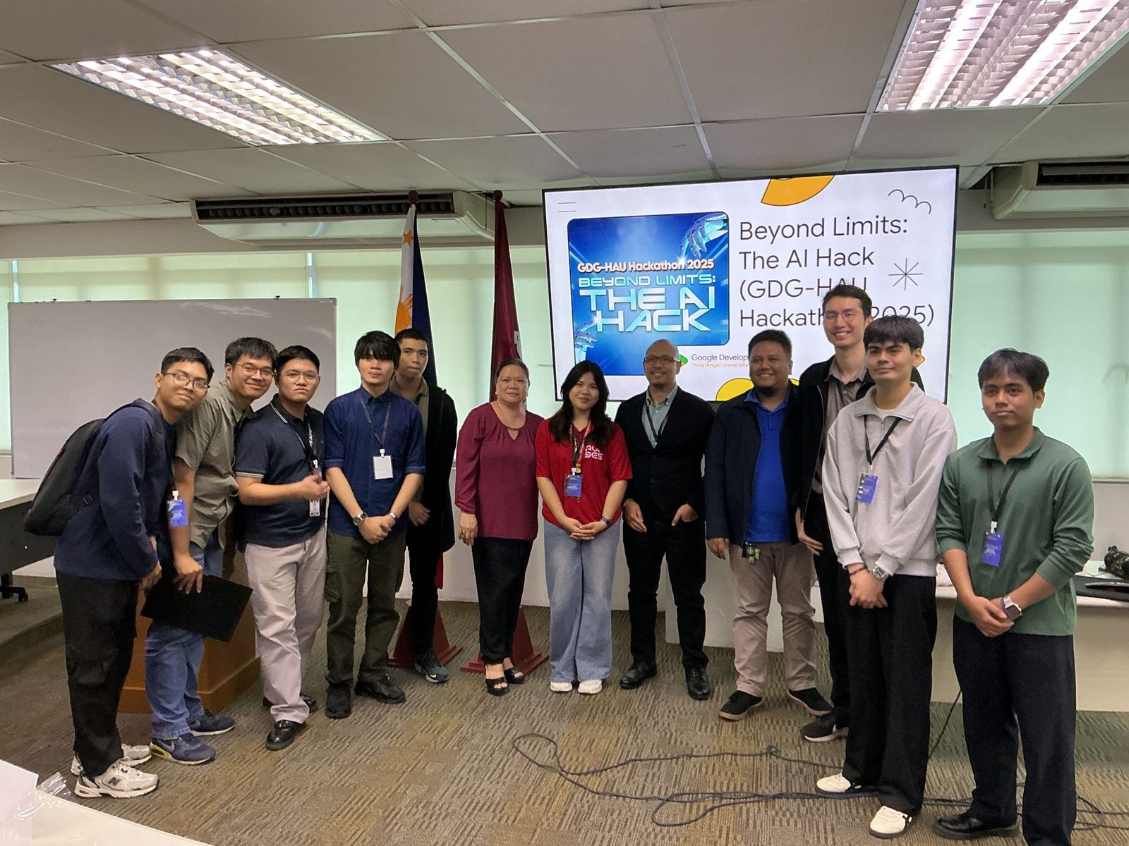
<div class="feed-photos">
  <a class="feed-photo" href="/media/feed/gdg-hau-ai-hack-group.jpg">
    <img loading="lazy" decoding="async" src="/media/feed/gdg-hau-ai-hack-group.jpg" width="1600" height="1200"
         alt="Organizers, judges and teams lined up in front of the hackathon title slide after the demos">
  </a>
</div>
One image in a feed card's photo strip, nested each="photos" inside feed-card (bound to an event's photos: { src, width, height, alt }). Parent-context requirement: a direct child of div.feed-photos.
data-lightbox wires it to GRAIN's image viewer (scripts/lightbox.js): a click opens the full image in a <dialog> and walks every photo in the strip's data-lightbox-group (feed-card.html), the tiles hidden past the five-tile cap included. The href stays the full image, so with no JS (or a modified click) it degrades to a plain navigation — the no-JS-safe fallback. The bound width/height plus the CSS aspect-ratio reserve the box so a lazily-loaded photo can't shift the layout while you scroll.
The .feed-photos strip is shared: the event page renders the same markup from its frontmatter (content.ts renderPhotoGrid, composed in shellChrome for /calendar entries), so a card and its own page read identically. Photos come from a flat "src | 1200x675 | alt" frontmatter string (parsePhotos), because MILL's frontmatter parser is flat; a grain proposal tracks first-class nested frontmatter to retire that encoding.
Alt-text discipline: one real sentence, saying what is actually in the frame. Every photo under media/feed/ is a real photograph now; the placeholder SVGs that used to stand in for them were deleted with the placeholder posts they served.
<div class="feed-photos">
  <a class="feed-photo" href="/media/feed/gdg-hau-ai-hack-group.jpg">
    <img loading="lazy" decoding="async" src="/media/feed/gdg-hau-ai-hack-group.jpg" width="1600" height="1200"
         alt="Organizers, judges and teams lined up in front of the hackathon title slide after the demos">
  </a>
</div>
Molecules
An image with an optional caption. The clipped variant gives the editorial clipped-photo edge (a hard corner clip, no border). MILL maps a standalone Markdown image to this; composed by hand, so nothing data-binds it. Images never overflow the column.
<figure class="figure">
  <img src="/assets/figure-sample.svg" alt="An abstract field of grain strokes">
  <figcaption class="figure__caption">A caption sits under the image, set small.</figcaption>
</figure><figure class="figure" data-variant="clipped">
<img src="/assets/figure-sample.svg" alt="The same image, clipped">
</figure>Holds an inline SVG instead of an image. MILL emits this for a rendered mermaid fence, with the SVG's colors written as token references so the diagram follows both theme axes without being re-rendered. A diagram wider than the column scrolls rather than shrinking to unreadable.
<figure class="figure" data-variant="diagram">
  <svg viewBox="0 0 120 40"><rect x="1" y="1" width="118" height="38"
    fill="var(--color-surface)" stroke="var(--color-line)"></rect></svg>
</figure>
An image with an optional caption. The clipped variant gives the editorial clipped-photo edge (a hard corner clip, no border). MILL maps a standalone Markdown image to this; composed by hand, so nothing data-binds it. Images never overflow the column.
<figure class="figure">
  <img src="/assets/figure-sample.svg" alt="An abstract field of grain strokes">
  <figcaption class="figure__caption">A caption sits under the image, set small.</figcaption>
</figure><figure class="figure" data-variant="clipped">
<img src="/assets/figure-sample.svg" alt="The same image, clipped">
</figure>Holds an inline SVG instead of an image. MILL emits this for a rendered mermaid fence, with the SVG's colors written as token references so the diagram follows both theme axes without being re-rendered. A diagram wider than the column scrolls rather than shrinking to unreadable.
<figure class="figure" data-variant="diagram">
  <svg viewBox="0 0 120 40"><rect x="1" y="1" width="118" height="38"
    fill="var(--color-surface)" stroke="var(--color-line)"></rect></svg>
</figure>
Molecules
A small left-to-right diagram of boxed nodes joined by arrows — a dependency chain or a pipeline. CSS-only layout pattern (no .html): compose the markup inline. Wraps on narrow widths; tokens only. Variants: flow__node--door (heavier border, for the emphasised step), flow__node--code (grain face). A <small> inside a node is muted sub-text.
<div class="flow" aria-hidden="true">
  <div class="flow__node">BATCH<br><small>substrate</small></div>
  <div class="flow__arrow">→</div>
  <div class="flow__node">GRAIN<br><small>design system</small></div>
  <div class="flow__arrow">→</div>
  <div class="flow__node">MILL<br><small>content engine</small></div>
</div>
A small left-to-right diagram of boxed nodes joined by arrows — a dependency chain or a pipeline. CSS-only layout pattern (no .html): compose the markup inline. Wraps on narrow widths; tokens only. Variants: flow__node--door (heavier border, for the emphasised step), flow__node--code (grain face). A <small> inside a node is muted sub-text.
<div class="flow" aria-hidden="true">
  <div class="flow__node">BATCH<br><small>substrate</small></div>
  <div class="flow__arrow">→</div>
  <div class="flow__node">GRAIN<br><small>design system</small></div>
  <div class="flow__arrow">→</div>
  <div class="flow__node">MILL<br><small>content engine</small></div>
</div>
Molecules
The layout the field family never had. A field is told to grow inside a column, which says nothing about how several sit together, so every form so far laid itself out by hand. CSS only, so there is no tag: put the class on whatever holds the controls, hand-authored or generated, and it asks nothing of its own parent.
Columns are found rather than declared by default, flowing into as many tracks as fit down to a minimum width a page can raise. A fixed count is an attribute, and it collapses to one column on a narrow screen. Two rules make one mistake unmakeable: a message box takes the full width without being asked, and fields align to the top so one carrying a hint cannot drag its neighbours down.
One limit. That collapse keys off the viewport rather than the container, so a fixed count inside a narrow panel keeps its columns and the fields get cramped. The found columns have no such problem, because their floor is a width rather than a count. Prefer them wherever the container can be much narrower than the window.
<div class="form-grid">
  <label class="field">
    <span class="field__label">Name</span>
    <input class="field__input" name="name" placeholder="Jane">
  </label>
  <label class="field">
    <span class="field__label">Email</span>
    <input class="field__input" type="email" name="email" placeholder="jane@example.com" required>
  </label>
  <label class="field">
    <span class="field__label">Company</span>
    <input class="field__input" name="company">
    <span class="field__hint">Optional.</span>
  </label>
  <label class="field">
    <span class="field__label">Message</span>
    <textarea class="field__textarea" name="message" rows="3"></textarea>
  </label>
</div><div class="form-grid" data-columns="2">
<label class="field">
<span class="field__label">First name</span>
<input class="field__input" name="first">
</label>
<label class="field">
<span class="field__label">Last name</span>
<input class="field__input" name="last">
</label>
<label class="field" data-span="full">
<span class="field__label">Where should the reply go</span>
<input class="field__input" type="email" name="reply" required>
<span class="field__hint">Spanning the whole row because it was asked to.</span>
</label>
<label class="field">
<input type="checkbox" class="field__box" name="terms" value="yes" required>
<span class="field__label">I agree to be contacted</span>
</label>
</div>The layout the field family never had. A field is told to grow inside a column, which says nothing about how several sit together, so every form so far laid itself out by hand. CSS only, so there is no tag: put the class on whatever holds the controls, hand-authored or generated, and it asks nothing of its own parent.
Columns are found rather than declared by default, flowing into as many tracks as fit down to a minimum width a page can raise. A fixed count is an attribute, and it collapses to one column on a narrow screen. Two rules make one mistake unmakeable: a message box takes the full width without being asked, and fields align to the top so one carrying a hint cannot drag its neighbours down.
One limit. That collapse keys off the viewport rather than the container, so a fixed count inside a narrow panel keeps its columns and the fields get cramped. The found columns have no such problem, because their floor is a width rather than a count. Prefer them wherever the container can be much narrower than the window.
<div class="form-grid">
  <label class="field">
    <span class="field__label">Name</span>
    <input class="field__input" name="name" placeholder="Jane">
  </label>
  <label class="field">
    <span class="field__label">Email</span>
    <input class="field__input" type="email" name="email" placeholder="jane@example.com" required>
  </label>
  <label class="field">
    <span class="field__label">Company</span>
    <input class="field__input" name="company">
    <span class="field__hint">Optional.</span>
  </label>
  <label class="field">
    <span class="field__label">Message</span>
    <textarea class="field__textarea" name="message" rows="3"></textarea>
  </label>
</div><div class="form-grid" data-columns="2">
<label class="field">
<span class="field__label">First name</span>
<input class="field__input" name="first">
</label>
<label class="field">
<span class="field__label">Last name</span>
<input class="field__input" name="last">
</label>
<label class="field" data-span="full">
<span class="field__label">Where should the reply go</span>
<input class="field__input" type="email" name="reply" required>
<span class="field__hint">Spanning the whole row because it was asked to.</span>
</label>
<label class="field">
<input type="checkbox" class="field__box" name="terms" value="yes" required>
<span class="field__label">I agree to be contacted</span>
</label>
</div>Molecules
A captioned image grid: the companion to card-grid, for pictures rather than facts. Every tile is equal weight, cropped to one ratio, caption underneath. Composed by hand, so nothing data-binds it.
It is not a hero strip. A strip runs one photo big to carry a post; a gallery is the roll that hero was picked from, and it belongs where a reader can scan it and move on. Tile width tunes with --gallery-min (default 15rem, the same idiom as --card-min), the crop with --gallery-ratio.
<div class="gallery">
  <figure class="gallery__item">
    <span class="gallery__link"><img src="/assets/figure-sample.svg" alt="An abstract field of grain strokes"></span>
    <figcaption class="gallery__caption">The caption is the alt text: it has to work read aloud and read on the page.</figcaption>
  </figure>
  <figure class="gallery__item">
    <span class="gallery__link"><img src="/assets/figure-sample.svg" alt="The same field, second frame"></span>
    <figcaption class="gallery__caption">One sentence, what is actually in the frame.</figcaption>
  </figure>
</div>Wrap the grid in data-lightbox-group and mark each tile data-lightbox (scripts/lightbox.js). One group per gallery, so prev/next never walks out of it into another strip on the same page. Keep the trigger an <a href> pointing at the full image: with no JS, or a modified click, it degrades to a plain navigation, which is the no-JS-safe fallback.
<div class="gallery" data-lightbox-group>
  <figure class="gallery__item">
    <a class="gallery__link" data-lightbox href="/assets/figure-sample.svg">
      <img src="/assets/figure-sample.svg" alt="An abstract field of grain strokes" loading="lazy" decoding="async">
    </a>
    <figcaption class="gallery__caption">Clicking any tile opens the viewer and walks the whole group.</figcaption>
  </figure>
</div>Alt text is the caption here, so write one that carries both jobs: read aloud, and read on the page under the picture.
<div class="gallery" style="--gallery-min: 20rem; --gallery-ratio: 1 / 1;">
  <figure class="gallery__item">
    <span class="gallery__link"><img src="/assets/figure-sample.svg" alt="A square crop of the same field"></span>
    <figcaption class="gallery__caption">Both knobs are custom properties, set them on the grid.</figcaption>
  </figure>
</div>
A captioned image grid: the companion to card-grid, for pictures rather than facts. Every tile is equal weight, cropped to one ratio, caption underneath. Composed by hand, so nothing data-binds it.
It is not a hero strip. A strip runs one photo big to carry a post; a gallery is the roll that hero was picked from, and it belongs where a reader can scan it and move on. Tile width tunes with --gallery-min (default 15rem, the same idiom as --card-min), the crop with --gallery-ratio.
<div class="gallery">
  <figure class="gallery__item">
    <span class="gallery__link"><img src="/assets/figure-sample.svg" alt="An abstract field of grain strokes"></span>
    <figcaption class="gallery__caption">The caption is the alt text: it has to work read aloud and read on the page.</figcaption>
  </figure>
  <figure class="gallery__item">
    <span class="gallery__link"><img src="/assets/figure-sample.svg" alt="The same field, second frame"></span>
    <figcaption class="gallery__caption">One sentence, what is actually in the frame.</figcaption>
  </figure>
</div>Wrap the grid in data-lightbox-group and mark each tile data-lightbox (scripts/lightbox.js). One group per gallery, so prev/next never walks out of it into another strip on the same page. Keep the trigger an <a href> pointing at the full image: with no JS, or a modified click, it degrades to a plain navigation, which is the no-JS-safe fallback.
<div class="gallery" data-lightbox-group>
  <figure class="gallery__item">
    <a class="gallery__link" data-lightbox href="/assets/figure-sample.svg">
      <img src="/assets/figure-sample.svg" alt="An abstract field of grain strokes" loading="lazy" decoding="async">
    </a>
    <figcaption class="gallery__caption">Clicking any tile opens the viewer and walks the whole group.</figcaption>
  </figure>
</div>Alt text is the caption here, so write one that carries both jobs: read aloud, and read on the page under the picture.
<div class="gallery" style="--gallery-min: 20rem; --gallery-ratio: 1 / 1;">
  <figure class="gallery__item">
    <span class="gallery__link"><img src="/assets/figure-sample.svg" alt="A square crop of the same field"></span>
    <figcaption class="gallery__caption">Both knobs are custom properties, set them on the grid.</figcaption>
  </figure>
</div>
Molecules
The opening paragraph of a page or section — larger, muted, held to a readable measure (56ch). One class, composed by hand under a masthead; emphasis inside it reads as an underline, not italic (state is ink, not hue).
A no-build, server-rendered hypermedia substrate. The browser gets near-zero framework JavaScript; the runtime reads the source directly.
<p class="lede">A <em>no-build, server-rendered</em> hypermedia substrate. The browser gets
near-zero framework JavaScript; the runtime reads the source directly.</p>An in-browser demo is on the way — a tiny model running client-side, no backend, no key.
<p class="lede" data-size="sm">An in-browser demo is on the way — a tiny model running
client-side, no backend, no key.</p>
The opening paragraph of a page or section — larger, muted, held to a readable measure (56ch). One class, composed by hand under a masthead; emphasis inside it reads as an underline, not italic (state is ink, not hue).
A no-build, server-rendered hypermedia substrate. The browser gets near-zero framework JavaScript; the runtime reads the source directly.
<p class="lede">A <em>no-build, server-rendered</em> hypermedia substrate. The browser gets
near-zero framework JavaScript; the runtime reads the source directly.</p>An in-browser demo is on the way — a tiny model running client-side, no backend, no key.
<p class="lede" data-size="sm">An in-browser demo is on the way — a tiny model running
client-side, no backend, no key.</p>
Molecules
The system byline: made with GRAIN by tjakoen. One quiet mono line, mounted at the bottom of every GRAIN app's shell, so provenance reads identically across the fleet. Links: GRAIN → the design-system docs home, tjakoen → the portfolio.
CSS-only (no .html) — but the content is centralized too: server-side template-literal shells import the string helper so the line can never drift per app:
Canonical markup (what the helper emits):
- Block form (default): a centered --text-xs mono line in --color-muted; links keep ink and underline only on hover/focus. Place it last inside <body> (after <main>). - Inline form (data-inline, emitted as a <span>): inherits the row's type treatment — made for the right side of a status-bar, after the __spacer. - No grade texture on the wordmark: grade only reads at ≥ --text-2xl (CLAUDE.md lesson 4), and this line is deliberately small.
Parent contract: none — self-sufficient anywhere. Consumers must ship components/molecules/made-with/made-with.css in their stylesheet set.
<footer class="made-with">
  made with <a href="https://tjakoen.github.io/grain">GRAIN</a>
  by <a href="https://tjakoen.github.io">tjakoen</a>
</footer>
The system byline: made with GRAIN by tjakoen. One quiet mono line, mounted at the bottom of every GRAIN app's shell, so provenance reads identically across the fleet. Links: GRAIN → the design-system docs home, tjakoen → the portfolio.
CSS-only (no .html) — but the content is centralized too: server-side template-literal shells import the string helper so the line can never drift per app:
Canonical markup (what the helper emits):
- Block form (default): a centered --text-xs mono line in --color-muted; links keep ink and underline only on hover/focus. Place it last inside <body> (after <main>). - Inline form (data-inline, emitted as a <span>): inherits the row's type treatment — made for the right side of a status-bar, after the __spacer. - No grade texture on the wordmark: grade only reads at ≥ --text-2xl (CLAUDE.md lesson 4), and this line is deliberately small.
Parent contract: none — self-sufficient anywhere. Consumers must ship components/molecules/made-with/made-with.css in their stylesheet set.
<footer class="made-with">
  made with <a href="https://tjakoen.github.io/grain">GRAIN</a>
  by <a href="https://tjakoen.github.io">tjakoen</a>
</footer>
Molecules
One folder in the /mail rail. Data-bound via each="mailFolders" (built in server.ts from data/mailbox.json): { id, label, count }, where count is computed server-side as the number of messages in that folder, so the badge can never drift from the list it describes.
Parent-context requirement: a direct child of nav.mailbox__folders. The rail box owns the border and background; this molecule is just the row. href="#mailbox-list" is a harmless in-page jump kept for the no-JS path (the list is already on the page). With JS, the mailbox island owns aria-current="page" (it moves to whichever folder you click and filters the list to it); the server renders no current folder, so with no JS every folder's messages stay visible — nothing real is gated.
The count itself can also move: archiving a letter (mail-reader's Archive button) recomputes every folder's .mailbox__folder-count from the live DOM, so Inbox's count drops and Archive's rises the moment a letter changes folder, still never drifting from the list it describes.
Editing data/mailbox.json needs a server restart (the file is read once at boot, same as desk-feed.json and the notes).
<nav class="mailbox__folders" data-mailbox-folders aria-label="Folders">
  <a class="mailbox__folder" href="#mailbox-list" data-folder="inbox">
    <span class="mailbox__folder-label">Inbox</span>
    <span class="mailbox__folder-count">3</span>
  </a>
  <!-- … one per folder … -->
  <a class="btn mailbox__compose" href="#compose" data-open-compose>Compose</a>
</nav>
One folder in the /mail rail. Data-bound via each="mailFolders" (built in server.ts from data/mailbox.json): { id, label, count }, where count is computed server-side as the number of messages in that folder, so the badge can never drift from the list it describes.
Parent-context requirement: a direct child of nav.mailbox__folders. The rail box owns the border and background; this molecule is just the row. href="#mailbox-list" is a harmless in-page jump kept for the no-JS path (the list is already on the page). With JS, the mailbox island owns aria-current="page" (it moves to whichever folder you click and filters the list to it); the server renders no current folder, so with no JS every folder's messages stay visible — nothing real is gated.
The count itself can also move: archiving a letter (mail-reader's Archive button) recomputes every folder's .mailbox__folder-count from the live DOM, so Inbox's count drops and Archive's rises the moment a letter changes folder, still never drifting from the list it describes.
Editing data/mailbox.json needs a server restart (the file is read once at boot, same as desk-feed.json and the notes).
<nav class="mailbox__folders" data-mailbox-folders aria-label="Folders">
  <a class="mailbox__folder" href="#mailbox-list" data-folder="inbox">
    <span class="mailbox__folder-label">Inbox</span>
    <span class="mailbox__folder-count">3</span>
  </a>
  <!-- … one per folder … -->
  <a class="btn mailbox__compose" href="#compose" data-open-compose>Compose</a>
</nav>
Molecules
One open message below the /mail list. Data-bound via each="mailMessages" (built in server.ts from data/mailbox.json). Parent-context requirement: a direct child of .mailbox__readers.
The body is plain text by design: batch's bindings escape HTML, so a message body can't carry inline anchors. It renders in a single block with white-space: pre-line, so the \n\n paragraph breaks in the JSON become the visible spacing. Any link a message wants surfaces in a Related row below the body (mail-related, nested each="links"), which hides itself when a message has no links (.mailbox__reader-links:empty { display: none }).
Reply / Forward stay honest set dressing everywhere: disabled, with a title that says so. Archive is server-rendered disabled too (so a no-JS reader makes no archive claim), but carries data-mail-archive. The mailbox island enables it — removing disabled and swapping the title to say what it now does — on any reader whose data-folder is "inbox"; sent/drafts/archive readers keep it disabled. Clicking it moves that letter to the Archive folder (row and reader data-folder become "archive", sessionStorage remembers it for the rest of the tab, rail counts and the current folder filter re-settle, and the button itself falls back to disabled dressing) — see mail.html's island script for the full move.
With JS, the mailbox island also shows one reader at a time (keyed to the selected row) and marks the row read. With no JS, every reader is visible as a stacked letters page and nothing is gated except Archive, which needs the island to mean anything.
<article class="mailbox__reader" data-message id="msg-welcome" data-folder="inbox">
  <div class="mailbox__reader-head"><h2 class="mailbox__reader-subject">Welcome to the mail panel</h2></div>
  <p class="mailbox__reader-meta">The Desk → You · Jul 14, 2026</p>
  <div class="mailbox__reader-tools"><!-- Reply / Forward disabled; Archive disabled here, live once JS enables it on inbox readers --></div>
  <div class="mailbox__reader-body">This whole panel is dressed up like a real inbox…</div>
  <ul class="mailbox__reader-links"><!-- mail-related per link, or empty (hidden) --></ul>
</article>
One open message below the /mail list. Data-bound via each="mailMessages" (built in server.ts from data/mailbox.json). Parent-context requirement: a direct child of .mailbox__readers.
The body is plain text by design: batch's bindings escape HTML, so a message body can't carry inline anchors. It renders in a single block with white-space: pre-line, so the \n\n paragraph breaks in the JSON become the visible spacing. Any link a message wants surfaces in a Related row below the body (mail-related, nested each="links"), which hides itself when a message has no links (.mailbox__reader-links:empty { display: none }).
Reply / Forward stay honest set dressing everywhere: disabled, with a title that says so. Archive is server-rendered disabled too (so a no-JS reader makes no archive claim), but carries data-mail-archive. The mailbox island enables it — removing disabled and swapping the title to say what it now does — on any reader whose data-folder is "inbox"; sent/drafts/archive readers keep it disabled. Clicking it moves that letter to the Archive folder (row and reader data-folder become "archive", sessionStorage remembers it for the rest of the tab, rail counts and the current folder filter re-settle, and the button itself falls back to disabled dressing) — see mail.html's island script for the full move.
With JS, the mailbox island also shows one reader at a time (keyed to the selected row) and marks the row read. With no JS, every reader is visible as a stacked letters page and nothing is gated except Archive, which needs the island to mean anything.
<article class="mailbox__reader" data-message id="msg-welcome" data-folder="inbox">
  <div class="mailbox__reader-head"><h2 class="mailbox__reader-subject">Welcome to the mail panel</h2></div>
  <p class="mailbox__reader-meta">The Desk → You · Jul 14, 2026</p>
  <div class="mailbox__reader-tools"><!-- Reply / Forward disabled; Archive disabled here, live once JS enables it on inbox readers --></div>
  <div class="mailbox__reader-body">This whole panel is dressed up like a real inbox…</div>
  <ul class="mailbox__reader-links"><!-- mail-related per link, or empty (hidden) --></ul>
</article>
Molecules
One message row in the /mail list. Data-bound via each="mailMessages" (built in server.ts from data/mailbox.json). Every message is set dressing (FROM "The Desk" TO the visitor, hand-authored ahead of time), so a row is a link to its own reader below (href="#msg-<id>"), never a fetch.
Parent-context requirement: a direct child of .mailbox__list (the dense grid + separators are keyed to that container). Columns: status dot, from, subject, when; the snippet spans the width below.
Two client-only touches, both degrading cleanly to nothing:
- Unread dot. .mailbox__item-dot is transparent until the island adds .is-unread. Read state lives only in localStorage (tj.mail.read), so the server renders zero dots and a no-JS page makes no read-tracking claim at all. - Relative date. .mailbox__item-when is server-rendered absolute (Jul 14) with the full date in title and a machine date in data-date; the island rewrites [data-relativize] spans to "N days ago". Undated rows (Sent, Drafts) carry a literal label (Not sent, While you type) and no data-date, so they're left alone.
A third one isn't cosmetic: the row also carries an AI target address, data-surface="item:mail-<id>" (computed server-side alongside href/domId), plus data-kind="item" and data-accepts="item.archive" so it's harvested as operable markup the same way other AI-addressable rows are (AI-INTERFACE §4). Archiving a letter through that surface and through the reader's own Archive button (mail-reader) are the same move: both flip data-folder to "archive" for the rest of the visit.
<a class="mailbox__item" href="#msg-welcome" data-folder="inbox"
   data-kind="item" data-accepts="item.archive" data-surface="item:mail-welcome">
  <span class="mailbox__item-dot" aria-hidden="true"></span>
  <span class="mailbox__item-from">The Desk</span>
  <span class="mailbox__item-subject">Welcome to the mail panel</span>
  <span class="mailbox__item-when" data-relativize data-date="2026-07-14" title="Jul 14, 2026">Jul 14</span>
  <span class="mailbox__item-snippet">What's real here, what isn't…</span>
</a>
One message row in the /mail list. Data-bound via each="mailMessages" (built in server.ts from data/mailbox.json). Every message is set dressing (FROM "The Desk" TO the visitor, hand-authored ahead of time), so a row is a link to its own reader below (href="#msg-<id>"), never a fetch.
Parent-context requirement: a direct child of .mailbox__list (the dense grid + separators are keyed to that container). Columns: status dot, from, subject, when; the snippet spans the width below.
Two client-only touches, both degrading cleanly to nothing:
- Unread dot. .mailbox__item-dot is transparent until the island adds .is-unread. Read state lives only in localStorage (tj.mail.read), so the server renders zero dots and a no-JS page makes no read-tracking claim at all. - Relative date. .mailbox__item-when is server-rendered absolute (Jul 14) with the full date in title and a machine date in data-date; the island rewrites [data-relativize] spans to "N days ago". Undated rows (Sent, Drafts) carry a literal label (Not sent, While you type) and no data-date, so they're left alone.
A third one isn't cosmetic: the row also carries an AI target address, data-surface="item:mail-<id>" (computed server-side alongside href/domId), plus data-kind="item" and data-accepts="item.archive" so it's harvested as operable markup the same way other AI-addressable rows are (AI-INTERFACE §4). Archiving a letter through that surface and through the reader's own Archive button (mail-reader) are the same move: both flip data-folder to "archive" for the rest of the visit.
<a class="mailbox__item" href="#msg-welcome" data-folder="inbox"
   data-kind="item" data-accepts="item.archive" data-surface="item:mail-welcome">
  <span class="mailbox__item-dot" aria-hidden="true"></span>
  <span class="mailbox__item-from">The Desk</span>
  <span class="mailbox__item-subject">Welcome to the mail panel</span>
  <span class="mailbox__item-when" data-relativize data-date="2026-07-14" title="Jul 14, 2026">Jul 14</span>
  <span class="mailbox__item-snippet">What's real here, what isn't…</span>
</a>
Molecules
A card that leads with a picture: one image, a title, an optional description, an optional row of buttons. It borrows card's vocabulary rather than inventing a second one, so the box is a hairline with no fill, data-pad tunes the padding, and the whole tile is the link when the root is an <a>. Composed by hand, so nothing data-binds it. The crop tunes with --media-ratio (default 16 / 9, the same idiom as --gallery-ratio).
It embeds nothing. The reason lives in the second example below, but it applies to the whole component: there is no iframe, no third-party script and no JS of any kind in it, which makes the no-JS case the only case there is.
The plain case. The root is the anchor, so the picture is the tap target, and the description collapses to nothing when you leave it out.
<a class="media-card" href="#media-card">
  <span class="media-card__media">
    <img class="media-card__image" src="/assets/figure-sample.svg"
         alt="An abstract field of grain strokes" loading="lazy" decoding="async">
  </span>
  <span class="media-card__body">
    <span class="media-card__title">The field, in one frame</span>
    <span class="media-card__text">One sentence about where this goes, written like a link and not
      like a button.</span>
  </span>
</a>data-layout="overlay" moves the text onto the bottom of the picture, on a scrim, and the play badge sits centred over it. The badge is decorative, so it is aria-hidden and the title is what a screen reader is given.
This is the shape to reach for when a video lives on somebody else's platform. Embedding it would put a third-party iframe and its scripts on the page to play something that lives over there regardless: the visitor lands on that platform the moment they press play either way. So the tile is one anchor over a still you host yourself, and the title says where the tap goes and whose platform it lands on, because the picture cannot.
Both scrim colors hold their value in light and dark. A scrim darkens somebody else's photograph so a label survives on top of it, and a photograph does not invert with the palette.
<a class="media-card" data-layout="overlay" href="https://example.com/reel/1" rel="noopener">
  <span class="media-card__media">
    <img class="media-card__image" src="/assets/figure-sample.svg" width="1600" height="900"
         alt="A still from the recap, the room mid-session" loading="lazy" decoding="async">
    <span class="media-card__play" aria-hidden="true">▶</span>
  </span>
  <span class="media-card__body">
    <span class="media-card__title">Watch the recap on the platform it lives on</span>
  </span>
</a>When there are buttons, the root is a <div>, never an <a>. A link inside a link is invalid markup and browsers recover from it in their own ways, so the two are mutually exclusive: either the whole tile navigates, or the buttons do.
The description is optional and so is this row. Both collapse to nothing when they are absent.
<div class="media-card" data-pad="sm">
  <span class="media-card__media">
    <img class="media-card__image" src="/assets/figure-sample.svg" style="--media-ratio: 3 / 2;"
         alt="The same field, second frame" loading="lazy" decoding="async">
  </span>
  <div class="media-card__body">
    <h3 class="media-card__title">Two ways out of one tile</h3>
    <p class="media-card__text">The description is optional and so is this row. Both collapse to
      nothing when they are absent.</p>
    <div class="media-card__actions">
      <a class="btn" data-size="sm" href="#media-card">Read the write-up</a>
      <a class="btn" data-size="sm" data-variant="soft" href="#media-card">See the photos</a>
    </div>
  </div>
</div>data-layout carries the layout, because the two shapes share every rule they have apart from where the text sits: the box, the crop, the hover, the badge and the pending edge. Two components would fork all five of those to move one block of text.
| Value | What it does | | --- | --- | | (omitted) | Stacked. The text sits under the picture. | | overlay | The text sits over the bottom of the picture, on a scrim. |
A beside-the-picture layout is the same decision one more time, and it is deliberately not shipped until something asks for it. When something does, it is one more value in that table rather than a new molecule.
A card that leads with a picture: one image, a title, an optional description, an optional row of buttons. It borrows card's vocabulary rather than inventing a second one, so the box is a hairline with no fill, data-pad tunes the padding, and the whole tile is the link when the root is an <a>. Composed by hand, so nothing data-binds it. The crop tunes with --media-ratio (default 16 / 9, the same idiom as --gallery-ratio).
It embeds nothing. The reason lives in the second example below, but it applies to the whole component: there is no iframe, no third-party script and no JS of any kind in it, which makes the no-JS case the only case there is.
The plain case. The root is the anchor, so the picture is the tap target, and the description collapses to nothing when you leave it out.
<a class="media-card" href="#media-card">
  <span class="media-card__media">
    <img class="media-card__image" src="/assets/figure-sample.svg"
         alt="An abstract field of grain strokes" loading="lazy" decoding="async">
  </span>
  <span class="media-card__body">
    <span class="media-card__title">The field, in one frame</span>
    <span class="media-card__text">One sentence about where this goes, written like a link and not
      like a button.</span>
  </span>
</a>data-layout="overlay" moves the text onto the bottom of the picture, on a scrim, and the play badge sits centred over it. The badge is decorative, so it is aria-hidden and the title is what a screen reader is given.
This is the shape to reach for when a video lives on somebody else's platform. Embedding it would put a third-party iframe and its scripts on the page to play something that lives over there regardless: the visitor lands on that platform the moment they press play either way. So the tile is one anchor over a still you host yourself, and the title says where the tap goes and whose platform it lands on, because the picture cannot.
Both scrim colors hold their value in light and dark. A scrim darkens somebody else's photograph so a label survives on top of it, and a photograph does not invert with the palette.
<a class="media-card" data-layout="overlay" href="https://example.com/reel/1" rel="noopener">
  <span class="media-card__media">
    <img class="media-card__image" src="/assets/figure-sample.svg" width="1600" height="900"
         alt="A still from the recap, the room mid-session" loading="lazy" decoding="async">
    <span class="media-card__play" aria-hidden="true">▶</span>
  </span>
  <span class="media-card__body">
    <span class="media-card__title">Watch the recap on the platform it lives on</span>
  </span>
</a>When there are buttons, the root is a <div>, never an <a>. A link inside a link is invalid markup and browsers recover from it in their own ways, so the two are mutually exclusive: either the whole tile navigates, or the buttons do.
The description is optional and so is this row. Both collapse to nothing when they are absent.
<div class="media-card" data-pad="sm">
  <span class="media-card__media">
    <img class="media-card__image" src="/assets/figure-sample.svg" style="--media-ratio: 3 / 2;"
         alt="The same field, second frame" loading="lazy" decoding="async">
  </span>
  <div class="media-card__body">
    <h3 class="media-card__title">Two ways out of one tile</h3>
    <p class="media-card__text">The description is optional and so is this row. Both collapse to
      nothing when they are absent.</p>
    <div class="media-card__actions">
      <a class="btn" data-size="sm" href="#media-card">Read the write-up</a>
      <a class="btn" data-size="sm" data-variant="soft" href="#media-card">See the photos</a>
    </div>
  </div>
</div>data-layout carries the layout, because the two shapes share every rule they have apart from where the text sits: the box, the crop, the hover, the badge and the pending edge. Two components would fork all five of those to move one block of text.
| Value | What it does | | --- | --- | | (omitted) | Stacked. The text sits under the picture. | | overlay | The text sits over the bottom of the picture, on a scrim. |
A beside-the-picture layout is the same decision one more time, and it is deliberately not shipped until something asks for it. When something does, it is one more value in that table rather than a new molecule.
Molecules
The /notes feed's card: a Reddit-ish read of the notes collection (vote glyph, title, summary, tags, a "sections" link standing in for a comment count). CSS-only (grain lesson 3: a CSS-only component must state its parent-context requirement here) — there is no note-card.html because the markup is server-composed directly in content.ts's renderNotesFeedPage, not a batch template. note-card.css is auto-bundled through config.styleRoots (this repo's components/ root) with no manual registration; nothing data-binds it.
Parent-context requirement: every .note-card must be a direct child of a <ul class="note-feed"> (the vote-glyph gutter + separators are keyed to that flex-list layout, and the feed's inline island reorders/hides .note-feed > .note-card nodes by that exact shape). The vote-glyph number is real reading minutes, parsed server-side from the note's own readingTime frontmatter — it is never a vote count, and the element's own title="" attribute says so for anyone hovering it.
data-surface="note:<slug>" addresses the card for the grain reasoner's "See what's new" run (the /notes page keeps that trigger, same door as /grain's demo). data-date/data-score/ data-tags are read by the feed's own inline island (New/Top sort, tag filter) — a plain DOM reorder/hide over the cards already on the page, no fetch involved. With no JS the list stays in its server-rendered newest-first order and the sort/filter controls (.feed-controls) stay hidden.
The island also honors a ?tag= deep link (comma list ok): on boot it checks every matching chip and filters, and it mirrors the live selection back into the URL (history.replaceState, so a filtered view is shareable — the target of résumé role links). A requested tag that no note carries has no chip, so it filters nothing and instead reveals <p class="feed-empty" data-feed-empty> naming the tag ("No notes tagged … yet."). With no JS the query is ignored: the full list renders and both .feed-controls and .feed-empty stay hidden.
How trying to organize my own life turned into a no-build stack…
<ul class="note-feed">
<li class="note-card" data-surface="note:origin-story" data-date="2026-07-02" data-score="9" data-tags="origin-story batch grain">
<div class="note-card__vote" aria-hidden="true" title="Reading minutes, from the note's own frontmatter. Not votes.">
▲<span class="note-card__score">9</span>
</div>
<div class="note-card__main">
<p class="note-card__byline">Tjakoen Stolk · the desk · <time datetime="2026-07-02">2026-07-02</time></p>
<h2 class="note-card__title"><a href="/notes/origin-story">I Built a Whole Stack Because No To-Do App Would Have Me</a></h2>
<p class="note-card__summary">How trying to organize my own life turned into a no-build stack…</p>
<p class="note-card__foot">
<span class="note__tags"><span class="badge" data-status="active">origin-story</span></span>
<a class="note-card__sections" href="/notes/origin-story">4 sections</a>
</p>
</div>
</li>
</ul>The /notes feed's card: a Reddit-ish read of the notes collection (vote glyph, title, summary, tags, a "sections" link standing in for a comment count). CSS-only (grain lesson 3: a CSS-only component must state its parent-context requirement here) — there is no note-card.html because the markup is server-composed directly in content.ts's renderNotesFeedPage, not a batch template. note-card.css is auto-bundled through config.styleRoots (this repo's components/ root) with no manual registration; nothing data-binds it.
Parent-context requirement: every .note-card must be a direct child of a <ul class="note-feed"> (the vote-glyph gutter + separators are keyed to that flex-list layout, and the feed's inline island reorders/hides .note-feed > .note-card nodes by that exact shape). The vote-glyph number is real reading minutes, parsed server-side from the note's own readingTime frontmatter — it is never a vote count, and the element's own title="" attribute says so for anyone hovering it.
data-surface="note:<slug>" addresses the card for the grain reasoner's "See what's new" run (the /notes page keeps that trigger, same door as /grain's demo). data-date/data-score/ data-tags are read by the feed's own inline island (New/Top sort, tag filter) — a plain DOM reorder/hide over the cards already on the page, no fetch involved. With no JS the list stays in its server-rendered newest-first order and the sort/filter controls (.feed-controls) stay hidden.
The island also honors a ?tag= deep link (comma list ok): on boot it checks every matching chip and filters, and it mirrors the live selection back into the URL (history.replaceState, so a filtered view is shareable — the target of résumé role links). A requested tag that no note carries has no chip, so it filters nothing and instead reveals <p class="feed-empty" data-feed-empty> naming the tag ("No notes tagged … yet."). With no JS the query is ignored: the full list renders and both .feed-controls and .feed-empty stay hidden.
How trying to organize my own life turned into a no-build stack…
<ul class="note-feed">
<li class="note-card" data-surface="note:origin-story" data-date="2026-07-02" data-score="9" data-tags="origin-story batch grain">
<div class="note-card__vote" aria-hidden="true" title="Reading minutes, from the note's own frontmatter. Not votes.">
▲<span class="note-card__score">9</span>
</div>
<div class="note-card__main">
<p class="note-card__byline">Tjakoen Stolk · the desk · <time datetime="2026-07-02">2026-07-02</time></p>
<h2 class="note-card__title"><a href="/notes/origin-story">I Built a Whole Stack Because No To-Do App Would Have Me</a></h2>
<p class="note-card__summary">How trying to organize my own life turned into a no-build stack…</p>
<p class="note-card__foot">
<span class="note__tags"><span class="badge" data-status="active">origin-story</span></span>
<a class="note-card__sections" href="/notes/origin-story">4 sections</a>
</p>
</div>
</li>
</ul>Molecules
The summary and section list under a long note's masthead, plus the reading-progress rule that sticks to the top of the reading pane.
Emitted by src/content.ts (renderNoteContents) for every /notes entry, spliced into the rendered body after the note head. Not authored in Markdown, so no note can forget to have one.
The two halves are decided separately. The summary renders whenever the frontmatter has one, which is all twelve notes. The jump links render at two or more sections, because a contents list of one item is not a list. It shipped behind an eight-section threshold and the owner removed it the same day, correctly: the summary is the valuable half and it has nothing to do with length.
position: sticky is bounded by the parent's box. Nested inside the short .note-contents aside, the progress rule would unstick about a screen later and read as broken. As a sibling its parent is the full-height board, so it holds for the whole article.
With no JavaScript the --read custom property never resolves, the fill has zero width, and what is left is a hairline under the masthead. The <details> still opens, because that is the element doing the work rather than a script. Print and the static export get the summary and the full list.
The current section is marked with aria-current="true" and reads darker with a small label. No colour carries meaning here, same rule as the figures.
The summary and section list under a long note's masthead, plus the reading-progress rule that sticks to the top of the reading pane.
Emitted by src/content.ts (renderNoteContents) for every /notes entry, spliced into the rendered body after the note head. Not authored in Markdown, so no note can forget to have one.
The two halves are decided separately. The summary renders whenever the frontmatter has one, which is all twelve notes. The jump links render at two or more sections, because a contents list of one item is not a list. It shipped behind an eight-section threshold and the owner removed it the same day, correctly: the summary is the valuable half and it has nothing to do with length.
position: sticky is bounded by the parent's box. Nested inside the short .note-contents aside, the progress rule would unstick about a screen later and read as broken. As a sibling its parent is the full-height board, so it holds for the whole article.
With no JavaScript the --read custom property never resolves, the fill has zero width, and what is left is a hairline under the masthead. The <details> still opens, because that is the element doing the work rather than a script. Print and the static export get the summary and the full list.
The current section is marked with aria-current="true" and reads darker with a small label. No colour carries meaning here, same rule as the figures.
Molecules
The byline footer that closes every landing page — a ruled, muted sign-off with the "built with" line. Links keep full ink so they read against the muted prose.
🤖 Built with Claude. I don't prompt and pray, I prompt and prove.
<div class="page-foot">
Part of <a href="/">tjakoen.github.io</a>, built with itself.
<p>🤖 Built with Claude. I don't prompt and pray, I prompt and prove.</p>
</div>The byline footer that closes every landing page — a ruled, muted sign-off with the "built with" line. Links keep full ink so they read against the muted prose.
🤖 Built with Claude. I don't prompt and pray, I prompt and prove.
<div class="page-foot">
Part of <a href="/">tjakoen.github.io</a>, built with itself.
<p>🤖 Built with Claude. I don't prompt and pray, I prompt and prove.</p>
</div>Molecules
A person header: an avatar tile, an id block (eyebrow · masthead name · role · mono tagline), and an actions group. Shared by /about and /resume. CSS-only (no .html) — author the markup per page:
No parent-context requirement: it lays out standalone inside .board. Tokens only, so it re-skins with the theme. The name uses grain's masthead type; actions use grain's btn.
About
Role line.
Tagline.
<header class="profile-card">
<div class="profile-card__avatar" aria-hidden="true">🧑💻</div>
<div class="profile-card__id">
<p class="eyebrow">About</p>
<h1 class="masthead profile-card__name">Name</h1>
<p class="profile-card__role">Role line.</p>
<p class="profile-card__tagline">Tagline.</p>
</div>
<div class="profile-card__actions"><a class="btn" href="…">Action</a></div>
</header>A person header: an avatar tile, an id block (eyebrow · masthead name · role · mono tagline), and an actions group. Shared by /about and /resume. CSS-only (no .html) — author the markup per page:
No parent-context requirement: it lays out standalone inside .board. Tokens only, so it re-skins with the theme. The name uses grain's masthead type; actions use grain's btn.
About
Role line.
Tagline.
<header class="profile-card">
<div class="profile-card__avatar" aria-hidden="true">🧑💻</div>
<div class="profile-card__id">
<p class="eyebrow">About</p>
<h1 class="masthead profile-card__name">Name</h1>
<p class="profile-card__role">Role line.</p>
<p class="profile-card__tagline">Tagline.</p>
</div>
<div class="profile-card__actions"><a class="btn" href="…">Action</a></div>
</header>Molecules
A verdict over its evidence: whether a set of boundary conditions holds, one line saying why, and what is still in the way. The generic shape behind "ready to deploy", "ready to release", "ready to hand off" — a run that has finished checking and now has to tell someone.
It is a readout, not an ask. It reports and stops. A closed-set question with options and an escape hatch belongs on CRUMB's decision ask; two surfaces putting the same question to the same person is a failure mode rather than thoroughness.
Composition note: no parent context is required — it fills its container and carries no width of its own, so it sits inside a card or bare in a panel. The evidence rows are a status-list, not markup this component invents: the marks, the in-flight lifecycle and the per-row data-surface hook already live there. Counts alongside the verdict are stat tiles, laid out by the parent.
State is an attribute (data-state), and reads as ink level and edge weight, never hue.
<div class="readiness" data-state="ready">
<span class="readiness__verdict">Ready to hand off</span>
<span class="readiness__why">Gates green, plan synced, nothing in flight.</span>
<ul class="status-list">
<li class="status-list__item">
<span class="status-list__mark">✓</span>
<span class="status-list__title">gates green</span>
<span class="status-list__meta">check · test</span>
</li>
<li class="status-list__item">
<span class="status-list__mark">✓</span>
<span class="status-list__title">plan synced</span>
<span class="status-list__meta">PLAN.md</span>
</li>
</ul>
</div>The one state meant to stop you, so it takes a solid-ink edge. What blocks goes in the rows; the verdict says only that something does.
<div class="readiness" data-state="blocked">
<span class="readiness__verdict">Not yet</span>
<span class="readiness__why">Two conditions still hold it open.</span>
<ul class="status-list">
<li class="status-list__item">
<span class="status-list__mark">✕</span>
<span class="status-list__title">tests failing</span>
<span class="status-list__meta">3 of 663</span>
</li>
<li class="status-list__item" data-state="waiting">
<span class="status-list__mark">·</span>
<span class="status-list__title">plan not synced</span>
<span class="status-list__meta">PLAN.md</span>
</li>
</ul>
</div>Nothing has been checked yet, so the verdict recedes rather than claiming a result.
<div class="readiness" data-state="waiting">
<span class="readiness__verdict">Not checked</span>
<span class="readiness__why">No gate has run this session.</span>
</div>Tiles are laid out by the parent, never by a wrapper inside the component.
<div class="readiness" data-state="blocked">
<span class="readiness__verdict">Not yet</span>
<span class="readiness__why">Work is uncommitted.</span>
<div style="display:flex;gap:var(--space-3)">
<div class="stat" data-tone="bad"><span class="stat__value">12</span><span class="stat__label">uncommitted</span></div>
<div class="stat" data-tone="muted"><span class="stat__value">1</span><span class="stat__label">unpushed</span></div>
</div>
</div>The shared in-flight idiom, not a bespoke loading state. The verdict sits at display scale precisely so that an AI-composed line reads as grain rather than claiming to be checked fact.
<div class="readiness" data-commit="pending">
<span class="readiness__verdict" data-grade="grain">Checking…</span>
<span class="readiness__why">Reading the gate log.</span>
</div>A verdict over its evidence: whether a set of boundary conditions holds, one line saying why, and what is still in the way. The generic shape behind "ready to deploy", "ready to release", "ready to hand off" — a run that has finished checking and now has to tell someone.
It is a readout, not an ask. It reports and stops. A closed-set question with options and an escape hatch belongs on CRUMB's decision ask; two surfaces putting the same question to the same person is a failure mode rather than thoroughness.
Composition note: no parent context is required — it fills its container and carries no width of its own, so it sits inside a card or bare in a panel. The evidence rows are a status-list, not markup this component invents: the marks, the in-flight lifecycle and the per-row data-surface hook already live there. Counts alongside the verdict are stat tiles, laid out by the parent.
State is an attribute (data-state), and reads as ink level and edge weight, never hue.
<div class="readiness" data-state="ready">
<span class="readiness__verdict">Ready to hand off</span>
<span class="readiness__why">Gates green, plan synced, nothing in flight.</span>
<ul class="status-list">
<li class="status-list__item">
<span class="status-list__mark">✓</span>
<span class="status-list__title">gates green</span>
<span class="status-list__meta">check · test</span>
</li>
<li class="status-list__item">
<span class="status-list__mark">✓</span>
<span class="status-list__title">plan synced</span>
<span class="status-list__meta">PLAN.md</span>
</li>
</ul>
</div>The one state meant to stop you, so it takes a solid-ink edge. What blocks goes in the rows; the verdict says only that something does.
<div class="readiness" data-state="blocked">
<span class="readiness__verdict">Not yet</span>
<span class="readiness__why">Two conditions still hold it open.</span>
<ul class="status-list">
<li class="status-list__item">
<span class="status-list__mark">✕</span>
<span class="status-list__title">tests failing</span>
<span class="status-list__meta">3 of 663</span>
</li>
<li class="status-list__item" data-state="waiting">
<span class="status-list__mark">·</span>
<span class="status-list__title">plan not synced</span>
<span class="status-list__meta">PLAN.md</span>
</li>
</ul>
</div>Nothing has been checked yet, so the verdict recedes rather than claiming a result.
<div class="readiness" data-state="waiting">
<span class="readiness__verdict">Not checked</span>
<span class="readiness__why">No gate has run this session.</span>
</div>Tiles are laid out by the parent, never by a wrapper inside the component.
<div class="readiness" data-state="blocked">
<span class="readiness__verdict">Not yet</span>
<span class="readiness__why">Work is uncommitted.</span>
<div style="display:flex;gap:var(--space-3)">
<div class="stat" data-tone="bad"><span class="stat__value">12</span><span class="stat__label">uncommitted</span></div>
<div class="stat" data-tone="muted"><span class="stat__value">1</span><span class="stat__label">unpushed</span></div>
</div>
</div>The shared in-flight idiom, not a bespoke loading state. The verdict sits at display scale precisely so that an AI-composed line reads as grain rather than claiming to be checked fact.
<div class="readiness" data-commit="pending">
<span class="readiness__verdict" data-grade="grain">Checking…</span>
<span class="readiness__why">Reading the gate log.</span>
</div>Molecules
A framed screenshot of a real running interface, with a caption underneath. Used on project pages where the argument is "here is the thing actually working", so the capture has to stay unretouched.
Distinct from the figures in FIGURES: those are tokenized inline SVG and must survive the static export with no external assets. A shot is a raster capture of a live app, served from /media.
Always set loading="lazy" plus width and height on the image, so the page reserves the space and a screenshot never blocks first paint.
Add data-lightbox to the image when the capture carries UI text a reader has to be able to read. GRAIN's viewer (scripts/lightbox.js) then opens it full size on a click, and the alt text becomes the viewer's caption. A note's content column is narrower than a project page's, so a dense console screenshot needs it there and a single wide dashboard usually does not.
There is no side-by-side variant on purpose. The board's content column is around 688px, so a two-up grid renders each capture near 340px wide, and the UI text a screenshot exists to show stops being readable at that size. Stack them full width and let the captions do the pairing.
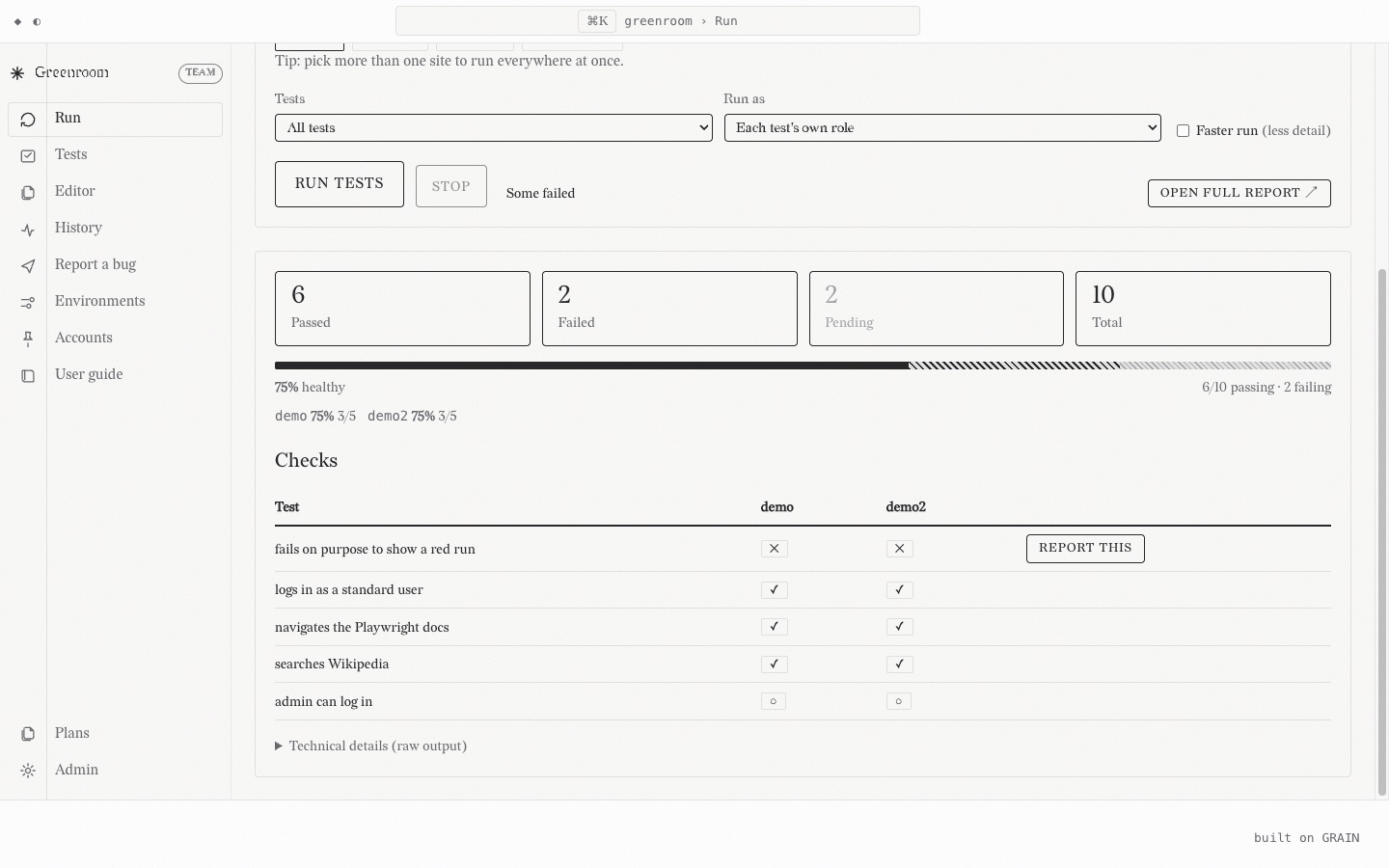
<figure class="shot">
<img class="shot__img" src="/media/greenroom/run-matrix.jpg" width="1440" height="900"
loading="lazy" alt="A run dashboard showing six passed and two failed checks across two environments.">
<figcaption class="shot__cap">One run, two environments, per-environment health.</figcaption>
</figure>A framed screenshot of a real running interface, with a caption underneath. Used on project pages where the argument is "here is the thing actually working", so the capture has to stay unretouched.
Distinct from the figures in FIGURES: those are tokenized inline SVG and must survive the static export with no external assets. A shot is a raster capture of a live app, served from /media.
Always set loading="lazy" plus width and height on the image, so the page reserves the space and a screenshot never blocks first paint.
Add data-lightbox to the image when the capture carries UI text a reader has to be able to read. GRAIN's viewer (scripts/lightbox.js) then opens it full size on a click, and the alt text becomes the viewer's caption. A note's content column is narrower than a project page's, so a dense console screenshot needs it there and a single wide dashboard usually does not.
There is no side-by-side variant on purpose. The board's content column is around 688px, so a two-up grid renders each capture near 340px wide, and the UI text a screenshot exists to show stops being readable at that size. Stack them full width and let the captions do the pairing.
<figure class="shot">
<img class="shot__img" src="/media/greenroom/run-matrix.jpg" width="1440" height="900"
loading="lazy" alt="A run dashboard showing six passed and two failed checks across two environments.">
<figcaption class="shot__cap">One run, two environments, per-environment health.</figcaption>
</figure>Molecules
The shared "four layers, one direction" figure that opens every BREAD layer page. One authored SVG, used once per page with a current prop; the matching layer is highlighted so a reader lands already knowing where they are in the stack. Built to the FIGURES geometry (the 0 0 620 H canvas, width="100%", role="img" + a spoken aria-label, serif, the 15/14/12.5 type scale) but deliberately re-colored from the live theme tokens instead of the fixed FIGURES palette, so it flips with the site theme (sourdough / baguette / brioche, light ↔ dark). No chromatic accent; the only emphasis is ink-fill vs outline. No client JS.
Bottom → top: BATCH (the base) · GRAIN · MILL · then PROOF and CRUMB sharing the top row, side by side — CRUMB builds on GRAIN and MILL exactly as PROOF does, so it shares PROOF's altitude rather than stacking a fifth, taller row. "One direction" means each rests on the ones below (the upward cue on the left). PANTRY is not a layer: it is the enclosing frame, the app that composes the four (BATCH, GRAIN, MILL, PROOF).
Pass the member whose page this is. It is stamped onto the root as data-current (via prop-attr-data-current, the same interpolation b-icon uses for data-size); the CSS keys the ink-fill off [data-current] × the per-layer data-layer. Values: batch · grain · mill · proof · crumb · pantry. Omit it for the /bread overview — nothing is singled out (the whole stack reads evenly, PANTRY frame present).
> Do not try to drive the highlight from data-section: that attribute is not unique across > the layer pages (bread/batch/mill/proof/pantry all resolve to "bread"; only grain differs). > The current member must be passed explicitly here.
<stack-diagram current="grain"></stack-diagram> <!-- GRAIN ink-filled, the rest outlined -->
<stack-diagram current="pantry"></stack-diagram> <!-- the PANTRY frame emphasized -->
<stack-diagram></stack-diagram> <!-- /bread overview: nothing singled out -->The first visual in the page header: the small eyebrow ("you are here") stays above it, then the diagram, then the h1 masthead, then the rule + lede. The canvas is kept compact (H 240) so it leads without pushing the headline below the fold.
- data-layer values on the five <g> layer groups (batch/grain/mill/proof/crumb) and on the PANTRY frame group are what the CSS targets — keep them in sync with the current values. - The aria-label states the whole stack in words (a screen reader reads that, not the shapes); the current member is announced textually by the page's adjacent eyebrow.
The shared "four layers, one direction" figure that opens every BREAD layer page. One authored SVG, used once per page with a current prop; the matching layer is highlighted so a reader lands already knowing where they are in the stack. Built to the FIGURES geometry (the 0 0 620 H canvas, width="100%", role="img" + a spoken aria-label, serif, the 15/14/12.5 type scale) but deliberately re-colored from the live theme tokens instead of the fixed FIGURES palette, so it flips with the site theme (sourdough / baguette / brioche, light ↔ dark). No chromatic accent; the only emphasis is ink-fill vs outline. No client JS.
Bottom → top: BATCH (the base) · GRAIN · MILL · then PROOF and CRUMB sharing the top row, side by side — CRUMB builds on GRAIN and MILL exactly as PROOF does, so it shares PROOF's altitude rather than stacking a fifth, taller row. "One direction" means each rests on the ones below (the upward cue on the left). PANTRY is not a layer: it is the enclosing frame, the app that composes the four (BATCH, GRAIN, MILL, PROOF).
Pass the member whose page this is. It is stamped onto the root as data-current (via prop-attr-data-current, the same interpolation b-icon uses for data-size); the CSS keys the ink-fill off [data-current] × the per-layer data-layer. Values: batch · grain · mill · proof · crumb · pantry. Omit it for the /bread overview — nothing is singled out (the whole stack reads evenly, PANTRY frame present).
> Do not try to drive the highlight from data-section: that attribute is not unique across > the layer pages (bread/batch/mill/proof/pantry all resolve to "bread"; only grain differs). > The current member must be passed explicitly here.
<stack-diagram current="grain"></stack-diagram> <!-- GRAIN ink-filled, the rest outlined -->
<stack-diagram current="pantry"></stack-diagram> <!-- the PANTRY frame emphasized -->
<stack-diagram></stack-diagram> <!-- /bread overview: nothing singled out -->The first visual in the page header: the small eyebrow ("you are here") stays above it, then the diagram, then the h1 masthead, then the rule + lede. The canvas is kept compact (H 240) so it leads without pushing the headline below the fold.
- data-layer values on the five <g> layer groups (batch/grain/mill/proof/crumb) and on the PANTRY frame group are what the CSS targets — keep them in sync with the current values. - The aria-label states the whole stack in words (a screen reader reads that, not the shapes); the current member is announced textually by the page's adjacent eyebrow.
Molecules
A KPI tile — one big number, a small label, an optional sub-line. The standard dashboard primitive (a stats strip, a run summary, a cockpit home). Monochrome: tone is ink-level + border weight, never hue.
Composition note: tiles are laid out by their parent, not by a wrapper component — drop them in a plain flex or grid row (display: flex; gap: var(--space-3), or a grid-template-columns: repeat(auto-fit, minmax(…, 1fr))). Keep the .stat itself layout-free so it fits any strip.
The value sits at display scale so, when an AI writes it, the grain texture reads — put data-grade="grain" on the .stat__value while the AI is composing it; a tile whose number is mid-update wears data-commit="pending" (the shared in-transit idiom), not a bespoke "loading" state.
<div class="stat">
<span class="stat__value">128</span>
<span class="stat__label">total</span>
</div><div class="stat">
<span class="stat__value">128</span>
<span class="stat__label">total</span>
<span class="stat__sub">across 4 environments</span>
</div>data-tone shifts ink-level, not hue. bad draws the eye with a solid-ink border; muted is a secondary/context count that recedes to faint; ok and the default read identically on purpose (a healthy count needs no shouting).
<div class="stat" data-tone="ok"><span class="stat__value">14</span><span class="stat__label">passed</span></div>
<div class="stat" data-tone="bad"><span class="stat__value">2</span><span class="stat__label">failed</span></div>
<div class="stat" data-tone="muted"><span class="stat__value">3</span><span class="stat__label">skipped</span></div><div class="stat" data-commit="pending">
<span class="stat__value" data-grade="grain">…</span>
<span class="stat__label">passed</span>
</div>A KPI tile — one big number, a small label, an optional sub-line. The standard dashboard primitive (a stats strip, a run summary, a cockpit home). Monochrome: tone is ink-level + border weight, never hue.
Composition note: tiles are laid out by their parent, not by a wrapper component — drop them in a plain flex or grid row (display: flex; gap: var(--space-3), or a grid-template-columns: repeat(auto-fit, minmax(…, 1fr))). Keep the .stat itself layout-free so it fits any strip.
The value sits at display scale so, when an AI writes it, the grain texture reads — put data-grade="grain" on the .stat__value while the AI is composing it; a tile whose number is mid-update wears data-commit="pending" (the shared in-transit idiom), not a bespoke "loading" state.
<div class="stat">
<span class="stat__value">128</span>
<span class="stat__label">total</span>
</div><div class="stat">
<span class="stat__value">128</span>
<span class="stat__label">total</span>
<span class="stat__sub">across 4 environments</span>
</div>data-tone shifts ink-level, not hue. bad draws the eye with a solid-ink border; muted is a secondary/context count that recedes to faint; ok and the default read identically on purpose (a healthy count needs no shouting).
<div class="stat" data-tone="ok"><span class="stat__value">14</span><span class="stat__label">passed</span></div>
<div class="stat" data-tone="bad"><span class="stat__value">2</span><span class="stat__label">failed</span></div>
<div class="stat" data-tone="muted"><span class="stat__value">3</span><span class="stat__label">skipped</span></div><div class="stat" data-commit="pending">
<span class="stat__value" data-grade="grain">…</span>
<span class="stat__label">passed</span>
</div>Molecules
A list where each row carries a leading status mark, a title, and trailing meta — a live pass/fail checklist, a job queue, a deploy pipeline, a task run-down. b-list is a prose-marker list; this is a three-slot structural row.
Composition note: an item is a <li class="status-list__item"> inside a <ul class="status-list">, with three children — .status-list__mark (a glyph, a b-badge, or a b-icon), .status-list__title, and .status-list__meta. The mark carries the signal (monochrome, currentColor) — the component bakes in no domain status colours.
The load-bearing idea: an in-flight row wears data-commit="pending" — a dashed leading edge + a blinking caret trailing the title — and settles on result. That's the grain control lifecycle (the row a runner/AI is acting on), not a bespoke "running" state. A not-yet-reached row reads faint via data-state="waiting". Rows take data-surface="…" so an AI can address one row at a time (a plain attribute hook — it adds no surface kind to ai/contract.ts).
<ul class="status-list">
<li class="status-list__item" data-surface="row:login">
<span class="status-list__mark">✓</span>
<span class="status-list__title">login works</span>
<span class="status-list__meta">2.1s · staging</span>
</li>
<li class="status-list__item" data-surface="row:checkout">
<span class="status-list__mark">✕</span>
<span class="status-list__title">checkout completes</span>
<span class="status-list__meta">4.8s · staging</span>
</li>
</ul>The first row hasn't been reached (faint); the second is being run right now (data-commit="pending" → dashed edge + caret).
<ul class="status-list">
<li class="status-list__item" data-state="waiting">
<span class="status-list__mark">○</span>
<span class="status-list__title">search returns results</span>
<span class="status-list__meta"></span>
</li>
<li class="status-list__item" data-commit="pending">
<span class="status-list__mark">◐</span>
<span class="status-list__title">profile loads</span>
<span class="status-list__meta">staging</span>
</li>
</ul>The mark slot takes any small primitive — here a b-badge instead of a bare glyph.
<ul class="status-list">
<li class="status-list__item">
<span class="status-list__mark"><span class="badge" data-status="active">ok</span></span>
<span class="status-list__title">deploy · api</span>
<span class="status-list__meta">1m 12s</span>
</li>
</ul>A list where each row carries a leading status mark, a title, and trailing meta — a live pass/fail checklist, a job queue, a deploy pipeline, a task run-down. b-list is a prose-marker list; this is a three-slot structural row.
Composition note: an item is a <li class="status-list__item"> inside a <ul class="status-list">, with three children — .status-list__mark (a glyph, a b-badge, or a b-icon), .status-list__title, and .status-list__meta. The mark carries the signal (monochrome, currentColor) — the component bakes in no domain status colours.
The load-bearing idea: an in-flight row wears data-commit="pending" — a dashed leading edge + a blinking caret trailing the title — and settles on result. That's the grain control lifecycle (the row a runner/AI is acting on), not a bespoke "running" state. A not-yet-reached row reads faint via data-state="waiting". Rows take data-surface="…" so an AI can address one row at a time (a plain attribute hook — it adds no surface kind to ai/contract.ts).
<ul class="status-list">
<li class="status-list__item" data-surface="row:login">
<span class="status-list__mark">✓</span>
<span class="status-list__title">login works</span>
<span class="status-list__meta">2.1s · staging</span>
</li>
<li class="status-list__item" data-surface="row:checkout">
<span class="status-list__mark">✕</span>
<span class="status-list__title">checkout completes</span>
<span class="status-list__meta">4.8s · staging</span>
</li>
</ul>The first row hasn't been reached (faint); the second is being run right now (data-commit="pending" → dashed edge + caret).
<ul class="status-list">
<li class="status-list__item" data-state="waiting">
<span class="status-list__mark">○</span>
<span class="status-list__title">search returns results</span>
<span class="status-list__meta"></span>
</li>
<li class="status-list__item" data-commit="pending">
<span class="status-list__mark">◐</span>
<span class="status-list__title">profile loads</span>
<span class="status-list__meta">staging</span>
</li>
</ul>The mark slot takes any small primitive — here a b-badge instead of a bare glyph.
<ul class="status-list">
<li class="status-list__item">
<span class="status-list__mark"><span class="badge" data-status="active">ok</span></span>
<span class="status-list__title">deploy · api</span>
<span class="status-list__meta">1m 12s</span>
</li>
</ul>Molecules
One open view in the tab-bar, editor-style: a boxed tab with an optional icon (.tab__icon), a mono label, and an optional close affordance (.tab__close). The active tab carries a top accent line and merges into its pane. The close is presentational by default (pointer-events off; a click lands on the tab's link) — wire it as a real button only when views are genuinely closable.
A pinned tab ships a .tab__pin in place of the .tab__close: same box, always visible, pointer-events: none — the icon reads "this view stays open" (e.g. a home/Welcome tab).
<a class="tab" aria-current="page"><span class="tab__icon"><b-icon sym="/assets/sprite.svg#tasks" size="sm"></b-icon></span>Overview<span class="tab__close" aria-hidden="true"><b-icon sym="/assets/sprite.svg#close" size="sm"></b-icon></span></a><a class="tab"><span class="tab__icon"><b-icon sym="/assets/sprite.svg#loop" size="sm"></b-icon></span>Tasks<span class="tab__close" aria-hidden="true"><b-icon sym="/assets/sprite.svg#close" size="sm"></b-icon></span></a>
<a class="tab">Library · notes</a><a class="tab" data-pinned aria-current="page"><span class="tab__icon"><b-icon sym="/assets/sprite.svg#spark" size="sm"></b-icon></span>Welcome<span class="tab__pin" aria-hidden="true"><b-icon sym="/assets/sprite.svg#pin" size="sm"></b-icon></span></a>One open view in the tab-bar, editor-style: a boxed tab with an optional icon (.tab__icon), a mono label, and an optional close affordance (.tab__close). The active tab carries a top accent line and merges into its pane. The close is presentational by default (pointer-events off; a click lands on the tab's link) — wire it as a real button only when views are genuinely closable.
A pinned tab ships a .tab__pin in place of the .tab__close: same box, always visible, pointer-events: none — the icon reads "this view stays open" (e.g. a home/Welcome tab).
<a class="tab" aria-current="page"><span class="tab__icon"><b-icon sym="/assets/sprite.svg#tasks" size="sm"></b-icon></span>Overview<span class="tab__close" aria-hidden="true"><b-icon sym="/assets/sprite.svg#close" size="sm"></b-icon></span></a><a class="tab"><span class="tab__icon"><b-icon sym="/assets/sprite.svg#loop" size="sm"></b-icon></span>Tasks<span class="tab__close" aria-hidden="true"><b-icon sym="/assets/sprite.svg#close" size="sm"></b-icon></span></a>
<a class="tab">Library · notes</a><a class="tab" data-pinned aria-current="page"><span class="tab__icon"><b-icon sym="/assets/sprite.svg#spark" size="sm"></b-icon></span>Welcome<span class="tab__pin" aria-hidden="true"><b-icon sym="/assets/sprite.svg#pin" size="sm"></b-icon></span></a>Molecules
A content data table — MILL maps Markdown pipe tables (| a | b | + |---|---|) to it. Ruled and monochrome, not zebra-striped; the .table-scroll wrapper keeps wide tables scrolling inside their own box. CSS-only: composed by MILL or written by hand.
For a list of records — a workspace app's rows you scan and open, with a sticky header and whole-row links — reach for data-table instead. This one is for reading.
| You change… | …also update |
|---|---|
| An action verb | contract.ts → reasoner → tests → docs |
| A design token | grain/styles/variables.css only |
<div class="table-scroll">
<table class="table">
<thead><tr><th>You change…</th><th>…also update</th></tr></thead>
<tbody>
<tr><td>An action verb</td><td>contract.ts → reasoner → tests → docs</td></tr>
<tr><td>A design token</td><td>grain/styles/variables.css only</td></tr>
</tbody>
</table>
</div>A content data table — MILL maps Markdown pipe tables (| a | b | + |---|---|) to it. Ruled and monochrome, not zebra-striped; the .table-scroll wrapper keeps wide tables scrolling inside their own box. CSS-only: composed by MILL or written by hand.
For a list of records — a workspace app's rows you scan and open, with a sticky header and whole-row links — reach for data-table instead. This one is for reading.
| You change… | …also update |
|---|---|
| An action verb | contract.ts → reasoner → tests → docs |
| A design token | grain/styles/variables.css only |
<div class="table-scroll">
<table class="table">
<thead><tr><th>You change…</th><th>…also update</th></tr></thead>
<tbody>
<tr><td>An action verb</td><td>contract.ts → reasoner → tests → docs</td></tr>
<tr><td>A design token</td><td>grain/styles/variables.css only</td></tr>
</tbody>
</table>
</div>Molecules
A row composing the type atom, a badge, and an action button. Bindings (data-field, data-bind-*) are filled from a task's data at render; the panels below show the expanded markup the component produces.
<article class="task-card">
<h3 class="card-title">Read the architecture</h3>
<span class="badge" data-status="active">Active</span>
<button class="btn" data-size="sm" data-variant="outline">Archive</button>
</article><article class="task-card">
<h3 class="card-title">Ship the POC</h3>
<span class="badge" data-status="archived">Archived</span>
<button class="btn" data-size="sm" data-variant="outline">Archived</button>
</article>A row composing the type atom, a badge, and an action button. Bindings (data-field, data-bind-*) are filled from a task's data at render; the panels below show the expanded markup the component produces.
<article class="task-card">
<h3 class="card-title">Read the architecture</h3>
<span class="badge" data-status="active">Active</span>
<button class="btn" data-size="sm" data-variant="outline">Archive</button>
</article><article class="task-card">
<h3 class="card-title">Ship the POC</h3>
<span class="badge" data-status="archived">Archived</span>
<button class="btn" data-size="sm" data-variant="outline">Archived</button>
</article>Molecules
The Welcome page's feed walkthrough: a door to /calendar whose subject is whatever was posted most recently. Data-bound via each="latestEvents" (server-provided, content.ts listLatestEvents), which is a one-item array so the card binds with the same each= every other data-bound card uses, rather than needing a "first item" mechanism it would be the only user of.
Why it is shaped this way: the other walkthroughs are evergreen trailheads, and a card that rewrites itself every time a post lands would stop being one. So the card's identity is fixed (it always says "The feed", it always goes to /calendar) and only its body changes. The href is the feed anchored at that post (/calendar#evt-event-<slug>), not the post's own page, because the point is to land someone in the feed with the post in front of them.
Empty state is free: no dated events means the binding renders nothing, so the card is absent rather than empty.
Styling is walkthrough-card.css (it is a .walk); this component's CSS only lays out the bound title and date inside the body.
<a class="walk walk--latest" href="/calendar#evt-event-gdgoc-hau-general-assembly">
<span class="walk__head">📌 The feed <span class="walk__badge">Talk</span></span>
<p class="walk__body">
<span class="walk-latest__title">Don't vibe anything you can't code yourself</span>
<span class="walk-latest__date">2026-08-08</span>
</p>
</a>The Welcome page's feed walkthrough: a door to /calendar whose subject is whatever was posted most recently. Data-bound via each="latestEvents" (server-provided, content.ts listLatestEvents), which is a one-item array so the card binds with the same each= every other data-bound card uses, rather than needing a "first item" mechanism it would be the only user of.
Why it is shaped this way: the other walkthroughs are evergreen trailheads, and a card that rewrites itself every time a post lands would stop being one. So the card's identity is fixed (it always says "The feed", it always goes to /calendar) and only its body changes. The href is the feed anchored at that post (/calendar#evt-event-<slug>), not the post's own page, because the point is to land someone in the feed with the post in front of them.
Empty state is free: no dated events means the binding renders nothing, so the card is absent rather than empty.
Styling is walkthrough-card.css (it is a .walk); this component's CSS only lays out the bound title and date inside the body.
<a class="walk walk--latest" href="/calendar#evt-event-gdgoc-hau-general-assembly">
<span class="walk__head">📌 The feed <span class="walk__badge">Talk</span></span>
<p class="walk__body">
<span class="walk-latest__title">Don't vibe anything you can't code yourself</span>
<span class="walk-latest__date">2026-08-08</span>
</p>
</a>Molecules
A Welcome page Walkthroughs card — a bordered link card with an icon head, an optional mono badge, and a muted body. The PoC's progress meters were dropped on purpose: a meter that measures nothing is decoration pretending to be data (honest-status doctrine); they return if/when they can mean something real.
<div class="walks">
<a class="walk" href="/grain">
<span class="walk__head"><b-icon sym="/assets/sprite.svg#spark" size="sm"></b-icon>Watch the AI act
<span class="walk__badge">live</span></span>
<p class="walk__body">One vocabulary, two operators — the AI's hand stays visible as grain.</p>
</a>
</div>A Welcome page Walkthroughs card — a bordered link card with an icon head, an optional mono badge, and a muted body. The PoC's progress meters were dropped on purpose: a meter that measures nothing is decoration pretending to be data (honest-status doctrine); they return if/when they can mean something real.
<div class="walks">
<a class="walk" href="/grain">
<span class="walk__head"><b-icon sym="/assets/sprite.svg#spark" size="sm"></b-icon>Watch the AI act
<span class="walk__badge">live</span></span>
<p class="walk__body">One vocabulary, two operators — the AI's hand stays visible as grain.</p>
</a>
</div>Molecules
One row of the Welcome page's Recent feed — note title + muted mono file path, the notes as the editor's "recent files". Data-bound (href / title / path); the page composes it with each= over the live notes list (recentNotes, provided by the composition root from MILL frontmatter — newest first). The static export freezes whatever was newest at freeze time.
<div class="recent">
<welcome-recent each="recentNotes"></welcome-recent>
<a class="recent__item" href="/notes"><span class="recent__name">More…</span></a>
</div>One row of the Welcome page's Recent feed — note title + muted mono file path, the notes as the editor's "recent files". Data-bound (href / title / path); the page composes it with each= over the live notes list (recentNotes, provided by the composition root from MILL frontmatter — newest first). The static export freezes whatever was newest at freeze time.
<div class="recent">
<welcome-recent each="recentNotes"></welcome-recent>
<a class="recent__item" href="/notes"><span class="recent__name">More…</span></a>
</div>Molecules
The Welcome page's Start list — icon + link rows (the VS Code Start list). Every row is a real <a> (zero-JS navigable); a row that should hand focus to the assistant instead carries data-shell="focus-chat" (shell.js) with its href as the no-JS fallback.
<nav class="start" aria-label="Start">
<a class="start__item" href="/grain" data-shell="focus-chat"><b-icon sym="/assets/sprite.svg#spark" size="sm"></b-icon>Ask the desk…</a>
<a class="start__item" href="/notes"><b-icon sym="/assets/sprite.svg#knowledge" size="sm"></b-icon>Read the notes…</a>
</nav>The Welcome page's Start list — icon + link rows (the VS Code Start list). Every row is a real <a> (zero-JS navigable); a row that should hand focus to the assistant instead carries data-shell="focus-chat" (shell.js) with its href as the no-JS fallback.
<nav class="start" aria-label="Start">
<a class="start__item" href="/grain" data-shell="focus-chat"><b-icon sym="/assets/sprite.svg#spark" size="sm"></b-icon>Ask the desk…</a>
<a class="start__item" href="/notes"><b-icon sym="/assets/sprite.svg#knowledge" size="sm"></b-icon>Read the notes…</a>
</nav>Molecules
A navigable tile on the home "Work" grid: name + kind up top, a description, a "go" line pinned to the bottom. Composes GRAIN's card — the root must carry both classes (class="card work-card"); the border, hover lift, disabled state, and AI-mode dashed edge all come from card, this component owns only the anatomy.
<a class="card work-card" href="/grain">
<div class="work-card__head">
<span class="work-card__name name">GRAIN</span>
<span class="work-card__kind">Design system</span>
</div>
<p class="card__body">An AI-interaction design system: one shared vocabulary for humans
and AI. Built on BATCH.</p>
<span class="work-card__go">See the system →</span>
</a>A navigable tile on the home "Work" grid: name + kind up top, a description, a "go" line pinned to the bottom. Composes GRAIN's card — the root must carry both classes (class="card work-card"); the border, hover lift, disabled state, and AI-mode dashed edge all come from card, this component owns only the anatomy.
<a class="card work-card" href="/grain">
<div class="work-card__head">
<span class="work-card__name name">GRAIN</span>
<span class="work-card__kind">Design system</span>
</div>
<p class="card__body">An AI-interaction design system: one shared vocabulary for humans
and AI. Built on BATCH.</p>
<span class="work-card__go">See the system →</span>
</a>Organisms
The VS Code activity bar: a slim vertical icon column at the far edge of the app-shell rail. Icon-only entries — an explorer toggle at the top, app links (with a .activity-bar__spacer to push some to the bottom). Persona-neutral and CSS-only: the consumer supplies the links, hrefs, and glyphs. A layout class composed of native <a>/<button> + b-icon, not a data-bound tag.
Entries are plain links (.activity-bar__item) — no panel-switching JS. Each MUST carry an aria-label + title (icon-only, so the text label is the accessible name). Mark the current section's item aria-current="true" (or "page") for the accent left-edge.
- Mounts as the first child of .app-shell__rail (or of .rail-body, if the rail also carries a .rail-head), sibling of a nested .side-rail. The container opts into a flex row automatically: :has(> .activity-bar) (app-shell.css). A rail without an activity-bar is unaffected — the :has() rule simply never matches. - Collapse: [data-rail-collapsed="true"] hides the .side-rail (the tree) and leaves only the icon strip — the VS Code "collapsed to icons" look. Falls out of the existing collapse attribute; no new JS. - Mobile: it's part of the rail, so it rides the off-canvas drawer for free (the drawer is position: fixed on .app-shell__rail). Nothing special.
<aside class="app-shell__rail" data-tab-source>
<nav class="activity-bar" aria-label="Activity">
<button class="activity-bar__item" data-shell="rail-toggle" aria-current="true"
title="Explorer" aria-label="Explorer"><b-icon sym="/assets/sprite.svg#files"></b-icon></button>
<span class="activity-bar__spacer"></span>
<a class="activity-bar__item" href="/calendar" data-section="calendar" data-tab-label="Calendar"
title="Calendar" aria-label="Calendar"><b-icon sym="/assets/sprite.svg#traces"></b-icon></a>
</nav>
<div class="side-rail" data-variant="explorer"> …brand + file-tree… </div>
</aside>The activity bar could have been its own grid-template-columns track on .app-shell. Rejected: the mobile drawer is position: fixed on .app-shell__rail — an in-rail strip rides that drawer for free, whereas a separate column would need its own drawer plumbing. Keeping it in-rail also keeps data-tab-source singular (tabs.js takes the first match) and lets the existing collapse attribute do the icon-strip fold. The cost is one :has() opt-in rule in app-shell.css — cheap and contained.
The VS Code activity bar: a slim vertical icon column at the far edge of the app-shell rail. Icon-only entries — an explorer toggle at the top, app links (with a .activity-bar__spacer to push some to the bottom). Persona-neutral and CSS-only: the consumer supplies the links, hrefs, and glyphs. A layout class composed of native <a>/<button> + b-icon, not a data-bound tag.
Entries are plain links (.activity-bar__item) — no panel-switching JS. Each MUST carry an aria-label + title (icon-only, so the text label is the accessible name). Mark the current section's item aria-current="true" (or "page") for the accent left-edge.
- Mounts as the first child of .app-shell__rail (or of .rail-body, if the rail also carries a .rail-head), sibling of a nested .side-rail. The container opts into a flex row automatically: :has(> .activity-bar) (app-shell.css). A rail without an activity-bar is unaffected — the :has() rule simply never matches. - Collapse: [data-rail-collapsed="true"] hides the .side-rail (the tree) and leaves only the icon strip — the VS Code "collapsed to icons" look. Falls out of the existing collapse attribute; no new JS. - Mobile: it's part of the rail, so it rides the off-canvas drawer for free (the drawer is position: fixed on .app-shell__rail). Nothing special.
<aside class="app-shell__rail" data-tab-source>
<nav class="activity-bar" aria-label="Activity">
<button class="activity-bar__item" data-shell="rail-toggle" aria-current="true"
title="Explorer" aria-label="Explorer"><b-icon sym="/assets/sprite.svg#files"></b-icon></button>
<span class="activity-bar__spacer"></span>
<a class="activity-bar__item" href="/calendar" data-section="calendar" data-tab-label="Calendar"
title="Calendar" aria-label="Calendar"><b-icon sym="/assets/sprite.svg#traces"></b-icon></a>
</nav>
<div class="side-rail" data-variant="explorer"> …brand + file-tree… </div>
</aside>The activity bar could have been its own grid-template-columns track on .app-shell. Rejected: the mobile drawer is position: fixed on .app-shell__rail — an in-rail strip rides that drawer for free, whereas a separate column would need its own drawer plumbing. Keeping it in-rail also keeps data-tab-source singular (tabs.js takes the first match) and lets the existing collapse attribute do the icon-strip fold. The cost is one :has() opt-in rule in app-shell.css — cheap and contained.
Organisms
The workspace layout — the "work-y" archetype that coexists with the single-column editorial .container. A full-viewport CSS grid of five regions: a left rail, a top bar, the main pane, a right aside (the assistant), and a bottom console.
It hosts arbitrary content, so it's a layout you apply with region classes (not a data-bound tag): put class="app-shell" on the frame and drop content into app-shell__rail / __topbar / __main / __aside / __console. data-rail-collapsed narrows the rail to icons; on mobile the rail becomes a drawer (data-rail-open) over a app-shell__scrim. See the live composition on any page of the reference app (it's the EDITOR chrome — tjakoen.github.io's portfolio-frame).
Parent context (implicit, self-installing). .app-shell must be a direct-or-nested child of <body> — every real composition already is. app-shell.css sets container-type: inline-size on body:has(.app-shell) (named shell-frame) because the shell's own mobile/tablet layout breakpoints restyle .app-shell's OWN grid properties, and an element can never @container-query a condition on itself — only a descendant can query an ancestor container. Using body (rather than a purpose-built wrapper) means the real narrow-viewport case works with zero JS; the viewport-toggle (data-shell="viewport-toggle") clamps body[data-viewport]'s max-width so its preview shrinks the same container a real narrow window does. sidebar-panel and status-bar share this container for their own mobile rules. One documented gap: app-window's backdrop padding lives on body itself (.app-window-backdrop), so it can't follow suit — it stays a real @media and only responds to a genuinely narrow window, not the toggle preview.
Two optional full-width rows bracket the workspace: __window (top — the app-window title bar) and __status (bottom — the status-bar). They're auto rows, so a shell that places nothing in them renders exactly as before; fill them to dress the shell as an editor window (see app-window + status-bar).
Activity bar (opt-in). Put an activity-bar (the VS Code icon column) as the FIRST child of __rail (or of .rail-body, see below), with a nested .side-rail beside it: the container becomes a flex row (rule lives in this sheet, alongside the mobile-drawer rules, so bundle order can't break the drawer). A rail without one is untouched. Collapsing the rail then leaves the icon strip only. See activity-bar.md.
Rail head (opt-in). Put a full-width .rail-head (a brand/title row) as the FIRST child of __rail, followed by a .rail-body wrapping everything else (the activity-bar + side-rail row, or a bare side-rail): the rail stacks vertically, the head sitting flush with the topbar row beside it, everything else starting on its own line underneath. Skip both and the rail is untouched.
<div class="app-shell" data-rail-collapsed="false" style="height:280px">
<aside class="app-shell__rail side-rail">
<div class="side-rail__brand"><b-icon sym="/assets/sprite.svg#spark"></b-icon><span>Grain</span></div>
<a class="nav-item" aria-current="page"><b-icon sym="/assets/sprite.svg#loop"></b-icon><span class="nav-item__label">Overview</span></a>
<a class="nav-item"><b-icon sym="/assets/sprite.svg#tasks"></b-icon><span class="nav-item__label">Tasks</span></a>
</aside>
<div class="app-shell__topbar">
<nav class="tab-bar"><a class="tab" aria-current="page">Overview</a><a class="tab">Tasks</a></nav>
</div>
<main class="app-shell__main" style="padding:1rem">Main content.</main>
<aside class="app-shell__aside" style="padding:1rem">Assistant.</aside>
<section class="app-shell__console" style="padding:.5rem 1rem">✶ the AI — idle</section>
</div>The workspace layout — the "work-y" archetype that coexists with the single-column editorial .container. A full-viewport CSS grid of five regions: a left rail, a top bar, the main pane, a right aside (the assistant), and a bottom console.
It hosts arbitrary content, so it's a layout you apply with region classes (not a data-bound tag): put class="app-shell" on the frame and drop content into app-shell__rail / __topbar / __main / __aside / __console. data-rail-collapsed narrows the rail to icons; on mobile the rail becomes a drawer (data-rail-open) over a app-shell__scrim. See the live composition on any page of the reference app (it's the EDITOR chrome — tjakoen.github.io's portfolio-frame).
Parent context (implicit, self-installing). .app-shell must be a direct-or-nested child of <body> — every real composition already is. app-shell.css sets container-type: inline-size on body:has(.app-shell) (named shell-frame) because the shell's own mobile/tablet layout breakpoints restyle .app-shell's OWN grid properties, and an element can never @container-query a condition on itself — only a descendant can query an ancestor container. Using body (rather than a purpose-built wrapper) means the real narrow-viewport case works with zero JS; the viewport-toggle (data-shell="viewport-toggle") clamps body[data-viewport]'s max-width so its preview shrinks the same container a real narrow window does. sidebar-panel and status-bar share this container for their own mobile rules. One documented gap: app-window's backdrop padding lives on body itself (.app-window-backdrop), so it can't follow suit — it stays a real @media and only responds to a genuinely narrow window, not the toggle preview.
Two optional full-width rows bracket the workspace: __window (top — the app-window title bar) and __status (bottom — the status-bar). They're auto rows, so a shell that places nothing in them renders exactly as before; fill them to dress the shell as an editor window (see app-window + status-bar).
Activity bar (opt-in). Put an activity-bar (the VS Code icon column) as the FIRST child of __rail (or of .rail-body, see below), with a nested .side-rail beside it: the container becomes a flex row (rule lives in this sheet, alongside the mobile-drawer rules, so bundle order can't break the drawer). A rail without one is untouched. Collapsing the rail then leaves the icon strip only. See activity-bar.md.
Rail head (opt-in). Put a full-width .rail-head (a brand/title row) as the FIRST child of __rail, followed by a .rail-body wrapping everything else (the activity-bar + side-rail row, or a bare side-rail): the rail stacks vertically, the head sitting flush with the topbar row beside it, everything else starting on its own line underneath. Skip both and the rail is untouched.
<div class="app-shell" data-rail-collapsed="false" style="height:280px">
<aside class="app-shell__rail side-rail">
<div class="side-rail__brand"><b-icon sym="/assets/sprite.svg#spark"></b-icon><span>Grain</span></div>
<a class="nav-item" aria-current="page"><b-icon sym="/assets/sprite.svg#loop"></b-icon><span class="nav-item__label">Overview</span></a>
<a class="nav-item"><b-icon sym="/assets/sprite.svg#tasks"></b-icon><span class="nav-item__label">Tasks</span></a>
</aside>
<div class="app-shell__topbar">
<nav class="tab-bar"><a class="tab" aria-current="page">Overview</a><a class="tab">Tasks</a></nav>
</div>
<main class="app-shell__main" style="padding:1rem">Main content.</main>
<aside class="app-shell__aside" style="padding:1rem">Assistant.</aside>
<section class="app-shell__console" style="padding:.5rem 1rem">✶ the AI — idle</section>
</div>Organisms
The editor-window frame: boxes the whole app in a bordered, radiused window on a darker backdrop, with a title bar up top. Pairs with status-bar for the bottom row. CSS-only (no .html): it dresses an app-shell, it doesn't render content.
Parent contract (required): apply .app-window on the .app-shell element itself and .app-window-backdrop on <body>; the title bar is a .window-bar placed in the shell's .app-shell__window grid row (app-shell.css owns the rows). Without an app-shell grid around it, .window-bar is just a flex strip — the frame and rows come from the shell.
The title bar hosts, left to right:
- __dots — the window dots. Plain <i><i><i> for a decorative cluster (one filled, two hollow ink circles), or functional <button>s marked data-window-close / data-window-clear / data-window-back. At rest every dot reads as quiet ink; hovering the cluster reveals each dot's muted accent + glyph (--color-dot- tokens — the one sanctioned traffic-light exception to the closed palette). The behavior is the consumer's (wire the clicks in your app script); give each a title tooltip. - __ctl (optional) — a small control cluster (theme cycle, scheme toggle, pane toggles): unstyled text buttons, status-weight. - __title or __search — the centered element. __title is plain mono text; __search is a button drawn as an input* that opens the app's command palette (⌘K) — its text is the consumer's placeholder (e.g. the current page's breadcrumb). - __end — a symmetry spacer; give it a width matching the leading cluster so the center stays centered.
- On mobile the window collapses: no backdrop padding, no frame, the title bar hides (the shell's drawer chrome carries the brand); the status-bar row stays. - Tokens only — the frame re-themes with every flavor; the shadow is print-style solid offset, zero blur (DESIGN-SYSTEM §6).
<body class="app-window-backdrop">
<div class="app-shell app-window" data-surface="screen">
<header class="app-shell__window window-bar">
<span class="window-bar__dots">
<button type="button" data-window-close title="Close">×</button>
<button type="button" data-window-clear title="Clear cached data">⌫</button>
<button type="button" data-window-back title="Back">‹</button>
</span>
<span class="window-bar__ctl">
<button type="button" data-cycle-theme title="Cycle theme">◆</button>
<button type="button" data-toggle-scheme title="Light / dark">◐</button>
</span>
<button class="window-bar__search" type="button"><b-kbd keys="⌘K"></b-kbd> my-app › page</button>
<span class="window-bar__end" style="width: 7rem"></span>
</header>
<!-- rail / topbar / main / aside / console … -->
<footer class="app-shell__status status-bar">…</footer>
</div>
</body>The editor-window frame: boxes the whole app in a bordered, radiused window on a darker backdrop, with a title bar up top. Pairs with status-bar for the bottom row. CSS-only (no .html): it dresses an app-shell, it doesn't render content.
Parent contract (required): apply .app-window on the .app-shell element itself and .app-window-backdrop on <body>; the title bar is a .window-bar placed in the shell's .app-shell__window grid row (app-shell.css owns the rows). Without an app-shell grid around it, .window-bar is just a flex strip — the frame and rows come from the shell.
The title bar hosts, left to right:
- __dots — the window dots. Plain <i><i><i> for a decorative cluster (one filled, two hollow ink circles), or functional <button>s marked data-window-close / data-window-clear / data-window-back. At rest every dot reads as quiet ink; hovering the cluster reveals each dot's muted accent + glyph (--color-dot- tokens — the one sanctioned traffic-light exception to the closed palette). The behavior is the consumer's (wire the clicks in your app script); give each a title tooltip. - __ctl (optional) — a small control cluster (theme cycle, scheme toggle, pane toggles): unstyled text buttons, status-weight. - __title or __search — the centered element. __title is plain mono text; __search is a button drawn as an input* that opens the app's command palette (⌘K) — its text is the consumer's placeholder (e.g. the current page's breadcrumb). - __end — a symmetry spacer; give it a width matching the leading cluster so the center stays centered.
- On mobile the window collapses: no backdrop padding, no frame, the title bar hides (the shell's drawer chrome carries the brand); the status-bar row stays. - Tokens only — the frame re-themes with every flavor; the shadow is print-style solid offset, zero blur (DESIGN-SYSTEM §6).
<body class="app-window-backdrop">
<div class="app-shell app-window" data-surface="screen">
<header class="app-shell__window window-bar">
<span class="window-bar__dots">
<button type="button" data-window-close title="Close">×</button>
<button type="button" data-window-clear title="Clear cached data">⌫</button>
<button type="button" data-window-back title="Back">‹</button>
</span>
<span class="window-bar__ctl">
<button type="button" data-cycle-theme title="Cycle theme">◆</button>
<button type="button" data-toggle-scheme title="Light / dark">◐</button>
</span>
<button class="window-bar__search" type="button"><b-kbd keys="⌘K"></b-kbd> my-app › page</button>
<span class="window-bar__end" style="width: 7rem"></span>
</header>
<!-- rail / topbar / main / aside / console … -->
<footer class="app-shell__status status-bar">…</footer>
</div>
</body>Organisms
A vertical thread that lays out chat-messages. Each chat-message positions itself — you to the right, the AI to the left — via align-self, which only works inside a flex column. The chat-log provides that column, so messages can't silently misalign: compose them here, not in a bare div.
<div class="chat-log">
<div class="chat-message" data-role="you"><span class="chat-message__who">You</span><span class="chat-message__body">Plan my Thursday.</span></div>
<div class="chat-message" data-role="ai" data-grade="grain"><span class="chat-message__who">GRAIN</span><span class="chat-message__body">On it — three deep-work blocks, review at 2.</span></div>
</div>A vertical thread that lays out chat-messages. Each chat-message positions itself — you to the right, the AI to the left — via align-self, which only works inside a flex column. The chat-log provides that column, so messages can't silently misalign: compose them here, not in a bare div.
<div class="chat-log">
<div class="chat-message" data-role="you"><span class="chat-message__who">You</span><span class="chat-message__body">Plan my Thursday.</span></div>
<div class="chat-message" data-role="ai" data-grade="grain"><span class="chat-message__who">GRAIN</span><span class="chat-message__body">On it — three deep-work blocks, review at 2.</span></div>
</div>Organisms
The interactive tier above code-block: a framed edit surface with a toolbar, a mount slot a real editor is injected into, a validation status strip, a diagnostics list, and a version-history drawer. CSS-only like every grain component — it bundles no editor. The consumer lazy-loads its own (Monaco, CodeMirror, a plain <textarea>) into .code-editor__mount and toggles the data-state / data-history / data-dirty attributes; grain owns the chrome and the monochrome grammar, the app owns the engine. Shares code-block's mono/surface tokens so code in a blog and code in the editor read as one system. Give the panel a height (grid/flex parent) — the mount owns the scroll.
The mount holds a plain code-block until the engine mounts, so the panel never looks broken.
Flip data-dirty="true" to reveal the unsaved marker.
import { test, expect } from '@playwright/test';<div class="code-editor" style="height:20rem">
<div class="code-editor__bar">
<span class="code-editor__title">tests/checkout.spec.ts</span>
<span class="code-editor__dirty">• unsaved</span>
<span class="code-editor__actions">
<button class="btn" data-size="sm" data-variant="soft">Validate</button>
<button class="btn" data-size="sm">Save</button>
</span>
</div>
<div class="code-editor__mount">
<pre class="code-block"><code>import { test, expect } from '@playwright/test';</code></pre>
</div>
<div class="code-editor__status">Ready</div>
</div>// edited…<div class="code-editor" data-dirty="true" style="height:12rem">
<div class="code-editor__bar">
<span class="code-editor__title">tests/checkout.spec.ts</span>
<span class="code-editor__dirty">• unsaved</span>
<span class="code-editor__actions">
<button class="btn" data-size="sm">Save</button>
</span>
</div>
<div class="code-editor__mount"><pre class="code-block"><code>// edited…</code></pre></div>
<div class="code-editor__status">Ready</div>
</div>The status strip reads data-state on the root. Monochrome: the glyph + word carry the signal, invalid adds weight and a heavier frame — never colour.
The diagnostics list shows when data-state="invalid" and the list is non-empty. Each row is a __diag-loc (line:col — the app wires it to jump the caret) plus the message.
<div class="code-editor" data-state="validating" style="height:8rem">
<div class="code-editor__bar"><span class="code-editor__title">spec.ts</span></div>
<div class="code-editor__mount"></div>
<div class="code-editor__status">Validating…</div>
</div><div class="code-editor" data-state="valid" style="height:8rem">
<div class="code-editor__bar"><span class="code-editor__title">spec.ts</span></div>
<div class="code-editor__mount"></div>
<div class="code-editor__status">Compiles — 0 problems</div>
</div><div class="code-editor" data-state="invalid" style="height:12rem">
<div class="code-editor__bar"><span class="code-editor__title">spec.ts</span></div>
<div class="code-editor__mount"></div>
<div class="code-editor__status">1 problem</div>
<div class="code-editor__diagnostics">
<div class="code-editor__diag" data-clickable>
<span class="code-editor__diag-loc">12:4</span>
<span>Cannot find name 'expcet'. Did you mean 'expect'?</span>
</div>
</div>
</div><div class="code-editor" data-state="saved" style="height:8rem">
<div class="code-editor__bar"><span class="code-editor__title">spec.ts</span></div>
<div class="code-editor__mount"></div>
<div class="code-editor__status">Saved as version 4</div>
</div>Toggle data-history="open" to slide the version drawer in. Rows are newest-first; the live one carries data-current. Restore writes a new version — history is never mutated.
<div class="code-editor" data-history="open" style="height:16rem">
<div class="code-editor__bar">
<span class="code-editor__title">spec.ts</span>
<span class="code-editor__actions"><button class="btn" data-size="sm" data-variant="soft">History</button></span>
</div>
<div class="code-editor__mount"></div>
<div class="code-editor__status">Ready</div>
<aside class="code-editor__history">
<div class="code-editor__history-head">History</div>
<div class="code-editor__version" data-current>
<div class="code-editor__version-msg">tighten the checkout assertion</div>
<div class="code-editor__version-meta"><span>maria</span><span>2m ago</span></div>
</div>
<div class="code-editor__version">
<div class="code-editor__version-msg">initial spec</div>
<div class="code-editor__version-meta"><span>maria</span><span>yesterday</span></div>
</div>
</aside>
</div>When the AI is writing into the editor, the whole panel wears the non-text grain: a dashed "terminal" edge (the same signal code-block uses when the AI authors a block). It settles back to a solid frame on commit — the moment the human owns the buffer again. Inherited grade works too: any [data-grade="grain"] ancestor puts the panel in-transit without touching the root.
await page.goto('/checkout');<div class="code-editor" data-commit="pending" style="height:12rem">
<div class="code-editor__bar">
<span class="code-editor__title">tests/checkout.spec.ts</span>
<span class="code-editor__dirty">• writing…</span>
</div>
<div class="code-editor__mount"><pre class="code-block"><code>await page.goto('/checkout');</code></pre></div>
<div class="code-editor__status">Drafting…</div>
</div><div data-grade="grain">
<div class="code-editor" style="height:8rem">
<div class="code-editor__bar"><span class="code-editor__title">spec.ts</span></div>
<div class="code-editor__mount"></div>
<div class="code-editor__status">Ready</div>
</div>
</div>Organisms
The AI's narration terminal — a docked bottom panel (VS Code style), not a floating box. At rest it's a slim clickable bar (Terminal ▸); clicking console-toggle opens the feed in place (data-console-open — the shell's console grid row grows to a fixed ~16rem band, so the main pane shrinks and scrolls). A second control, console-grow-toggle, expands that band further to fill the whole shell (data-console-expanded, main collapses to 0) — for reading a long run back. Every state change glides: the row is a minmax(<floor>, <fr>) grid track whose endpoints are all lengths/fr, so grid-template-rows interpolates (bar → band → full-screen) instead of snapping; the feed is flex: 1 1 0 and just fills the row (no max-height reveal). During a run (data-acting) the terminal stays collapsed — the sidebar-panel (chat) shows a live preview and the person clicks "open in terminal" (→ data-console-open) to see the full feed. It narrates the AI's steps as action-badge lines, each a plain row (not individually boxed — a run's lines read as one flowing entry). The terminal shows the AI's thinking; the chat is for communication — the two coexist, so the chat no longer collapses during a run. CSS-only (no .html).
Parent context (required): lives inside the shell's .app-shell__console region (which docks under main). Its height is driven by --shell-console-min / --shell-console-fr on the shell (data-console-open raises the floor to the band; data-console-expanded grows the fr to fill). data-acting (set by grain/scripts/ai-dispatch.js on a spotlight op) marks a run but does NOT open the feed. The AI narrates by pushing append ops at the console surface. Persona-neutral.
<section class="app-shell__console">
<div class="console__box">
<div class="console__bar">
<button class="console__expand" data-shell="console-toggle">
<b-icon sym="…#spark" size="sm"></b-icon><span class="console__label">the AI</span>
<span class="console__acting">is acting…</span><span class="console__chev">▾</span>
</button>
<button class="console__grow" data-shell="console-grow-toggle"></button>
</div>
<div class="console__feed" data-surface="console"></div>
</div>
</section>Add data-terminal="interactive" to the .console__box and load grain/scripts/terminal.js (<script type="module">). The island injects the input row itself (.console__input with a .console__prompt + .console__cmd) — no markup to compose. The row shows whenever the console is open (data-console-open) and rides the same open/close as the feed. A console without the attribute (e.g. the product's /loop narration feed) stays display-only, untouched.
The terminal becomes a third client of the one door: a human types a command, and anything AI-shaped (ask, tour, stop) is raised as a real Intent through window.grain.door.submit — the same door a click or the AI uses (so it inherits the pending-trigger lifecycle + the ready-gate; never a private fetch). Reads (help, go, ls, grep, theme, context, xray) run locally.
Grade doctrine in the feed: the feed defaults to grain (machine voice), so command output stays grain; the human's echoed command carries data-grade="smooth" and settles clean. History is ↑/↓ (localStorage), Tab completes commands + page slugs, ` Ctrl+ `` opens + focuses it.
Extend it: window.grain.terminal.register({ name, args, help, run(ctx) }). GRAIN ships the generic builtins (help/clear/exit/go/ls/grep/theme/ask/stop/context/xray); a consumer registers its own persona/tour commands in its own script (grain stays persona-neutral). The ctx gives { argv, arg, raw, print, printHtml, printPre, printErr, clear, door, corpus }.
See sidebar-panel (its counterpart) and app-shell (the grid + takeover state).
<div class="console__box" data-terminal="interactive"> … </div>
<script type="module" src="/scripts/terminal.js"></script>The AI's narration terminal — a docked bottom panel (VS Code style), not a floating box. At rest it's a slim clickable bar (Terminal ▸); clicking console-toggle opens the feed in place (data-console-open — the shell's console grid row grows to a fixed ~16rem band, so the main pane shrinks and scrolls). A second control, console-grow-toggle, expands that band further to fill the whole shell (data-console-expanded, main collapses to 0) — for reading a long run back. Every state change glides: the row is a minmax(<floor>, <fr>) grid track whose endpoints are all lengths/fr, so grid-template-rows interpolates (bar → band → full-screen) instead of snapping; the feed is flex: 1 1 0 and just fills the row (no max-height reveal). During a run (data-acting) the terminal stays collapsed — the sidebar-panel (chat) shows a live preview and the person clicks "open in terminal" (→ data-console-open) to see the full feed. It narrates the AI's steps as action-badge lines, each a plain row (not individually boxed — a run's lines read as one flowing entry). The terminal shows the AI's thinking; the chat is for communication — the two coexist, so the chat no longer collapses during a run. CSS-only (no .html).
Parent context (required): lives inside the shell's .app-shell__console region (which docks under main). Its height is driven by --shell-console-min / --shell-console-fr on the shell (data-console-open raises the floor to the band; data-console-expanded grows the fr to fill). data-acting (set by grain/scripts/ai-dispatch.js on a spotlight op) marks a run but does NOT open the feed. The AI narrates by pushing append ops at the console surface. Persona-neutral.
<section class="app-shell__console">
<div class="console__box">
<div class="console__bar">
<button class="console__expand" data-shell="console-toggle">
<b-icon sym="…#spark" size="sm"></b-icon><span class="console__label">the AI</span>
<span class="console__acting">is acting…</span><span class="console__chev">▾</span>
</button>
<button class="console__grow" data-shell="console-grow-toggle"></button>
</div>
<div class="console__feed" data-surface="console"></div>
</div>
</section>Add data-terminal="interactive" to the .console__box and load grain/scripts/terminal.js (<script type="module">). The island injects the input row itself (.console__input with a .console__prompt + .console__cmd) — no markup to compose. The row shows whenever the console is open (data-console-open) and rides the same open/close as the feed. A console without the attribute (e.g. the product's /loop narration feed) stays display-only, untouched.
The terminal becomes a third client of the one door: a human types a command, and anything AI-shaped (ask, tour, stop) is raised as a real Intent through window.grain.door.submit — the same door a click or the AI uses (so it inherits the pending-trigger lifecycle + the ready-gate; never a private fetch). Reads (help, go, ls, grep, theme, context, xray) run locally.
Grade doctrine in the feed: the feed defaults to grain (machine voice), so command output stays grain; the human's echoed command carries data-grade="smooth" and settles clean. History is ↑/↓ (localStorage), Tab completes commands + page slugs, ` Ctrl+ `` opens + focuses it.
Extend it: window.grain.terminal.register({ name, args, help, run(ctx) }). GRAIN ships the generic builtins (help/clear/exit/go/ls/grep/theme/ask/stop/context/xray); a consumer registers its own persona/tour commands in its own script (grain stays persona-neutral). The ctx gives { argv, arg, raw, print, printHtml, printPre, printErr, clear, door, corpus }.
See sidebar-panel (its counterpart) and app-shell (the grid + takeover state).
<div class="console__box" data-terminal="interactive"> … </div>
<script type="module" src="/scripts/terminal.js"></script>Organisms
A modal side panel: a scrim over the page and a column that slides in from the edge. Where a lightbox centers one thing to look at, a drawer docks a place to work — a create/edit form, a record's detail, a preview — beside the list you opened it from, so the context behind it stays visible.
CSS-only (no .html). The behavior is grain/scripts/drawer.js; load it and the markup below is live with no per-page wiring.
State is the plain hidden attribute, not a class. A server can ship an open drawer, and a page with no JS at all renders a closed one rather than an overlay stranded across the screen.
data-drawer-open names the drawer's id; with no value it opens the page's only [data-drawer]. Anything marked data-drawer-close closes it — the scrim carries it, and so should a close button in the head. The close control is a plain grain .icon-btn, not a drawer-specific class; the organism owns the panel, not the button.
The catalog renders this example as an empty panel on purpose: the drawer is position: fixed, so a live one would cover the whole catalog rather than sit in its box. Read the code, or see it in a shell.
<button class="btn" data-drawer-open="new-client">New client</button>
<aside class="drawer" id="new-client" data-drawer hidden>
<div class="drawer__backdrop" data-drawer-close></div>
<div class="drawer__panel" role="dialog" aria-modal="true" aria-labelledby="new-client-title">
<header class="drawer__head">
<h2 id="new-client-title">New client</h2>
<button class="icon-btn" data-variant="ghost" data-drawer-close aria-label="Close">✕</button>
</header>
<div class="drawer__body">…a form…</div>
</div>
</aside>A drawer is modal, and three obligations come with covering the page. drawer.js ships all three so no consumer has to remember them:
- Focus moves in on open — to the first control in the panel, or the panel itself. - Tab stays inside while it's up, wrapping at both ends, and the rest of the page goes inert (one attribute that stops focus, pointer events and screen-reader attention alike — the aria-hidden + tabindex dance it replaces never stopped a click). - Focus returns to the control that opened it on close. Dropping focus to <body> leaves a keyboard user at the top of the page with no idea where they were.
Escape and a scrim click both close. Only one drawer is ever open; opening a second closes the first.
Seam: window.grain.drawer — { open(idOrElement), close(), current() }. The element also emits grain:drawer-open / grain:drawer-close (bubbling), which is where a consumer hangs its own work: loading a fragment into .drawer__body, resetting a form, saving a draft.
data-side="start" puts the panel on the leading edge instead — a filter or navigation panel, where the trailing edge is the working one. Only the anchoring and the slide direction change.
<aside class="drawer" data-side="start" data-drawer hidden>…</aside>A modal side panel: a scrim over the page and a column that slides in from the edge. Where a lightbox centers one thing to look at, a drawer docks a place to work — a create/edit form, a record's detail, a preview — beside the list you opened it from, so the context behind it stays visible.
CSS-only (no .html). The behavior is grain/scripts/drawer.js; load it and the markup below is live with no per-page wiring.
State is the plain hidden attribute, not a class. A server can ship an open drawer, and a page with no JS at all renders a closed one rather than an overlay stranded across the screen.
data-drawer-open names the drawer's id; with no value it opens the page's only [data-drawer]. Anything marked data-drawer-close closes it — the scrim carries it, and so should a close button in the head. The close control is a plain grain .icon-btn, not a drawer-specific class; the organism owns the panel, not the button.
The catalog renders this example as an empty panel on purpose: the drawer is position: fixed, so a live one would cover the whole catalog rather than sit in its box. Read the code, or see it in a shell.
<button class="btn" data-drawer-open="new-client">New client</button>
<aside class="drawer" id="new-client" data-drawer hidden>
<div class="drawer__backdrop" data-drawer-close></div>
<div class="drawer__panel" role="dialog" aria-modal="true" aria-labelledby="new-client-title">
<header class="drawer__head">
<h2 id="new-client-title">New client</h2>
<button class="icon-btn" data-variant="ghost" data-drawer-close aria-label="Close">✕</button>
</header>
<div class="drawer__body">…a form…</div>
</div>
</aside>A drawer is modal, and three obligations come with covering the page. drawer.js ships all three so no consumer has to remember them:
- Focus moves in on open — to the first control in the panel, or the panel itself. - Tab stays inside while it's up, wrapping at both ends, and the rest of the page goes inert (one attribute that stops focus, pointer events and screen-reader attention alike — the aria-hidden + tabindex dance it replaces never stopped a click). - Focus returns to the control that opened it on close. Dropping focus to <body> leaves a keyboard user at the top of the page with no idea where they were.
Escape and a scrim click both close. Only one drawer is ever open; opening a second closes the first.
Seam: window.grain.drawer — { open(idOrElement), close(), current() }. The element also emits grain:drawer-open / grain:drawer-close (bubbling), which is where a consumer hangs its own work: loading a fragment into .drawer__body, resetting a form, saving a draft.
data-side="start" puts the panel on the leading edge instead — a filter or navigation panel, where the trailing edge is the working one. Only the anchoring and the slide direction change.
<aside class="drawer" data-side="start" data-drawer hidden>…</aside>Organisms
Shown when a list has nothing in it — muted, centred, quiet.
<div class="empty-state">No items yet. Capture one above.</div>Shown when a list has nothing in it — muted, centred, quiet.
<div class="empty-state">No items yet. Capture one above.</div>Organisms
An EXPLORER file tree for the editor-workspace metaphor: folders are native <details class="file-tree__dir"> / <summary> (zero-JS collapse — ship them collapsed, no open attribute; an island may open the current page's ancestors), files are real <a class="file-tree__file"> links, so the whole tree navigates as plain hypermedia. Mono type, hairline indent guides, a rotating chevron. A layout class, not a data-bound tag.
Honesty contract (consumer's job): every entry should name a REAL source file and link to the page that file produces — an invented filename in the tree is a lie in the UI. What maps to what is the consumer's knowledge; this component only draws it.
Directories carry the meaning. A folder's own page (its index.html) is an entry file, not where the meaning lives — the directory name above it does. Dim such a file with data-variant="index" so the eye reads the folder, and give it a data-tab-label so the open-tabs strip shows the section name ("GRAIN") not "index.html".
Parent-context notes (lesson 3 — say it here, don't let it fail silently): - In the app-shell rail, put data-variant="explorer" on the .side-rail — the tree brings its own indent guides, so the variant drops the rail's icon-gutter hairline. - A collapsed rail (data-rail-collapsed="true") hides the tree entirely (labels ARE the tree). - Mark the open file with aria-current="page" (an island or the server); folders don't get it.
Pairs with tab-bar/tab + scripts/tabs.js (open-pages strip): give the tree data-tab-source and the strip labels its tabs from the tree's link texts. The same script also injects a close affordance (.file-tree__close, hidden until hover) onto any tree entry that's currently an open (non-pinned) tab — closing it from the sidebar without switching to the page first. Purely a projection of tab state; the tree itself carries no close markup at rest.
<nav class="file-tree" aria-label="Explorer">
<details class="file-tree__dir">
<summary>tjakoen.github.io/</summary>
<div class="file-tree__children">
<details class="file-tree__dir">
<summary><a href="/notes">notes/</a></summary> <!-- a collection folder may link its index -->
<div class="file-tree__children">
<a class="file-tree__file" href="/notes/ten-times-zero">ten-times-zero.md</a>
</div>
</details>
<a class="file-tree__file" href="/" aria-current="page">pages/index.html</a>
</div>
</details>
</nav><a class="file-tree__file" href="/grain" data-variant="index" data-tab-label="GRAIN">index.html</a>An EXPLORER file tree for the editor-workspace metaphor: folders are native <details class="file-tree__dir"> / <summary> (zero-JS collapse — ship them collapsed, no open attribute; an island may open the current page's ancestors), files are real <a class="file-tree__file"> links, so the whole tree navigates as plain hypermedia. Mono type, hairline indent guides, a rotating chevron. A layout class, not a data-bound tag.
Honesty contract (consumer's job): every entry should name a REAL source file and link to the page that file produces — an invented filename in the tree is a lie in the UI. What maps to what is the consumer's knowledge; this component only draws it.
Directories carry the meaning. A folder's own page (its index.html) is an entry file, not where the meaning lives — the directory name above it does. Dim such a file with data-variant="index" so the eye reads the folder, and give it a data-tab-label so the open-tabs strip shows the section name ("GRAIN") not "index.html".
Parent-context notes (lesson 3 — say it here, don't let it fail silently): - In the app-shell rail, put data-variant="explorer" on the .side-rail — the tree brings its own indent guides, so the variant drops the rail's icon-gutter hairline. - A collapsed rail (data-rail-collapsed="true") hides the tree entirely (labels ARE the tree). - Mark the open file with aria-current="page" (an island or the server); folders don't get it.
Pairs with tab-bar/tab + scripts/tabs.js (open-pages strip): give the tree data-tab-source and the strip labels its tabs from the tree's link texts. The same script also injects a close affordance (.file-tree__close, hidden until hover) onto any tree entry that's currently an open (non-pinned) tab — closing it from the sidebar without switching to the page first. Purely a projection of tab state; the tree itself carries no close markup at rest.
<nav class="file-tree" aria-label="Explorer">
<details class="file-tree__dir">
<summary>tjakoen.github.io/</summary>
<div class="file-tree__children">
<details class="file-tree__dir">
<summary><a href="/notes">notes/</a></summary> <!-- a collection folder may link its index -->
<div class="file-tree__children">
<a class="file-tree__file" href="/notes/ten-times-zero">ten-times-zero.md</a>
</div>
</details>
<a class="file-tree__file" href="/" aria-current="page">pages/index.html</a>
</div>
</details>
</nav><a class="file-tree__file" href="/grain" data-variant="index" data-tab-label="GRAIN">index.html</a>Organisms
The editorial content article — the layout MILL's default GRAIN adapter emits for a rendered Markdown document (eyebrow meta → masthead → lede → tag badges → hairline rule → prose). CSS-only: MILL composes the markup; nothing data-binds it. Human-authored content → always clean ink (data-grade="smooth"; only the AI grains).
2026-07-03 · ~13 min
How I actually work with AI, and why it holds up.
AI is a multiplier, not an addend…
<article class="note" data-grade="smooth">
<header class="note__head">
<p class="eyebrow">2026-07-03 · ~13 min</p>
<h1 class="masthead">Ten Times Zero Is Still Zero</h1>
<p class="note__lede">How I actually work with AI, and why it holds up.</p>
<div class="note__tags"><span class="badge" data-status="active">ai</span> <span class="badge" data-status="active">workflow</span></div>
<hr class="rule">
</header>
<p>AI is a multiplier, not an addend…</p>
</article>The editorial content article — the layout MILL's default GRAIN adapter emits for a rendered Markdown document (eyebrow meta → masthead → lede → tag badges → hairline rule → prose). CSS-only: MILL composes the markup; nothing data-binds it. Human-authored content → always clean ink (data-grade="smooth"; only the AI grains).
2026-07-03 · ~13 min
How I actually work with AI, and why it holds up.
AI is a multiplier, not an addend…
<article class="note" data-grade="smooth">
<header class="note__head">
<p class="eyebrow">2026-07-03 · ~13 min</p>
<h1 class="masthead">Ten Times Zero Is Still Zero</h1>
<p class="note__lede">How I actually work with AI, and why it holds up.</p>
<div class="note__tags"><span class="badge" data-status="active">ai</span> <span class="badge" data-status="active">workflow</span></div>
<hr class="rule">
</header>
<p>AI is a multiplier, not an addend…</p>
</article>Organisms
The AI's memory as a visible, editable surface — a rail pane both operators write through the one door. Two modes flip on data-mode: rendered (the notes, where note.append / note.replace ops land on the inner notepad-body surface) and source (a textarea the human edits, then commits).
The canonical state is the markdown source, not this rendered HTML: each .notepad__entry carries its own source in data-md, so a client island can rebuild the whole pad's markdown (join the entries) and mirror it to localStorage — the DOM is a projection, the source is the truth. Build entries with notepadEntry / an note.append op (ai/reasoner-kit.ts) so the grade and the data-md round-trip are never hand-rolled. An AI entry grades grain (provenance persists, DESIGN-SYSTEM §3); a human commit settles clean.
The note.* verbs accept the notepad kind (the wrapper — also the surface the AI-acting spotlight lights); the ops write to the inner notepad-body push surface. Behaviour (the source⇄rendered toggle, localStorage mirror, and the human's Commit → note.replace through the door) is the consumer's island; grain/scripts/notepad.js ships a persona-neutral one.
The Commit button is a normal [data-action] trigger: it reads the textarea by its surface address (data-from="notepad-src", resolved the same way the chat composer's Send reads chat-input) and raises note.replace on the notepad surface — the same door a page control or the AI uses, no parallel path. The note.append verb (used by an AI "add to my notes" action) writes without clearing.
New this week: an app-like feel.
<section class="notepad" data-mode="rendered" data-surface="notepad">
<header class="notepad__head">
<span class="notepad__title">Notepad</span>
<button type="button" class="notepad__toggle" aria-label="Toggle source / rendered"></button>
<button type="button" class="notepad__commit"
data-action="note.replace" data-target="notepad" data-from="notepad-src">Commit</button>
</header>
<div class="notepad__body" data-surface="notepad-body">
<div class="notepad__entry" data-grade="grain" data-md="**New this week:** an app-like feel."><p><strong>New this week:</strong> an app-like feel.</p></div>
</div>
<textarea class="notepad__source" data-surface="notepad-src" aria-label="Notepad source (markdown)"
placeholder="Write markdown…"></textarea>
</section>The AI's memory as a visible, editable surface — a rail pane both operators write through the one door. Two modes flip on data-mode: rendered (the notes, where note.append / note.replace ops land on the inner notepad-body surface) and source (a textarea the human edits, then commits).
The canonical state is the markdown source, not this rendered HTML: each .notepad__entry carries its own source in data-md, so a client island can rebuild the whole pad's markdown (join the entries) and mirror it to localStorage — the DOM is a projection, the source is the truth. Build entries with notepadEntry / an note.append op (ai/reasoner-kit.ts) so the grade and the data-md round-trip are never hand-rolled. An AI entry grades grain (provenance persists, DESIGN-SYSTEM §3); a human commit settles clean.
The note.* verbs accept the notepad kind (the wrapper — also the surface the AI-acting spotlight lights); the ops write to the inner notepad-body push surface. Behaviour (the source⇄rendered toggle, localStorage mirror, and the human's Commit → note.replace through the door) is the consumer's island; grain/scripts/notepad.js ships a persona-neutral one.
The Commit button is a normal [data-action] trigger: it reads the textarea by its surface address (data-from="notepad-src", resolved the same way the chat composer's Send reads chat-input) and raises note.replace on the notepad surface — the same door a page control or the AI uses, no parallel path. The note.append verb (used by an AI "add to my notes" action) writes without clearing.
New this week: an app-like feel.
<section class="notepad" data-mode="rendered" data-surface="notepad">
<header class="notepad__head">
<span class="notepad__title">Notepad</span>
<button type="button" class="notepad__toggle" aria-label="Toggle source / rendered"></button>
<button type="button" class="notepad__commit"
data-action="note.replace" data-target="notepad" data-from="notepad-src">Commit</button>
</header>
<div class="notepad__body" data-surface="notepad-body">
<div class="notepad__entry" data-grade="grain" data-md="**New this week:** an app-like feel."><p><strong>New this week:</strong> an app-like feel.</p></div>
</div>
<textarea class="notepad__source" data-surface="notepad-src" aria-label="Notepad source (markdown)"
placeholder="Write markdown…"></textarea>
</section>Organisms
The portfolio's workspace chrome: the whole site presents as one editor window. It's a domain organism (it lives in the app, not grain) that composes the grain shell primitives (app-window / side-rail / file-tree / tab-bar / sidebar-panel / console / status-bar) into the site's persistent frame — the same window wraps every page, <main> swaps beneath it.
It's static markup wired by the app's client islands, not a data-bound tag:
- theme.js drives theming (the ◆ cycle + ◐ light/dark), - site.js wires the window nav (back/refresh/forward), the linked breadcrumb, and the explorer tree (fills notes/, opens the current file's ancestors, marks the open file), - tabs.js projects navigation into the open-pages strip (a localStorage projection, pinned Welcome first), - ai-dispatch.js stamps AI presence.
Nav model (THE EDITOR v3): the RAIL is the EXPLORER — a file tree of the real sources behind each page (the site is its own source tree), with an activity-bar icon column and fixed APP links (Feed / Mail / Catalog / Profile) at the bottom. The TABS are the OPEN PAGES.
Compose it as a sibling of <main>, inside .app-shell.app-window (the <body> carries .app-window-backdrop). It's the app's own chrome — it isn't meant to be re-instantiated in the catalog; see it live on any page of the running site.
The portfolio's workspace chrome: the whole site presents as one editor window. It's a domain organism (it lives in the app, not grain) that composes the grain shell primitives (app-window / side-rail / file-tree / tab-bar / sidebar-panel / console / status-bar) into the site's persistent frame — the same window wraps every page, <main> swaps beneath it.
It's static markup wired by the app's client islands, not a data-bound tag:
- theme.js drives theming (the ◆ cycle + ◐ light/dark), - site.js wires the window nav (back/refresh/forward), the linked breadcrumb, and the explorer tree (fills notes/, opens the current file's ancestors, marks the open file), - tabs.js projects navigation into the open-pages strip (a localStorage projection, pinned Welcome first), - ai-dispatch.js stamps AI presence.
Nav model (THE EDITOR v3): the RAIL is the EXPLORER — a file tree of the real sources behind each page (the site is its own source tree), with an activity-bar icon column and fixed APP links (Feed / Mail / Catalog / Profile) at the bottom. The TABS are the OPEN PAGES.
Compose it as a sibling of <main>, inside .app-shell.app-window (the <body> carries .app-window-backdrop). It's the app's own chrome — it isn't meant to be re-instantiated in the catalog; see it live on any page of the running site.
Organisms
A deck. Full-bleed slides, staged fragments, an overview grid, present mode, a speaker-notes strip, a second-window presenter view, and a print sheet that lands everything first.
It knows nothing about any particular talk. The organism owns which slide is up and how far into it we are; the app owns the slides, the figures, and every animation on them. That split is the whole design: one seam, no registry, no per-slide config.
CSS plus one island, grain/scripts/presentation.js. Load it and the markup below is live with no per-page wiring.
The dot strip and the overview grid are filled by the script from the slides themselves, so a deck never maintains two lists that can disagree. data-title is what shows in both, and in the presenter window.
The catalog renders this example flat rather than live, and that is the honest thing to do: a deck sizes itself from its own box with container-type: size and lays its slides out absolutely, so one dropped into a catalog panel collapses to nothing, and data-present puts it position: fixed over the whole catalog page. That is what the flat tag on the fence above asks for. Read the code, or open a real deck.
Opt in with data-deck. Without the script the markup still renders whichever slide carries data-current, which is what a static export and a print run get.
Source only — this one owns the whole window, so a panel cannot host it. Open a real one.
<div class="presentation" data-present data-deck data-hash data-minutes="20" data-channel="my-talk">
<div class="presentation__bar">
<p class="presentation__hint">← → move · <kbd>D</kbd> light/dark · <kbd>.</kbd> blank</p>
</div>
<section class="presentation__slide" data-title="Title">
<p class="slide-eyebrow">An eyebrow</p>
<h1 class="slide-head" data-size="xl">The claim</h1>
<ul class="beats">
<li class="frag">Lands on the first press</li>
<li class="frag">Then this one</li>
</ul>
<ul class="slide-notes" hidden>
<li>What to say here. Never rendered on the slide.</li>
</ul>
</section>
<nav class="presentation__dots" data-dots aria-label="Slides"></nav>
<div class="presentation__controls">
<button class="presentation__ctl" type="button" data-ctl="prev" aria-label="Back">‹</button>
<span class="presentation__ctl" data-wide aria-hidden="true"><span data-pos>1 / 1</span></span>
<button class="presentation__ctl" type="button" data-ctl="next" aria-label="Forward">›</button>
<button class="presentation__ctl" type="button" data-ctl="grid" aria-pressed="false">⊞</button>
<button class="presentation__ctl" type="button" data-ctl="notes" aria-pressed="false">☰</button>
<button class="presentation__ctl" type="button" data-ctl="presenter">◫</button>
<button class="presentation__ctl" type="button" data-present-toggle>⤢</button>
</div>
<div class="presentation__notes" data-inline-notes aria-live="polite"></div>
<div class="presentation__grid" data-grid></div>
</div>--u0 comes from the deck's own box in container query units, and --u is --u0 × --fit. Every size in the component is a multiple of --u.
--fit is the shrink factor the script measures per slide: it drops the factor until the slide's body fits its box, so a dense slide scales as one piece instead of reflowing into a mess. Anything marked aria-expanded="false" is measured open, so clicking a card on stage can never overflow a slide that fit a moment ago.
Two consequences worth knowing. A slide sitting near --fit: 0.6 is not a rendering bug, it is the component telling you the slide carries two ideas and wants to be two slides. And fragments only change opacity and transform, never layout, so one measurement per slide holds for every step.
.frag starts hidden and lands on a press. data-frag picks how: rise (the default), fade, grow, or dim for a beat that lands quieter than the ones above it.
Figures get two hooks that need no per-deck script. [data-draw] draws an SVG stroke in, using a --draw-len set to the path length. [data-lit] fades an element up once its slide arrives, or once its own fragment lands if it sits inside one.
Slides can also declare steps that no fragment represents, for an app-driven animation: data-steps="1" adds a press that fires the seam without changing the markup.
One event on the deck element, and it is the entire contract:
entered is true on the first event for a slide and false on later steps within it, so an app can start an animation once and advance a figure per step. A second event, presentation:print, fires before printing so an app can land its own figures in their final state.
Arrows and space move, Home and End jump, O opens the overview, N toggles notes, P opens the presenter window, F presents, and . blanks the screen. A swipe is an arrow key.
A slide can claim a key for its own control with data-cede="ArrowUp ArrowDown", and the deck yields it while that slide is current. A guess marker the room drives with the up and down arrows is the case this exists for.
P opens the same page again with ?presenter=1. It shows the current title, its notes, what is next, and a clock that turns accent past data-minutes. The two windows stay in step over a BroadcastChannel named by data-channel, and arrows pressed in the presenter window drive the main one. The audience never sees it.
Cmd+P lands every fragment and every figure first, then lays one slide per page. The component re-runs its fit pass under print rules, because print swaps --u0 to viewport units and a deck that skipped that step would print every slide at the screen's factor.
A deck follows grain's grade mechanism like anything else: data-grade="grain" on a line the machine drafted. The organism deliberately does not re-face type on arrival. An earlier build did, and from the back of a room a third of a second of shifting letterforms reads as a glitch rather than a signal. The script still sets data-settling while a slide lands, so a consumer that wants the effect can style it.
A deck. Full-bleed slides, staged fragments, an overview grid, present mode, a speaker-notes strip, a second-window presenter view, and a print sheet that lands everything first.
It knows nothing about any particular talk. The organism owns which slide is up and how far into it we are; the app owns the slides, the figures, and every animation on them. That split is the whole design: one seam, no registry, no per-slide config.
CSS plus one island, grain/scripts/presentation.js. Load it and the markup below is live with no per-page wiring.
The dot strip and the overview grid are filled by the script from the slides themselves, so a deck never maintains two lists that can disagree. data-title is what shows in both, and in the presenter window.
The catalog renders this example flat rather than live, and that is the honest thing to do: a deck sizes itself from its own box with container-type: size and lays its slides out absolutely, so one dropped into a catalog panel collapses to nothing, and data-present puts it position: fixed over the whole catalog page. That is what the flat tag on the fence above asks for. Read the code, or open a real deck.
Opt in with data-deck. Without the script the markup still renders whichever slide carries data-current, which is what a static export and a print run get.
Source only — this one owns the whole window, so a panel cannot host it. Open a real one.
<div class="presentation" data-present data-deck data-hash data-minutes="20" data-channel="my-talk">
<div class="presentation__bar">
<p class="presentation__hint">← → move · <kbd>D</kbd> light/dark · <kbd>.</kbd> blank</p>
</div>
<section class="presentation__slide" data-title="Title">
<p class="slide-eyebrow">An eyebrow</p>
<h1 class="slide-head" data-size="xl">The claim</h1>
<ul class="beats">
<li class="frag">Lands on the first press</li>
<li class="frag">Then this one</li>
</ul>
<ul class="slide-notes" hidden>
<li>What to say here. Never rendered on the slide.</li>
</ul>
</section>
<nav class="presentation__dots" data-dots aria-label="Slides"></nav>
<div class="presentation__controls">
<button class="presentation__ctl" type="button" data-ctl="prev" aria-label="Back">‹</button>
<span class="presentation__ctl" data-wide aria-hidden="true"><span data-pos>1 / 1</span></span>
<button class="presentation__ctl" type="button" data-ctl="next" aria-label="Forward">›</button>
<button class="presentation__ctl" type="button" data-ctl="grid" aria-pressed="false">⊞</button>
<button class="presentation__ctl" type="button" data-ctl="notes" aria-pressed="false">☰</button>
<button class="presentation__ctl" type="button" data-ctl="presenter">◫</button>
<button class="presentation__ctl" type="button" data-present-toggle>⤢</button>
</div>
<div class="presentation__notes" data-inline-notes aria-live="polite"></div>
<div class="presentation__grid" data-grid></div>
</div>--u0 comes from the deck's own box in container query units, and --u is --u0 × --fit. Every size in the component is a multiple of --u.
--fit is the shrink factor the script measures per slide: it drops the factor until the slide's body fits its box, so a dense slide scales as one piece instead of reflowing into a mess. Anything marked aria-expanded="false" is measured open, so clicking a card on stage can never overflow a slide that fit a moment ago.
Two consequences worth knowing. A slide sitting near --fit: 0.6 is not a rendering bug, it is the component telling you the slide carries two ideas and wants to be two slides. And fragments only change opacity and transform, never layout, so one measurement per slide holds for every step.
.frag starts hidden and lands on a press. data-frag picks how: rise (the default), fade, grow, or dim for a beat that lands quieter than the ones above it.
Figures get two hooks that need no per-deck script. [data-draw] draws an SVG stroke in, using a --draw-len set to the path length. [data-lit] fades an element up once its slide arrives, or once its own fragment lands if it sits inside one.
Slides can also declare steps that no fragment represents, for an app-driven animation: data-steps="1" adds a press that fires the seam without changing the markup.
One event on the deck element, and it is the entire contract:
entered is true on the first event for a slide and false on later steps within it, so an app can start an animation once and advance a figure per step. A second event, presentation:print, fires before printing so an app can land its own figures in their final state.
Arrows and space move, Home and End jump, O opens the overview, N toggles notes, P opens the presenter window, F presents, and . blanks the screen. A swipe is an arrow key.
A slide can claim a key for its own control with data-cede="ArrowUp ArrowDown", and the deck yields it while that slide is current. A guess marker the room drives with the up and down arrows is the case this exists for.
P opens the same page again with ?presenter=1. It shows the current title, its notes, what is next, and a clock that turns accent past data-minutes. The two windows stay in step over a BroadcastChannel named by data-channel, and arrows pressed in the presenter window drive the main one. The audience never sees it.
Cmd+P lands every fragment and every figure first, then lays one slide per page. The component re-runs its fit pass under print rules, because print swaps --u0 to viewport units and a deck that skipped that step would print every slide at the screen's factor.
A deck follows grain's grade mechanism like anything else: data-grade="grain" on a line the machine drafted. The organism deliberately does not re-face type on arrival. An earlier build did, and from the back of a room a third of a second of shifting letterforms reads as a glitch rather than a signal. The script still sets data-settling while a slide lands, so a consumer that wants the effect can style it.
Organisms
The vertical navigation rail inside the app-shell: brand → nav-items → spacer → footer items. A layout class composed with b-icon and nav-item. When the shell carries data-rail-collapsed="true" the labels drop and glyphs center (icons-only). On mobile the shell turns the whole rail into a drawer.
The brand mark (.side-rail__brand > b-icon) carries var(--color-accent) — hueless under the default theme, a hue under an accent theme (the accent reaches the brand + the presence star; DESIGN-SYSTEM §2). Pairs with the activity-bar organism when the shell wants a VS Code-style icon column (see activity-bar.md).
<aside class="side-rail" style="height:240px;border:1px solid var(--color-line)">
<div class="side-rail__brand"><b-icon sym="/assets/sprite.svg#spark"></b-icon><span>Grain</span></div>
<a class="nav-item" aria-current="page"><b-icon sym="/assets/sprite.svg#loop"></b-icon><span class="nav-item__label">Overview</span></a>
<a class="nav-item"><b-icon sym="/assets/sprite.svg#tasks"></b-icon><span class="nav-item__label">Tasks</span></a>
<a class="nav-item"><b-icon sym="/assets/sprite.svg#knowledge"></b-icon><span class="nav-item__label">Library</span></a>
<div class="side-rail__spacer"></div>
<a class="nav-item"><b-icon sym="/assets/sprite.svg#settings"></b-icon><span class="nav-item__label">Settings</span></a>
</aside>Three optional pieces for a rail with more in it than a handful of destinations — a workspace app rather than a site. All three collapse with the rail: the label goes entirely, the counts go with the nav-item labels, and the foot keeps its mark and drops its text.
- .side-rail__label — a section heading between runs of items. Not a .side-rail__group (that's a collapsible <details>); this only separates. - .nav-item__count — how much is waiting in a destination (see nav-item.md). The value is the consumer's to keep current. - .side-rail__foot — a mark plus two lines of identity, pinned under the spacer. Persona-neutral: grain ships the shape; who it names — an account, a workspace, "signed out" — is the consumer's, exactly like the topbar's presence label.
<aside class="side-rail" style="height:280px;border:1px solid var(--color-line)">
<div class="side-rail__brand"><b-icon sym="/assets/sprite.svg#spark"></b-icon><span>Grain</span></div>
<a class="nav-item"><b-icon sym="/assets/sprite.svg#loop"></b-icon><span class="nav-item__label">Home</span></a>
<span class="side-rail__label">Workspace</span>
<a class="nav-item" aria-current="page"><b-icon sym="/assets/sprite.svg#tasks"></b-icon><span class="nav-item__label">Tickets</span><span class="nav-item__count">12</span></a>
<a class="nav-item"><b-icon sym="/assets/sprite.svg#knowledge"></b-icon><span class="nav-item__label">Clients</span><span class="nav-item__count">3</span></a>
<div class="side-rail__spacer"></div>
<a class="nav-item"><b-icon sym="/assets/sprite.svg#settings"></b-icon><span class="nav-item__label">Settings</span></a>
<div class="side-rail__foot">
<span class="side-rail__avatar">TS</span>
<span class="side-rail__who"><strong>Local workspace</strong>no account</span>
</div>
</aside>The vertical navigation rail inside the app-shell: brand → nav-items → spacer → footer items. A layout class composed with b-icon and nav-item. When the shell carries data-rail-collapsed="true" the labels drop and glyphs center (icons-only). On mobile the shell turns the whole rail into a drawer.
The brand mark (.side-rail__brand > b-icon) carries var(--color-accent) — hueless under the default theme, a hue under an accent theme (the accent reaches the brand + the presence star; DESIGN-SYSTEM §2). Pairs with the activity-bar organism when the shell wants a VS Code-style icon column (see activity-bar.md).
<aside class="side-rail" style="height:240px;border:1px solid var(--color-line)">
<div class="side-rail__brand"><b-icon sym="/assets/sprite.svg#spark"></b-icon><span>Grain</span></div>
<a class="nav-item" aria-current="page"><b-icon sym="/assets/sprite.svg#loop"></b-icon><span class="nav-item__label">Overview</span></a>
<a class="nav-item"><b-icon sym="/assets/sprite.svg#tasks"></b-icon><span class="nav-item__label">Tasks</span></a>
<a class="nav-item"><b-icon sym="/assets/sprite.svg#knowledge"></b-icon><span class="nav-item__label">Library</span></a>
<div class="side-rail__spacer"></div>
<a class="nav-item"><b-icon sym="/assets/sprite.svg#settings"></b-icon><span class="nav-item__label">Settings</span></a>
</aside>Three optional pieces for a rail with more in it than a handful of destinations — a workspace app rather than a site. All three collapse with the rail: the label goes entirely, the counts go with the nav-item labels, and the foot keeps its mark and drops its text.
- .side-rail__label — a section heading between runs of items. Not a .side-rail__group (that's a collapsible <details>); this only separates. - .nav-item__count — how much is waiting in a destination (see nav-item.md). The value is the consumer's to keep current. - .side-rail__foot — a mark plus two lines of identity, pinned under the spacer. Persona-neutral: grain ships the shape; who it names — an account, a workspace, "signed out" — is the consumer's, exactly like the topbar's presence label.
<aside class="side-rail" style="height:280px;border:1px solid var(--color-line)">
<div class="side-rail__brand"><b-icon sym="/assets/sprite.svg#spark"></b-icon><span>Grain</span></div>
<a class="nav-item"><b-icon sym="/assets/sprite.svg#loop"></b-icon><span class="nav-item__label">Home</span></a>
<span class="side-rail__label">Workspace</span>
<a class="nav-item" aria-current="page"><b-icon sym="/assets/sprite.svg#tasks"></b-icon><span class="nav-item__label">Tickets</span><span class="nav-item__count">12</span></a>
<a class="nav-item"><b-icon sym="/assets/sprite.svg#knowledge"></b-icon><span class="nav-item__label">Clients</span><span class="nav-item__count">3</span></a>
<div class="side-rail__spacer"></div>
<a class="nav-item"><b-icon sym="/assets/sprite.svg#settings"></b-icon><span class="nav-item__label">Settings</span></a>
<div class="side-rail__foot">
<span class="side-rail__avatar">TS</span>
<span class="side-rail__who"><strong>Local workspace</strong>no account</span>
</div>
</aside>Organisms
The workspace's right-hand panel — a header / scrolling body / footer column that fills the shell's .app-shell__aside region. Its default use is the assistant (chat). CSS-only (no .html): compose the markup in your frame.
Parent context (required): lives inside .app-shell__aside (grain app-shell). The takeover behavior keys off the shell's data-acting / data-chat-open / data-aside-open attributes, and on mobile it becomes a bottom sheet — all driven by the shell + grain/scripts/ai-dispatch.js, not this CSS. Persona-neutral: any label ("Assistant", a product name) is the consumer's.
On an AI takeover the panel slides away so the console can narrate; the chat⇄terminal toggle brings it back. See console (its counterpart) and app-shell (the grid + takeover state).
Optional modes. A panel can carry several panes switched by small tabs in the head — the consumer names the modes (a catalog, settings, anything). Add .assistant__modes (buttons [data-shell-mode="…"]) to the head and wrap each body in .assistant__pane[data-pane="…"], marking the inactive ones hidden (SSR ships the initial state, so no-JS shows the default pane). grain/scripts/shell.js flips data-mode on .assistant, hidden on the panes, and aria-selected on the tabs — value-agnostic. A panel with no panes (the plain assistant) is untouched.
<aside class="app-shell__aside">
<div class="assistant">
<div class="assistant__head"><span>Assistant</span></div>
<div class="assistant__log" data-surface="chat-log">…messages…</div>
<div class="assistant__composer">
<input data-action="chat.send" data-target="chat-log" data-surface="chat-input">
<button class="icon-btn" data-action="chat.send" data-target="chat-log" data-from="chat-input">…</button>
</div>
</div>
</aside><div class="assistant" data-mode="chat">
<div class="assistant__head"><span>Assistant</span>
<nav class="assistant__modes" aria-label="Panel mode">
<button type="button" data-shell-mode="chat" aria-selected="true">Chat</button>
<button type="button" data-shell-mode="catalog" aria-selected="false">Catalog</button>
</nav>
</div>
<div class="assistant__pane" data-pane="chat">…log + composer…</div>
<div class="assistant__pane" data-pane="catalog" hidden>…anything…</div>
</div>The workspace's right-hand panel — a header / scrolling body / footer column that fills the shell's .app-shell__aside region. Its default use is the assistant (chat). CSS-only (no .html): compose the markup in your frame.
Parent context (required): lives inside .app-shell__aside (grain app-shell). The takeover behavior keys off the shell's data-acting / data-chat-open / data-aside-open attributes, and on mobile it becomes a bottom sheet — all driven by the shell + grain/scripts/ai-dispatch.js, not this CSS. Persona-neutral: any label ("Assistant", a product name) is the consumer's.
On an AI takeover the panel slides away so the console can narrate; the chat⇄terminal toggle brings it back. See console (its counterpart) and app-shell (the grid + takeover state).
Optional modes. A panel can carry several panes switched by small tabs in the head — the consumer names the modes (a catalog, settings, anything). Add .assistant__modes (buttons [data-shell-mode="…"]) to the head and wrap each body in .assistant__pane[data-pane="…"], marking the inactive ones hidden (SSR ships the initial state, so no-JS shows the default pane). grain/scripts/shell.js flips data-mode on .assistant, hidden on the panes, and aria-selected on the tabs — value-agnostic. A panel with no panes (the plain assistant) is untouched.
<aside class="app-shell__aside">
<div class="assistant">
<div class="assistant__head"><span>Assistant</span></div>
<div class="assistant__log" data-surface="chat-log">…messages…</div>
<div class="assistant__composer">
<input data-action="chat.send" data-target="chat-log" data-surface="chat-input">
<button class="icon-btn" data-action="chat.send" data-target="chat-log" data-from="chat-input">…</button>
</div>
</div>
</aside><div class="assistant" data-mode="chat">
<div class="assistant__head"><span>Assistant</span>
<nav class="assistant__modes" aria-label="Panel mode">
<button type="button" data-shell-mode="chat" aria-selected="true">Chat</button>
<button type="button" data-shell-mode="catalog" aria-selected="false">Catalog</button>
</nav>
</div>
<div class="assistant__pane" data-pane="chat">…log + composer…</div>
<div class="assistant__pane" data-pane="catalog" hidden>…anything…</div>
</div>Organisms
The editor-style status row at the bottom of the app window: quiet mono meta-text (presence, build info) on the left, small controls (theme cycle, scheme toggle, ⌘K hint) on the right of a __spacer. CSS-only (no .html) — the consumer supplies the content; controls here are status, not content, so buttons unstyle to plain text and sharpen on hover/focus.
Parent contract (required): place a .status-bar in the app-shell's .app-shell__status grid row (app-shell.css owns the row). Pairs with app-window for the full editor-window frame.
- The theming controls are the standard declarative ones (scripts/theme.js); a [data-theme-name] span inside anything gets kept in sync with the current flavor name. - Mark middle meta-text data-status-optional — it hides on narrow screens so presence and the controls keep the row. - Honest-status doctrine: what this row claims (build ref, check counts, presence) should be real — bake real values at export/compose time or show none.
<footer class="app-shell__status status-bar">
<span class="presence">✶ online</span>
<span data-status-optional>0 ⊘ · 0 ⚠</span>
<span data-status-optional>main</span>
<span class="status-bar__spacer"></span>
<button type="button" data-cycle-theme>◆ <span data-theme-name>sourdough</span></button>
<button type="button" data-toggle-scheme>◐ scheme</button>
<b-kbd keys="⌘K"></b-kbd>
</footer>The editor-style status row at the bottom of the app window: quiet mono meta-text (presence, build info) on the left, small controls (theme cycle, scheme toggle, ⌘K hint) on the right of a __spacer. CSS-only (no .html) — the consumer supplies the content; controls here are status, not content, so buttons unstyle to plain text and sharpen on hover/focus.
Parent contract (required): place a .status-bar in the app-shell's .app-shell__status grid row (app-shell.css owns the row). Pairs with app-window for the full editor-window frame.
- The theming controls are the standard declarative ones (scripts/theme.js); a [data-theme-name] span inside anything gets kept in sync with the current flavor name. - Mark middle meta-text data-status-optional — it hides on narrow screens so presence and the controls keep the row. - Honest-status doctrine: what this row claims (build ref, check counts, presence) should be real — bake real values at export/compose time or show none.
<footer class="app-shell__status status-bar">
<span class="presence">✶ online</span>
<span data-status-optional>0 ⊘ · 0 ⚠</span>
<span data-status-optional>main</span>
<span class="status-bar__spacer"></span>
<button type="button" data-cycle-theme>◆ <span data-theme-name>sourdough</span></button>
<button type="button" data-toggle-scheme>◐ scheme</button>
<b-kbd keys="⌘K"></b-kbd>
</footer>Organisms
The top strip of open views, inside the app-shell topbar. A scrollable row of tabs; place controls (a b-kbd for ⌘K, an AI presence marker) after it in the topbar. Tabs are navigation (links) — active is per-page, not client state.
Close all (opt-in): a control marked data-shell="tabs-close-all" placed as a SIBLING of the strip (not inside it, so it survives the strip's own horizontal scroll) is wired live by scripts/tabs.js: it clears every non-pinned tab and, if the current page was one of them, navigates to the first pinned tab. tabs.js toggles its hidden attribute — shown only once there's something closable open.
<div style="display:flex;align-items:stretch;border:1px solid var(--color-line)">
<nav class="tab-bar">
<a class="tab" aria-current="page">Overview</a>
<a class="tab">Tasks</a>
<a class="tab">Library · notes</a>
</nav>
<span style="margin-left:auto;display:flex;align-items:center;gap:.5rem;padding:0 .75rem">
<b-kbd keys="⌘K"></b-kbd>
</span>
</div>The top strip of open views, inside the app-shell topbar. A scrollable row of tabs; place controls (a b-kbd for ⌘K, an AI presence marker) after it in the topbar. Tabs are navigation (links) — active is per-page, not client state.
Close all (opt-in): a control marked data-shell="tabs-close-all" placed as a SIBLING of the strip (not inside it, so it survives the strip's own horizontal scroll) is wired live by scripts/tabs.js: it clears every non-pinned tab and, if the current page was one of them, navigates to the first pinned tab. tabs.js toggles its hidden attribute — shown only once there's something closable open.
<div style="display:flex;align-items:stretch;border:1px solid var(--color-line)">
<nav class="tab-bar">
<a class="tab" aria-current="page">Overview</a>
<a class="tab">Tasks</a>
<a class="tab">Library · notes</a>
</nav>
<span style="margin-left:auto;display:flex;align-items:center;gap:.5rem;padding:0 .75rem">
<b-kbd keys="⌘K"></b-kbd>
</span>
</div>Organisms
A simple grid of task rows. Renders task-cards from a collection (each="items"); the panel shows the expanded result.
<div class="task-list">
<article class="task-card">
<h3 class="card-title">Read the architecture</h3>
<span class="badge" data-status="active">Active</span>
<button class="btn" data-size="sm" data-variant="outline">Archive</button>
</article>
<article class="task-card">
<h3 class="card-title">Ship the POC</h3>
<span class="badge" data-status="archived">Archived</span>
<button class="btn" data-size="sm" data-variant="outline">Archived</button>
</article>
</div>A simple grid of task rows. Renders task-cards from a collection (each="items"); the panel shows the expanded result.
<div class="task-list">
<article class="task-card">
<h3 class="card-title">Read the architecture</h3>
<span class="badge" data-status="active">Active</span>
<button class="btn" data-size="sm" data-variant="outline">Archive</button>
</article>
<article class="task-card">
<h3 class="card-title">Ship the POC</h3>
<span class="badge" data-status="archived">Archived</span>
<button class="btn" data-size="sm" data-variant="outline">Archived</button>
</article>
</div>Organisms
The interaction timeline — a read-only feed of every crossing of the one door, human and AI, recorded identically at the single writer (AI-INTERFACE §5g). It is the unified log the whole stack implies: because both a human click and an AI decision enter through the same handleIntent, the door records them in one place, one format, source-tagged — so the history reads the same for either operator (uniform auditability a pixel-click imitation can't give).
Push-only, never a SurfaceKind. The AI only ever writes to it — log render ops at the timeline surface. Nothing acts on it, so like console it is addressed by its bare slug and is not a verb target. Entries are produced by a LogSink (grain/ai/timeline-log.ts createStreamLogSink) wired at the composition root; the door calls logSink.record(...) for each crossing.
Provenance is shown by GRADE, not a hue (the palette is hueless by design): an AI crossing renders in the grain font behind a dashed terminal edge (grain = AI); a human crossing in the smooth font behind a solid edge; a system rejection stays faint. A failed crossing (rejected request, rolled-back write) reads struck-through. So the timeline itself demonstrates grade-as-signal.
Parent context: none required — it's self-contained. Give the feed a bounded height (the component caps it at 18rem) so a long run scrolls inside it; the dispatcher pins it to newest and caps the DOM at 80 rows. CSS-only (no .html).
Each log op appends one row (built by timelineEntryHtml):
<section class="timeline" aria-label="Interaction timeline">
<div class="timeline__head">
<span>Interaction timeline</span>
<span class="timeline__hint">every crossing of the one door — human and AI, recorded identically</span>
</div>
<ol class="timeline__feed" data-surface="timeline"></ol>
</section><li class="timeline__entry" data-provenance="ai" data-kind="response" data-seq="4">
<span class="timeline__who">ai</span>
<span class="timeline__mark">✓</span>
<span class="timeline__verb">chat.send</span>
<span class="timeline__detail">2 ops</span>
</li>The interaction timeline — a read-only feed of every crossing of the one door, human and AI, recorded identically at the single writer (AI-INTERFACE §5g). It is the unified log the whole stack implies: because both a human click and an AI decision enter through the same handleIntent, the door records them in one place, one format, source-tagged — so the history reads the same for either operator (uniform auditability a pixel-click imitation can't give).
Push-only, never a SurfaceKind. The AI only ever writes to it — log render ops at the timeline surface. Nothing acts on it, so like console it is addressed by its bare slug and is not a verb target. Entries are produced by a LogSink (grain/ai/timeline-log.ts createStreamLogSink) wired at the composition root; the door calls logSink.record(...) for each crossing.
Provenance is shown by GRADE, not a hue (the palette is hueless by design): an AI crossing renders in the grain font behind a dashed terminal edge (grain = AI); a human crossing in the smooth font behind a solid edge; a system rejection stays faint. A failed crossing (rejected request, rolled-back write) reads struck-through. So the timeline itself demonstrates grade-as-signal.
Parent context: none required — it's self-contained. Give the feed a bounded height (the component caps it at 18rem) so a long run scrolls inside it; the dispatcher pins it to newest and caps the DOM at 80 rows. CSS-only (no .html).
Each log op appends one row (built by timelineEntryHtml):
<section class="timeline" aria-label="Interaction timeline">
<div class="timeline__head">
<span>Interaction timeline</span>
<span class="timeline__hint">every crossing of the one door — human and AI, recorded identically</span>
</div>
<ol class="timeline__feed" data-surface="timeline"></ol>
</section><li class="timeline__entry" data-provenance="ai" data-kind="response" data-seq="4">
<span class="timeline__who">ai</span>
<span class="timeline__mark">✓</span>
<span class="timeline__verb">chat.send</span>
<span class="timeline__detail">2 ops</span>
</li>Organisms
The app-shell top bar's content — a right-aligned control cluster. The shell (app-shell) owns the bar's grid slot + border; this primitive is the cluster you place inside .app-shell__topbar. CSS-only (no .html): compose the markup in your frame.
Parent context: lives inside .app-shell__topbar. .topbar-ctl pushes itself to the right (margin-left:auto).
The theming toggles are grain .icon-btns carrying the declarative theming controls from grain/scripts/theme.js — they need no per-page JS:
Persona-neutral: the presence label ("online", a product name, "Acme's assistant") is the consumer's — the primitive ships no persona. The flavor list the cycle rotates is declared on <html data-themes="…">.
<header class="app-shell__topbar">
<!-- …brand / nav… -->
<div class="topbar-ctl">
<button class="icon-btn" data-variant="ghost" data-toggle-scheme aria-label="Toggle light / dark">…</button>
<button class="icon-btn" data-variant="ghost" data-cycle-theme aria-label="Cycle theme">…</button>
<b-kbd keys="⌘K"></b-kbd>
<span class="presence"><b-icon sym="…#spark" size="sm"></b-icon> online</span>
</div>
</header>A workspace bar usually says where you are on the left and what you can do here on the right. .topbar-crumbs is that left slot; it needs no coordination with .topbar-ctl, which pushes itself right on its own. A long trail truncates rather than shoving the controls off the bar.
.topbar-search is the optional box between them. Grain ships the box and nothing else — whether typing filters rows already on the page, queries a server, or opens a palette is yours to wire to the input. A box that looks like it searches but ships no search is a contract that fails silently, so the promise here is only "an input that belongs in a topbar".
<header class="app-shell__topbar">
<span class="topbar-crumbs"><a href="#tickets">Tickets</a> / <strong>Annual Review</strong></span>
<div class="topbar-search"><input type="search" placeholder="Filter…" aria-label="Filter"></div>
<div class="topbar-ctl">
<button class="icon-btn" data-variant="ghost" data-toggle-scheme aria-label="Toggle light / dark">◐</button>
</div>
</header>The app-shell top bar's content — a right-aligned control cluster. The shell (app-shell) owns the bar's grid slot + border; this primitive is the cluster you place inside .app-shell__topbar. CSS-only (no .html): compose the markup in your frame.
Parent context: lives inside .app-shell__topbar. .topbar-ctl pushes itself to the right (margin-left:auto).
The theming toggles are grain .icon-btns carrying the declarative theming controls from grain/scripts/theme.js — they need no per-page JS:
Persona-neutral: the presence label ("online", a product name, "Acme's assistant") is the consumer's — the primitive ships no persona. The flavor list the cycle rotates is declared on <html data-themes="…">.
<header class="app-shell__topbar">
<!-- …brand / nav… -->
<div class="topbar-ctl">
<button class="icon-btn" data-variant="ghost" data-toggle-scheme aria-label="Toggle light / dark">…</button>
<button class="icon-btn" data-variant="ghost" data-cycle-theme aria-label="Cycle theme">…</button>
<b-kbd keys="⌘K"></b-kbd>
<span class="presence"><b-icon sym="…#spark" size="sm"></b-icon> online</span>
</div>
</header>A workspace bar usually says where you are on the left and what you can do here on the right. .topbar-crumbs is that left slot; it needs no coordination with .topbar-ctl, which pushes itself right on its own. A long trail truncates rather than shoving the controls off the bar.
.topbar-search is the optional box between them. Grain ships the box and nothing else — whether typing filters rows already on the page, queries a server, or opens a palette is yours to wire to the input. A box that looks like it searches but ships no search is a contract that fails silently, so the promise here is only "an input that belongs in a topbar".
<header class="app-shell__topbar">
<span class="topbar-crumbs"><a href="#tickets">Tickets</a> / <strong>Annual Review</strong></span>
<div class="topbar-search"><input type="search" placeholder="Filter…" aria-label="Filter"></div>
<div class="topbar-ctl">
<button class="icon-btn" data-variant="ghost" data-toggle-scheme aria-label="Toggle light / dark">◐</button>
</div>
</header>Organisms
The editor's Welcome page layout — the VS Code start screen, re-spoken in GRAIN: a display title, a one-liner, a two-column Start/Recent + Walkthroughs grid, and a footed pill CTA with the (functional) "Show welcome page on startup" checkbox. CSS-only scaffold; the lists inside are welcome-start, welcome-recent, and walkthrough-card.
Parent contract: lives in the app-shell's main pane (the editor window frame around it comes from portfolio-frame). The checkbox is wired by site.js ([data-startup-checkbox], localStorage): unchecked, / reopens on the page you last had open (workspace fallback).
<div class="welcome">
<h1 class="welcome__title">TJ's Desk</h1>
<p class="welcome__sub">Software engineering, taught and shipped.</p>
<div class="welcome__cols">
<div><h2>Start</h2> … <h2>Recent</h2> …</div>
<div><h2>Walkthroughs</h2> …</div>
</div>
<div class="welcome__foot">
<a class="welcome__cta" href="/grain">✶ Try the desk</a>
<label class="welcome__startup"><input type="checkbox" data-startup-checkbox checked> Show welcome page on startup</label>
</div>
</div>The editor's Welcome page layout — the VS Code start screen, re-spoken in GRAIN: a display title, a one-liner, a two-column Start/Recent + Walkthroughs grid, and a footed pill CTA with the (functional) "Show welcome page on startup" checkbox. CSS-only scaffold; the lists inside are welcome-start, welcome-recent, and walkthrough-card.
Parent contract: lives in the app-shell's main pane (the editor window frame around it comes from portfolio-frame). The checkbox is wired by site.js ([data-startup-checkbox], localStorage): unchecked, / reopens on the page you last had open (workspace fallback).
<div class="welcome">
<h1 class="welcome__title">TJ's Desk</h1>
<p class="welcome__sub">Software engineering, taught and shipped.</p>
<div class="welcome__cols">
<div><h2>Start</h2> … <h2>Recent</h2> …</div>
<div><h2>Walkthroughs</h2> …</div>
</div>
<div class="welcome__foot">
<a class="welcome__cta" href="/grain">✶ Try the desk</a>
<label class="welcome__startup"><input type="checkbox" data-startup-checkbox checked> Show welcome page on startup</label>
</div>
</div>